In this post I do a deep dive into the records of the all-time batting legends of cricket to identify interesting information about their achievements. In my opinion, the usual currency for batsman’s performance like most number of centuries or highest batting average are too gross in their significance. I wanted something finer where we can pin-point specific strengths of different players
This post will answer the following questions.
– How many times has a batsman scored runs in a specific range say 20-40 or 80-100 and so on?
– How do different batsmen compare against each other?
– Which of the batsmen stayed well beyond their sell-by date?
– Which of the batsmen retired too soon?
– What is the propensity for a batsman to get caught, bowled run out etc?
For this analysis I have chosen the batsmen below for the following reasons
Sir Don Bradman : With a batting average of 99.94 Bradman was an obvious choice
Sunil Gavaskar is one of India’s batting icons who amassed 774 runs in his debut against the formidable West Indies in West Indies
Brian Lara : A West Indian batting hero who has double, triple and quadruple centuries under his belt
Sachin Tendulkar: A prolific run getter, India’s idol, who holds the record for most test centuries by any batsman (51 centuries)
Ricky Ponting:A dangerous batsman against any bowling attack and who can demolish any bowler on his day
Rahul Dravid: He was India’s most dependable batsman who could weather any storm in a match single-handedly
AB De Villiers : The destructive South African batsman who can pulverize any attack when he gets going
The analysis has been performed on these batsmen on various parameters. Clearly different batsmen have shone in different batting aspects. The analysis focuses on each of these to see how the different players stack up against each other.
The data for the above batsmen has been taken from ESPN Cricinfo. Only the batting statistics of the above batsmen in Test cricket has been taken. The implementation for this analysis has been done using the R language. The R implementation, datasets and the plots can be accessed at GitHub at analyze-batting-legends. Feel free to fork or clone the code. You should be able to use the code with minor modifications on other players. Also go ahead make your own modifications and hack away!
If you are passionate about cricket, and love analyzing cricket performances, then check out my 2 racy books on cricket! In my books, I perform detailed yet compact analysis of performances of both batsmen, bowlers besides evaluating team & match performances in Tests , ODIs, T20s & IPL. You can buy my books on cricket from Amazon at $12.99 for the paperback and $4.99/$6.99 respectively for the kindle versions. The books can be accessed at Cricket analytics with cricketr and Beaten by sheer pace-Cricket analytics with yorkr A must read for any cricket lover! Check it out!!
Important note: Do check out the python avatar of cricketr, ‘cricpy’ in my post ‘Introducing cricpy:A python package to analyze performances of cricketers”
Key insights from my analysis below
a) Sir Don Bradman’s unmatchable record of 99.94 test average with several centuries, double and triple centuries makes him the gold standard of test batting as seen in the ‘All-time best batsman below’
b) Sunil Gavaskar is the king of batting in India, followed by Rahul Dravid and finally Sachin Tendulkar. See the charts below for details
c) Sunil Gavaskar and Rahul Dravid had at least 2 more years of good test cricket in them. Their retirement was premature. This is based on the individual batsmen’s career graph (moving average below)
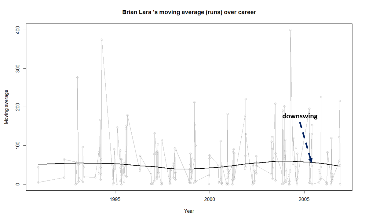
d) Brian Lara, Sachin Tendulkar, Ricky Ponting, Vivian Richards retired at a time when their batting was clearly declining. The writing on the wall was clear and they had to go (see moving average below)
e) The biggest hitter of 4’s was Vivian Richards. In the 2nd place is Brian Lara. Tendulkar & Dravid follow behind. Dravid is a surprise as he has the image of a defender.
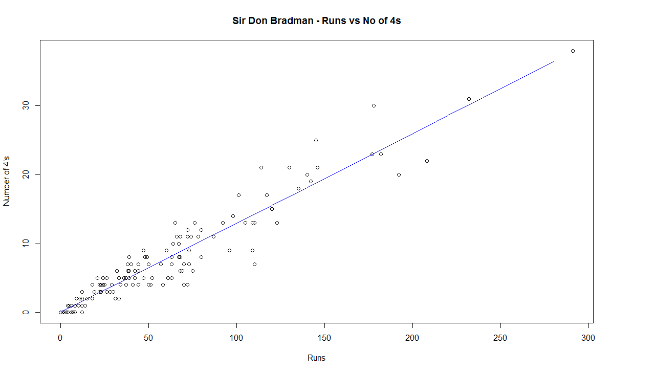
e) While Sir Don Bradman made huge scores, the number of 4’s in his innings was significantly less. This could be because the ground in those days did not carry the ball far enough
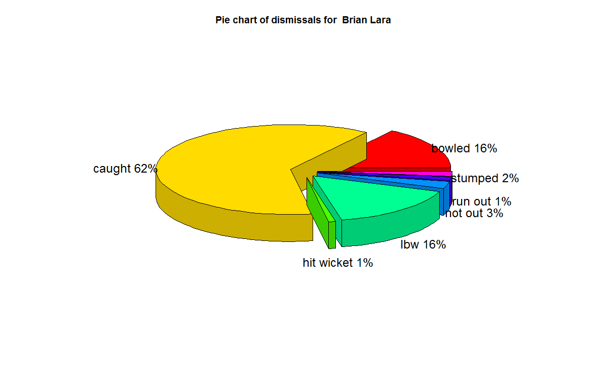
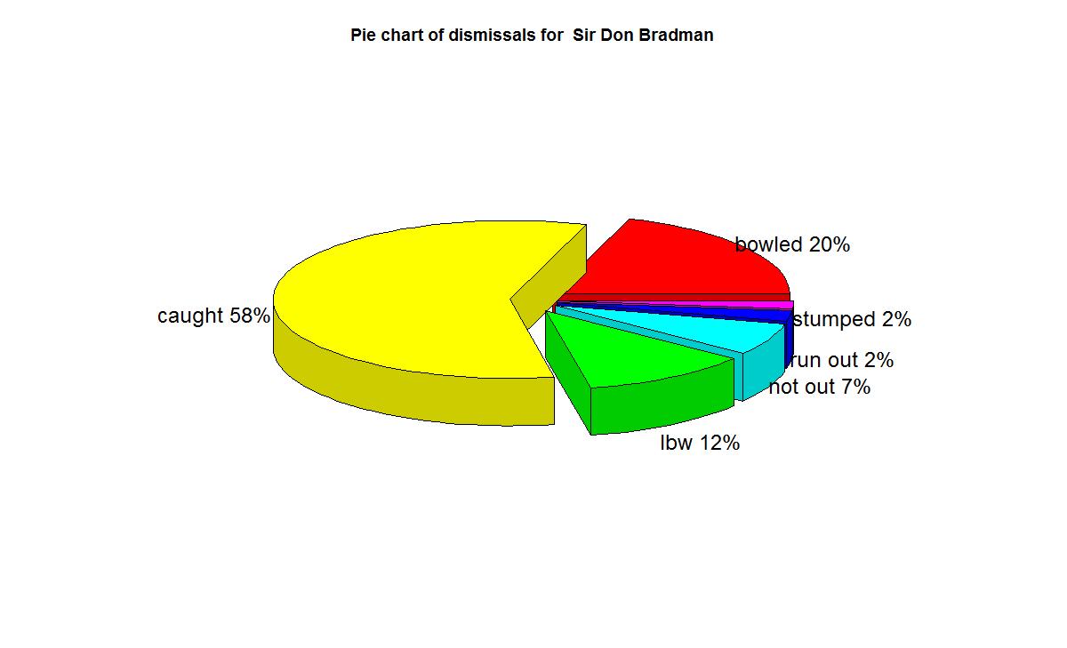
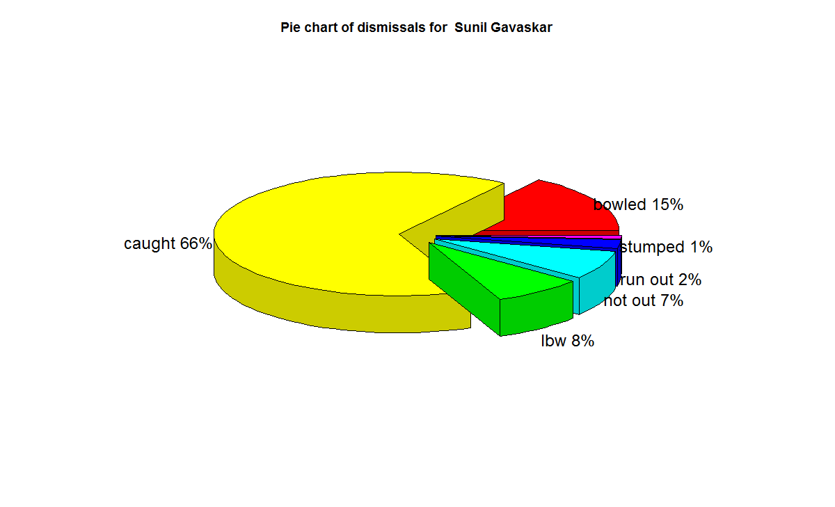
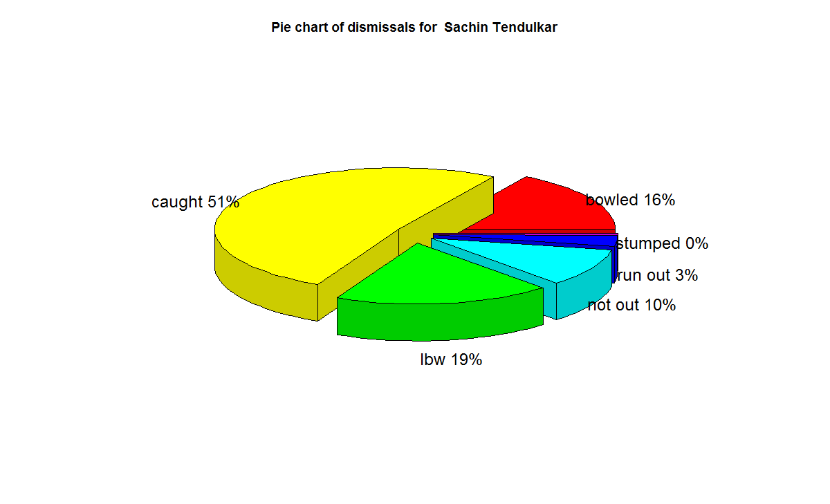
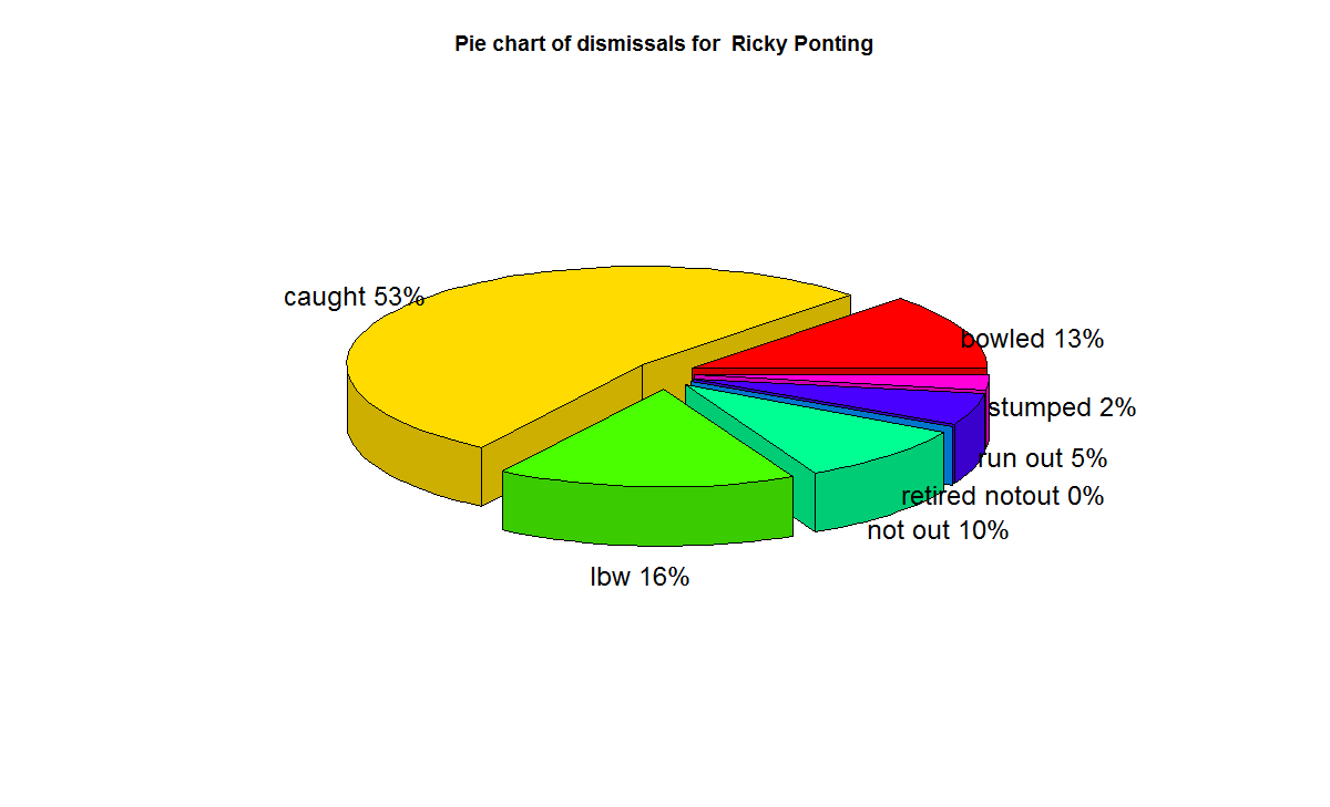
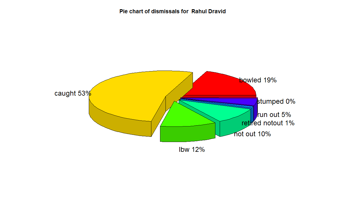
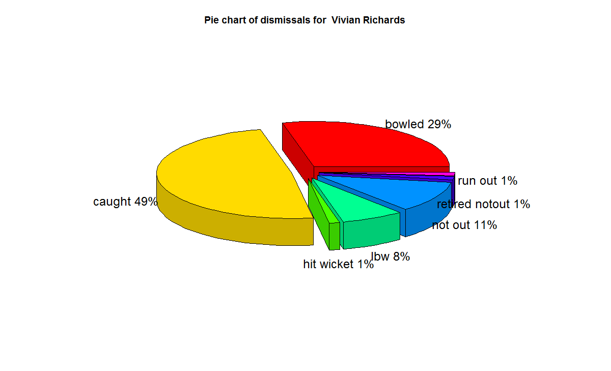
f) With respect to dismissals Richards was able to keep his wicket intact (11%) of the times , followed by Ponting Tendulkar, De Villiers, Dravid (10%) who carried the bat, and Gavaskar & Bradman (7%)
A) Runs frequency table and charts
These plots normalize the batting performance of different batsman, since the number of innings played ranges from 89 (Bradman) to 348 (Tendulkar), by calculating the percentage frequency the batsman scores runs in a particular range. For e.g. Sunil Gavaskar made scores between 60-80 10% of his total innings
This is shown in a tabular form below

The individual charts for each of the players are shwon belowThe top performers after removing ranges 0-20 & 20-40 are
Between 40-60 runs – 1) Ricky Ponting (16.4%) 2) Brian lara (15.8%) 3) AB De Villiers (14.6%)
Between 60-80 runs – 1) Vivian Richards (18%) 2) AB De Villiers (10.2%) 3) Sunil Gavaskar (10%)
Between 80-100 runs – 1) Rahul Dravid (7.6%) 2) Brian Lara (7.4%) 3) AB De Villiers (6.4%)
Between 100 -120 runs – 1) Sunil Gavaskar (7.5%) 2) Sir Don Bradman (6.8%) 3) Vivian Richards (5.8%)
Between 120-140 runs – 1) Sir Don Bradman (6.8%) 2) Sachin Tendulkar (2.5%) 3) Vivian Richards (2.3%)
The percentage frequency for Brian Lara is included below
1) Brian Lara
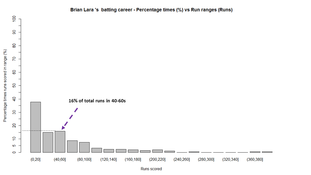
The above chart shows out of the total number of innings played by Brian Lara he scored runs in the range (40-60) 16% percent of the time. The chart also shows that Lara scored between 0-20, 40% while also scoring in the ranges 360-380 & 380-400 around 1%.
The same chart is displayed as continuous graph below

The run frequency charts for other batsman are
2) Sir Don Bradman
a) Run frequency
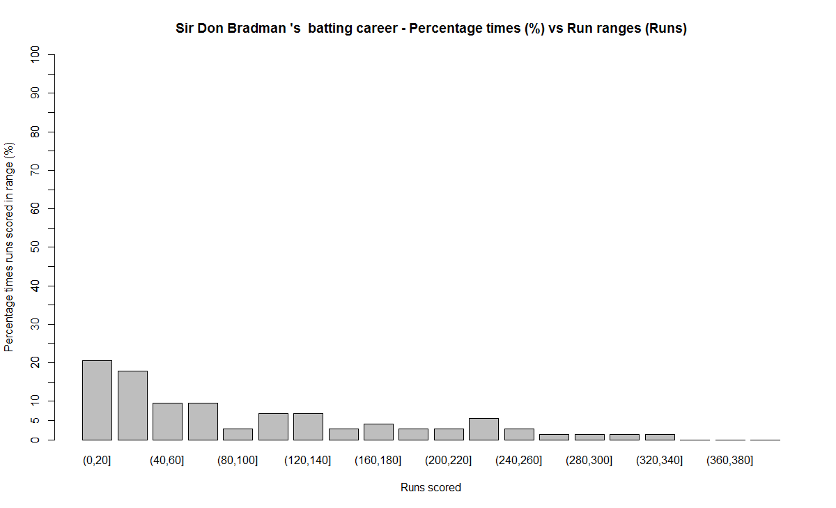
Note: Notice the significant contributions by Sir Don Bradman in the ranges 120-140,140-160,220-240,all the way up to 340
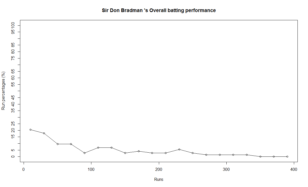
b) Performance
3) Sunil Gavaskar
a) Runs frequency chart

b) Performance chart

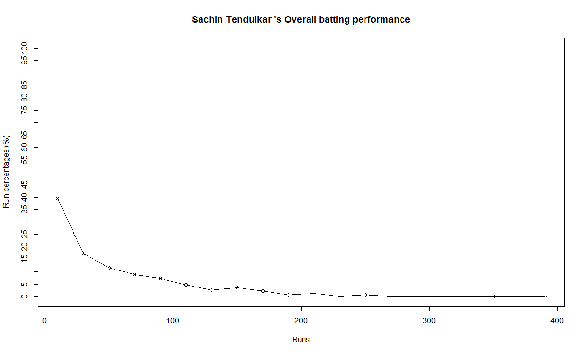
4) Sachin Tendulkar
a) Runs frequency chart

b) Performance chart
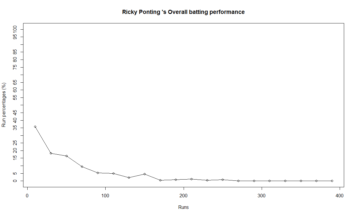
5) Ricky Ponting
a) Runs frequency

b) Performance
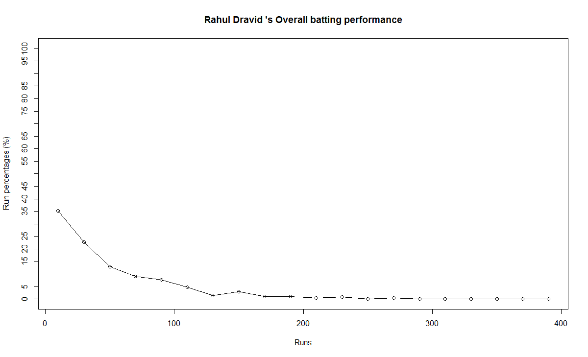
6) Rahul Dravid
a) Runs frequency chart
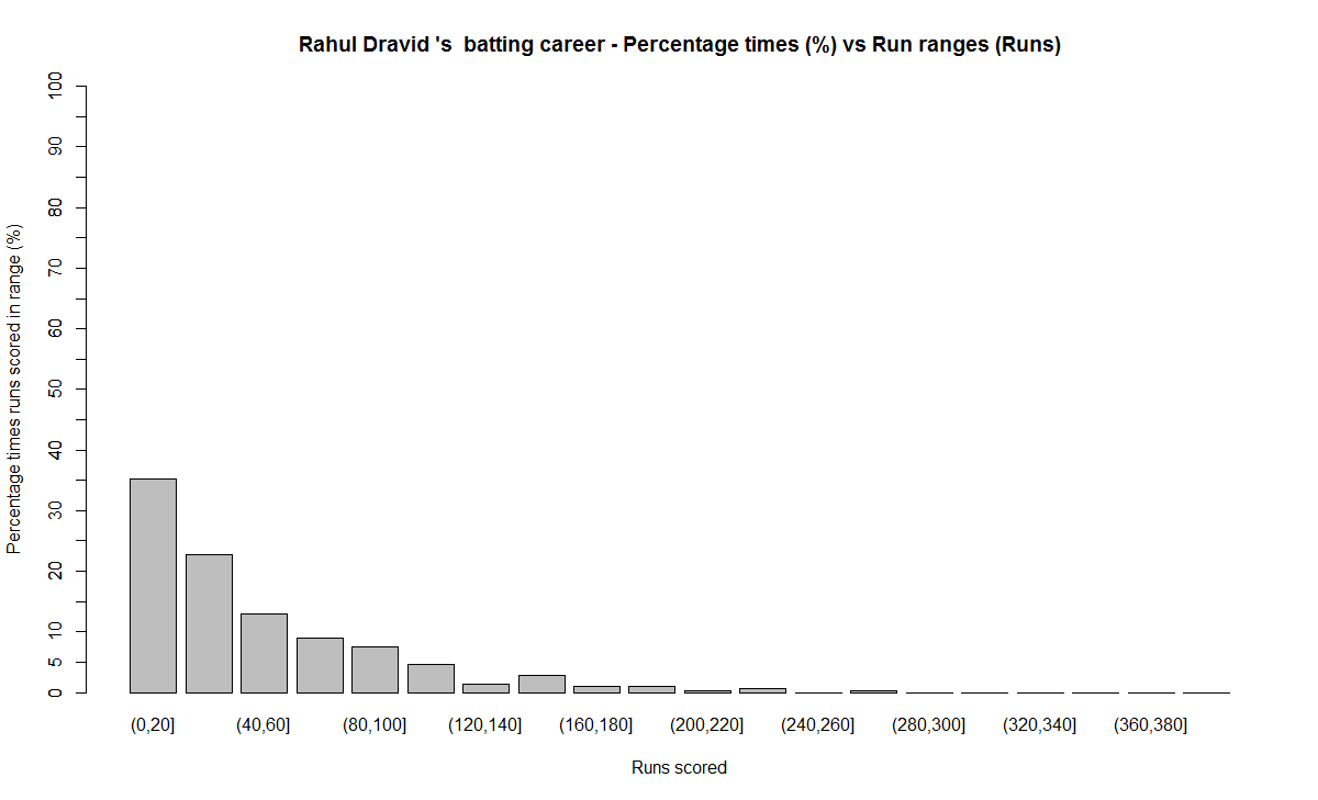
b) Performance chart
7) Vivian Richards
a) Runs frequency chart

b) Performance chart

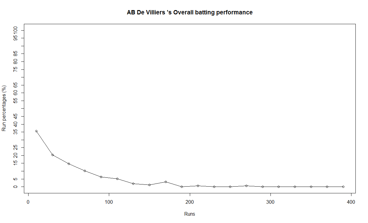
8) AB De Villiers
a) Runs frequency chart

b) Performance chart
B) Relative performance of the players
In this section I try to measure the relative performance of the players by superimposing the performance graphs obtained above. You may say that “comparisons are odious!”. But equally odious are myths that are based on gross facts like highest runs, average or most number of centuries.
a) All-time best batsman
(Sir Don Bradman, Sunil Gavaskar, Vivian Richards, Sachin Tendulkar, Ricky Ponting, Brian Lara, Rahul Dravid, AB De Villiers)
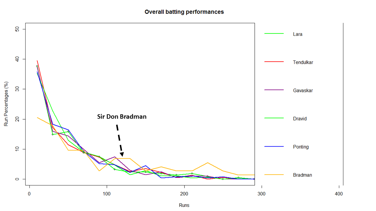
From the above chart it is clear that Sir Don Bradman is the ‘gold’ standard in batting. He is well above others for run ranges above 100 – 350
b) Best Indian batsman (Sunil Gavaskar, Sachin Tendulkar, Rahul Dravid)

The above chart shows that Gavaskar is ahead of the other two for key ranges between 100 – 130 with almost 8% contribution of total runs. This followed by Dravid who is ahead of Tendulkar in the range 80-120. According to me the all time best Indian batsman is 1) Sunil Gavaskar 2) Rahul Dravid 3) Sachin Tendulkar
c) Best batsman -( Brian Lara, Ricky Ponting, Sachin Tendulkar, AB De Villiers)
This chart was prepared since this comparison was often made in recent times

This chart shows the following ranking 1) AB De Villiers 2) Sachin Tendulkar 3) Brian Lara/Ricky Ponting
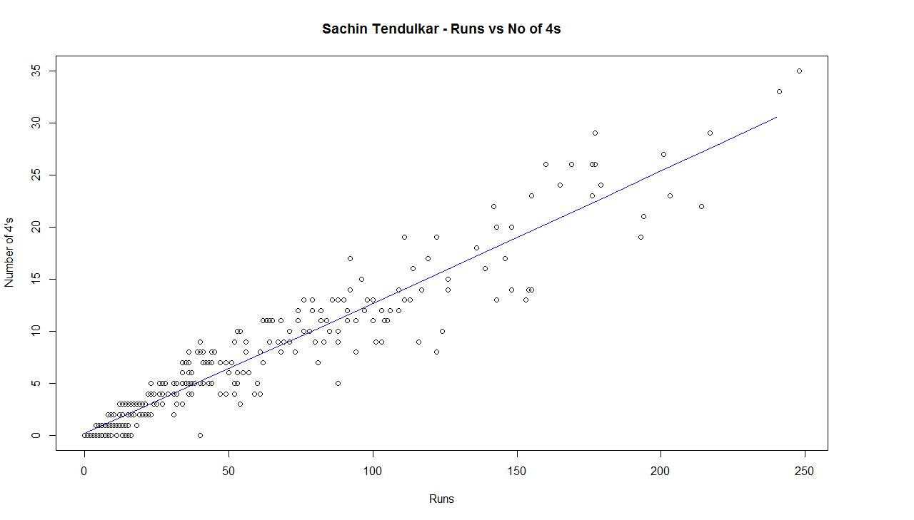
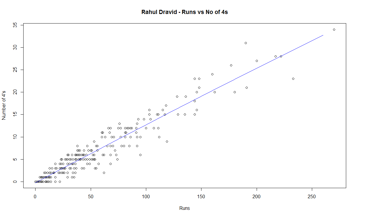
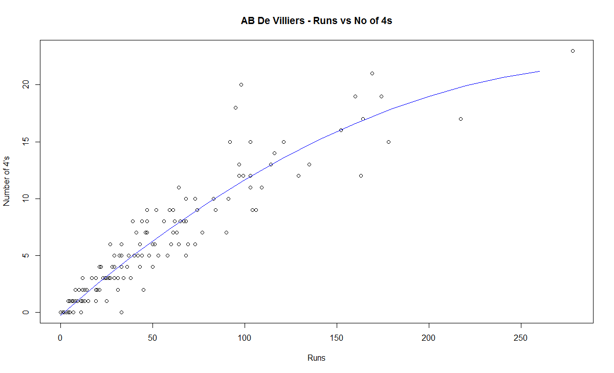
C) Chart of 4’s

This chart is plotted with a 2nd order curve of the number of 4’s versus the total runs in the innings
1) Brian Lara

2) Sir Don Bradman
3) Sunil Gavaskar

4) Sachin Tendulkar
5) Ricky Ponting

6) Rahul Dravid
7) Vivian Richards

8) AB De Villiers
D) Proclivity for type of dismissal
The below charts show how often the batsman was out bowled, caught, run out etc
1) Brian Lara
2) Sir Don Bradman
3) Sunil Gavaskar
4) Sachin Tendulkar
5) Ricky Ponting
6) Rahul Dravid
7) Vivian Richard
8) AB De Villiers

E) Moving Average
The plots below provide the performance of the batsman as a time series (chronological) and is displayed as the continuous gray lines. A moving average is computed using ‘loess regression’ and is shown as the dark line. This dark line represents the players performance improvement or decline. The moving average plots are shown below
1) Brian Lara
2) Sir Don Bradman
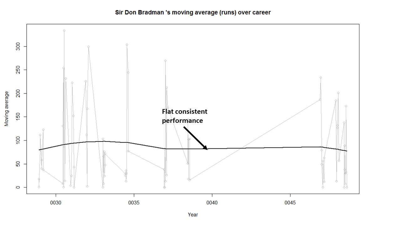
Sir Don Bradman’s moving average shows a remarkably consistent performance over the years. He probably could have a continued for a couple more years
3)Sunil Gavaskar

Gavaskar moving average does show a good improvement from a dip around 1983. Gavaskar retired bowing to public pressure on a mistaken belief that he was under performing. Gavaskar could have a continued for a couple of more years
4) Sachin Tendulkar
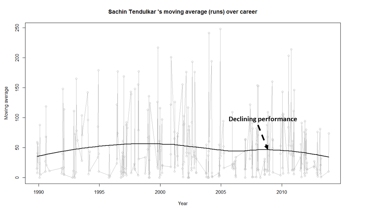
Tendulkar’s performance is clearly on the decline from 2011. He could have announced his retirement at least 2 years prior
5) Ricky Ponting
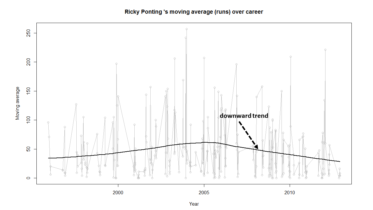
Ponting peak performance was around 2005 and does go steeply downward from then on. Ponting could have also retired around 2012
6) Rahul Dravid

Dravid seems to have recovered very effectively from his poor for around 2009. His overall performance shows steady improvement. Dravid’s announcement appeared impulsive. Dravid had another 2 good years of test cricket in him
7) Vivian Richards
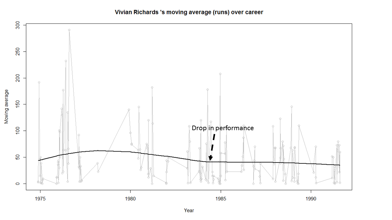
Richard’s performance seems to have dropped around 1984 and seems to remain that way.
8) AB De Villiers
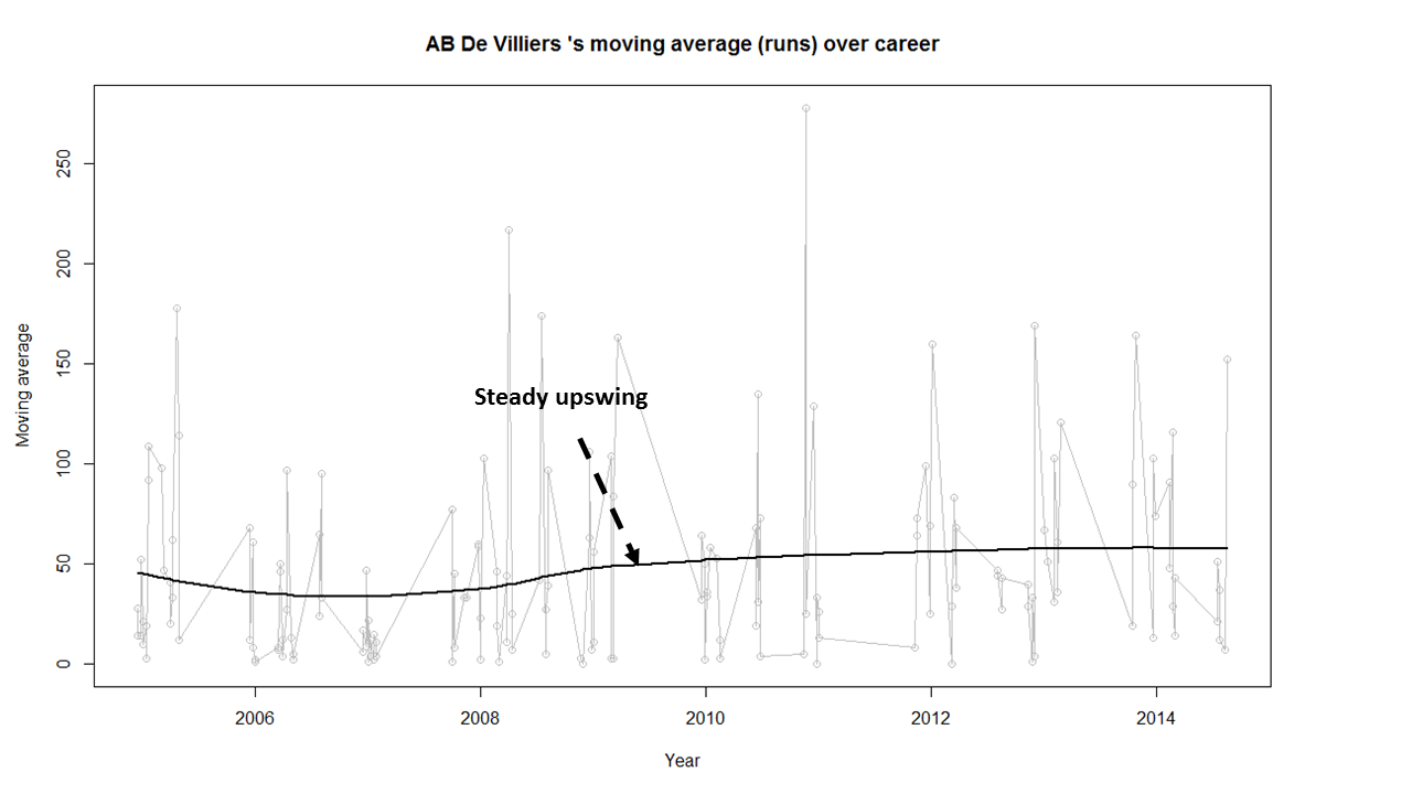
AB De Villiers moving average shows a steady upward swing from 2009 onwards. De Villiers has at least 3-4 years of great test cricket ahead of him.
Finally as mentioned above the dataset, the R implementation and all the charts are available at GitHub at analyze-batting-legends. Feel free to fork and clone the code. The code should work for other batsman as-is. Also go ahead and make any modifications for obtaining further insights.
Conclusion: The batting legends have been analyzed from various angles namely i) What is the frequency of runs scored in a particular range ii) How each batsman compares with others for relative runs in a specified range iii) How does the batsman get out? iv) What were the peak and lean period of the batsman and whether they recovered or slumped from these periods. While the batsman themselves have played in different time periods I think in an overall sense the performance under the conditions of the time will be similar.
Anyway feel free to let me know your thoughts. If you see other patterns in the data also do drop in your comment.
You may also like
1. Informed choices through Machine Learning : Analyzing Kohli, Tendulkar and Dravid
2. Informed choices through Machine Learning-2: Pitting together Kumble, Kapil,
Also see
– A crime map of India in R – Crimes against women
– What’s up Watson? Using IBM Watson’s QAAPI with Bluemix, NodeExpress – Part 1
– Bend it like Bluemix, MongoDB with autoscaling – Part 1


