Practical Machine Learning with R and Python – Part 5

This is the 5th and probably penultimate part of my series on ‘Practical Machine Learning with R and Python’. The earlier parts of this series included

1. Practical Machine Learning with R and Python – Part 1 In this initial post, I touch upon univariate, multivariate, polynomial regression and KNN regression in R and Python
2.Practical Machine Learning with R and Python – Part 2 In this post, I discuss Logistic Regression, KNN classification and cross validation error for both LOOCV and K-Fold in both R and Python
3.Practical Machine Learning with R and Python – Part 3 This post covered ‘feature selection’ in Machine Learning. Specifically I touch best fit, forward fit, backward fit, ridge(L2 regularization) & lasso (L1 regularization). The post includes equivalent code in R and Python.
4.Practical Machine Learning with R and Python – Part 4 In this part I discussed SVMs, Decision Trees, validation, precision recall, and roc curves

This post ‘Practical Machine Learning with R and Python – Part 5’ discusses regression with B-splines, natural splines, smoothing splines, generalized additive models (GAMS), bagging, random forest and boosting

As with my previous posts in this series, this post is largely based on the following 2 MOOC courses

1. Statistical Learning, Prof Trevor Hastie & Prof Robert Tibesherani, Online Stanford
2. Applied Machine Learning in Python Prof Kevyn-Collin Thomson, University Of Michigan, Coursera

You can download this R Markdown file and associated data files from Github at MachineLearning-RandPython-Part5

Note: Please listen to my video presentations Machine Learning in youtube
1. Machine Learning in plain English-Part 1
2. Machine Learning in plain English-Part 2
3. Machine Learning in plain English-Part 3

Check out my compact and minimal book  “Practical Machine Learning with R and Python:Third edition- Machine Learning in stereo”  available in Amazon in paperback($12.99) and kindle($8.99) versions. My book includes implementations of key ML algorithms and associated measures and metrics. The book is ideal for anybody who is familiar with the concepts and would like a quick reference to the different ML algorithms that can be applied to problems and how to select the best model. Pick your copy today!!


For this part I have used the data sets from UCI Machine Learning repository(Communities and Crime and Auto MPG)

1. Splines

When performing regression (continuous or logistic) between a target variable and a feature (or a set of features), a single polynomial for the entire range of the data set usually does not perform a good fit.Rather we would need to provide we could fit
regression curves for different section of the data set.

There are several techniques which do this for e.g. piecewise-constant functions, piecewise-linear functions, piecewise-quadratic/cubic/4th order polynomial functions etc. One such set of functions are the cubic splines which fit cubic polynomials to successive sections of the dataset. The points where the cubic splines join, are called ‘knots’.

Since each section has a different cubic spline, there could be discontinuities (or breaks) at these knots. To prevent these discontinuities ‘natural splines’ and ‘smoothing splines’ ensure that the seperate cubic functions have 2nd order continuity at these knots with the adjacent splines. 2nd order continuity implies that the value, 1st order derivative and 2nd order derivative at these knots are equal.

A cubic spline with knots \alpha_{k} , k=1,2,3,..K is a piece-wise cubic polynomial with continuous derivative up to order 2 at each knot. We can write y_{i} = \beta_{0} +\beta_{1}b_{1}(x_{i}) +\beta_{2}b_{2}(x_{i}) + .. + \beta_{K+3}b_{K+3}(x_{i}) + \epsilon_{i}.
For each (x{i},y{i}), b_{i} are called ‘basis’ functions, where  b_{1}(x_{i})=x_{i}b_{2}(x_{i})=x_{i}^2, b_{3}(x_{i})=x_{i}^3, b_{k+3}(x_{i})=(x_{i} -\alpha_{k})^3 where k=1,2,3… K The 1st and 2nd derivatives of cubic splines are continuous at the knots. Hence splines provide a smooth continuous fit to the data by fitting different splines to different sections of the data

1.1a Fit a 4th degree polynomial – R code

In the code below a non-linear function (a 4th order polynomial) is used to fit the data. Usually when we fit a single polynomial to the entire data set the tails of the fit tend to vary a lot particularly if there are fewer points at the ends. Splines help in reducing this variation at the extremities

library(dplyr)
library(ggplot2)
source('RFunctions-1.R')
# Read the data
df=read.csv("auto_mpg.csv",stringsAsFactors = FALSE) # Data from UCI
df1 <- as.data.frame(sapply(df,as.numeric))
#Select specific columns
df2 <- df1 %>% dplyr::select(cylinder,displacement, horsepower,weight, acceleration, year,mpg)
auto <- df2[complete.cases(df2),]
# Fit a 4th degree polynomial
fit=lm(mpg~poly(horsepower,4),data=auto)
#Display a summary of fit
summary(fit)
## 
## Call:
## lm(formula = mpg ~ poly(horsepower, 4), data = auto)
## 
## Residuals:
##      Min       1Q   Median       3Q      Max 
## -14.8820  -2.5802  -0.1682   2.2100  16.1434 
## 
## Coefficients:
##                       Estimate Std. Error t value Pr(>|t|)    
## (Intercept)            23.4459     0.2209 106.161   <2e-16 ***
## poly(horsepower, 4)1 -120.1377     4.3727 -27.475   <2e-16 ***
## poly(horsepower, 4)2   44.0895     4.3727  10.083   <2e-16 ***
## poly(horsepower, 4)3   -3.9488     4.3727  -0.903    0.367    
## poly(horsepower, 4)4   -5.1878     4.3727  -1.186    0.236    
## ---
## Signif. codes:  0 '***' 0.001 '**' 0.01 '*' 0.05 '.' 0.1 ' ' 1
## 
## Residual standard error: 4.373 on 387 degrees of freedom
## Multiple R-squared:  0.6893, Adjusted R-squared:  0.6861 
## F-statistic: 214.7 on 4 and 387 DF,  p-value: < 2.2e-16
#Get the range of horsepower
hp <- range(auto$horsepower)
#Create a sequence to be used for plotting
hpGrid <- seq(hp[1],hp[2],by=10)
#Predict for these values of horsepower. Set Standard error as TRUE
pred=predict(fit,newdata=list(horsepower=hpGrid),se=TRUE)
#Compute bands on either side that is 2xSE
seBands=cbind(pred$fit+2*pred$se.fit,pred$fit-2*pred$se.fit)
#Plot the fit with Standard Error bands
plot(auto$horsepower,auto$mpg,xlim=hp,cex=.5,col="black",xlab="Horsepower",
     ylab="MPG", main="Polynomial of degree 4")
lines(hpGrid,pred$fit,lwd=2,col="blue")
matlines(hpGrid,seBands,lwd=2,col="blue",lty=3)

fig1-1

1.1b Fit a 4th degree polynomial – Python code

import numpy as np
import pandas as pd
import os
import matplotlib.pyplot as plt
from sklearn.model_selection import train_test_split
from sklearn.preprocessing import PolynomialFeatures
from sklearn.linear_model import LinearRegression
#Read the auto data
autoDF =pd.read_csv("auto_mpg.csv",encoding="ISO-8859-1")
# Select columns
autoDF1=autoDF[['mpg','cylinder','displacement','horsepower','weight','acceleration','year']]
# Convert all columns to numeric
autoDF2 = autoDF1.apply(pd.to_numeric, errors='coerce')

#Drop NAs
autoDF3=autoDF2.dropna()
autoDF3.shape
X=autoDF3[['horsepower']]
y=autoDF3['mpg']
#Create a polynomial of degree 4
poly = PolynomialFeatures(degree=4)
X_poly = poly.fit_transform(X)

# Fit a polynomial regression line
linreg = LinearRegression().fit(X_poly, y)
# Create a range of values
hpGrid = np.arange(np.min(X),np.max(X),10)
hp=hpGrid.reshape(-1,1)
# Transform to 4th degree
poly = PolynomialFeatures(degree=4)
hp_poly = poly.fit_transform(hp)

#Create a scatter plot
plt.scatter(X,y)
# Fit the prediction
ypred=linreg.predict(hp_poly)
plt.title("Poylnomial of degree 4")
fig2=plt.xlabel("Horsepower")
fig2=plt.ylabel("MPG")
# Draw the regression curve
plt.plot(hp,ypred,c="red")
plt.savefig('fig1.png', bbox_inches='tight')

fig1

1.1c Fit a B-Spline – R Code

In the code below a B- Spline is fit to data. The B-spline requires the manual selection of knots

#Splines
library(splines)
# Fit a B-spline to the data. Select knots at 60,75,100,150
fit=lm(mpg~bs(horsepower,df=6,knots=c(60,75,100,150)),data=auto)
# Use the fitted regresion to predict
pred=predict(fit,newdata=list(horsepower=hpGrid),se=T)
# Create a scatter plot
plot(auto$horsepower,auto$mpg,xlim=hp,cex=.5,col="black",xlab="Horsepower",
     ylab="MPG", main="B-Spline with 4 knots")
#Draw lines with 2 Standard Errors on either side
lines(hpGrid,pred$fit,lwd=2)
lines(hpGrid,pred$fit+2*pred$se,lty="dashed")
lines(hpGrid,pred$fit-2*pred$se,lty="dashed")
abline(v=c(60,75,100,150),lty=2,col="darkgreen")

fig2-1

1.1d Fit a Natural Spline – R Code

Here a ‘Natural Spline’ is used to fit .The Natural Spline extrapolates beyond the boundary knots and the ends of the function are much more constrained than a regular spline or a global polynomoial where the ends can wag a lot more. Natural splines do not require the explicit selection of knots

# There is no need to select the knots here. There is a smoothing parameter which
# can be specified by the degrees of freedom 'df' parameter. The natural spline

fit2=lm(mpg~ns(horsepower,df=4),data=auto)
pred=predict(fit2,newdata=list(horsepower=hpGrid),se=T)
plot(auto$horsepower,auto$mpg,xlim=hp,cex=.5,col="black",xlab="Horsepower",
     ylab="MPG", main="Natural Splines")
lines(hpGrid,pred$fit,lwd=2)
lines(hpGrid,pred$fit+2*pred$se,lty="dashed")
lines(hpGrid,pred$fit-2*pred$se,lty="dashed")

fig3-1

1.1.e Fit a Smoothing Spline – R code

Here a smoothing spline is used. Smoothing splines also do not require the explicit setting of knots. We can change the ‘degrees of freedom(df)’ paramater to get the best fit

# Smoothing spline has a smoothing parameter, the degrees of freedom
# This is too wiggly
plot(auto$horsepower,auto$mpg,xlim=hp,cex=.5,col="black",xlab="Horsepower",
     ylab="MPG", main="Smoothing Splines")

# Here df is set to 16. This has a lot of variance
fit=smooth.spline(auto$horsepower,auto$mpg,df=16)
lines(fit,col="red",lwd=2)

# We can use Cross Validation to allow the spline to pick the value of this smpopothing paramter. We do not need to set the degrees of freedom 'df'
fit=smooth.spline(auto$horsepower,auto$mpg,cv=TRUE)
lines(fit,col="blue",lwd=2)

fig4-1

1.1e Splines – Python

There isn’t as much treatment of splines in Python and SKLearn. I did find the LSQUnivariate, UnivariateSpline spline. The LSQUnivariate spline requires the explcit setting of knots

import numpy as np
import pandas as pd
import os
import matplotlib.pyplot as plt
from scipy.interpolate import LSQUnivariateSpline
autoDF =pd.read_csv("auto_mpg.csv",encoding="ISO-8859-1")
autoDF.shape
autoDF.columns
autoDF1=autoDF[['mpg','cylinder','displacement','horsepower','weight','acceleration','year']]
autoDF2 = autoDF1.apply(pd.to_numeric, errors='coerce')
auto=autoDF2.dropna()
auto=auto[['horsepower','mpg']].sort_values('horsepower')

# Set the knots manually
knots=[65,75,100,150]
# Create an array for X & y
X=np.array(auto['horsepower'])
y=np.array(auto['mpg'])
# Fit a LSQunivariate spline
s = LSQUnivariateSpline(X,y,knots)

#Plot the spline
xs = np.linspace(40,230,1000)
ys = s(xs)
plt.scatter(X, y)
plt.plot(xs, ys)
plt.savefig('fig2.png', bbox_inches='tight')

fig2

1.2 Generalized Additiive models (GAMs)

Generalized Additive Models (GAMs) is a really powerful ML tool.

y_{i} = \beta_{0} + f_{1}(x_{i1}) + f_{2}(x_{i2}) + .. +f_{p}(x_{ip}) + \epsilon_{i}

In GAMs we use a different functions for each of the variables. GAMs give a much better fit since we can choose any function for the different sections

1.2a Generalized Additive Models (GAMs) – R Code

The plot below show the smooth spline that is fit for each of the features horsepower, cylinder, displacement, year and acceleration. We can use any function for example loess, 4rd order polynomial etc.

library(gam)
# Fit a smoothing spline for horsepower, cyliner, displacement and acceleration
gam=gam(mpg~s(horsepower,4)+s(cylinder,5)+s(displacement,4)+s(year,4)+s(acceleration,5),data=auto)
# Display the summary of the fit. This give the significance of each of the paramwetr
# Also an ANOVA is given for each combination of the features
summary(gam)
## 
## Call: gam(formula = mpg ~ s(horsepower, 4) + s(cylinder, 5) + s(displacement, 
##     4) + s(year, 4) + s(acceleration, 5), data = auto)
## Deviance Residuals:
##     Min      1Q  Median      3Q     Max 
## -8.3190 -1.4436 -0.0261  1.2279 12.0873 
## 
## (Dispersion Parameter for gaussian family taken to be 6.9943)
## 
##     Null Deviance: 23818.99 on 391 degrees of freedom
## Residual Deviance: 2587.881 on 370 degrees of freedom
## AIC: 1898.282 
## 
## Number of Local Scoring Iterations: 3 
## 
## Anova for Parametric Effects
##                     Df  Sum Sq Mean Sq  F value    Pr(>F)    
## s(horsepower, 4)     1 15632.8 15632.8 2235.085 < 2.2e-16 ***
## s(cylinder, 5)       1   508.2   508.2   72.666 3.958e-16 ***
## s(displacement, 4)   1   374.3   374.3   53.514 1.606e-12 ***
## s(year, 4)           1  2263.2  2263.2  323.583 < 2.2e-16 ***
## s(acceleration, 5)   1   372.4   372.4   53.246 1.809e-12 ***
## Residuals          370  2587.9     7.0                       
## ---
## Signif. codes:  0 '***' 0.001 '**' 0.01 '*' 0.05 '.' 0.1 ' ' 1
## 
## Anova for Nonparametric Effects
##                    Npar Df Npar F     Pr(F)    
## (Intercept)                                    
## s(horsepower, 4)         3 13.825 1.453e-08 ***
## s(cylinder, 5)           3 17.668 9.712e-11 ***
## s(displacement, 4)       3 44.573 < 2.2e-16 ***
## s(year, 4)               3 23.364 7.183e-14 ***
## s(acceleration, 5)       4  3.848  0.004453 ** 
## ---
## Signif. codes:  0 '***' 0.001 '**' 0.01 '*' 0.05 '.' 0.1 ' ' 1
par(mfrow=c(2,3))
plot(gam,se=TRUE)

fig5-1

1.2b Generalized Additive Models (GAMs) – Python Code

I did not find the equivalent of GAMs in SKlearn in Python. There was an early prototype (2012) in Github. Looks like it is still work in progress or has probably been abandoned.

1.3 Tree based Machine Learning Models

Tree based Machine Learning are all based on the ‘bootstrapping’ technique. In bootstrapping given a sample of size N, we create datasets of size N by sampling this original dataset with replacement. Machine Learning models are built on the different bootstrapped samples and then averaged.

Decision Trees as seen above have the tendency to overfit. There are several techniques that help to avoid this namely a) Bagging b) Random Forests c) Boosting

Bagging, Random Forest and Gradient Boosting

Bagging: Bagging, or Bootstrap Aggregation decreases the variance of predictions, by creating separate Decisiion Tree based ML models on the different samples and then averaging these ML models

Random Forests: Bagging is a greedy algorithm and tries to produce splits based on all variables which try to minimize the error. However the different ML models have a high correlation. Random Forests remove this shortcoming, by using a variable and random set of features to split on. Hence the features chosen and the resulting trees are uncorrelated. When these ML models are averaged the performance is much better.

Boosting: Gradient Boosted Decision Trees also use an ensemble of trees but they don’t build Machine Learning models with random set of features at each step. Rather small and simple trees are built. Successive trees try to minimize the error from the earlier trees.

Out of Bag (OOB) Error: In Random Forest and Gradient Boosting for each bootstrap sample taken from the dataset, there will be samples left out. These are known as Out of Bag samples.Classification accuracy carried out on these OOB samples is known as OOB error

1.31a Decision Trees – R Code

The code below creates a Decision tree with the cancer training data. The summary of the fit is output. Based on the ML model, the predict function is used on test data and a confusion matrix is output.

# Read the cancer data
library(tree)
library(caret)
library(e1071)
cancer <- read.csv("cancer.csv",stringsAsFactors = FALSE)
cancer <- cancer[,2:32]
cancer$target <- as.factor(cancer$target)
train_idx <- trainTestSplit(cancer,trainPercent=75,seed=5)
train <- cancer[train_idx, ]
test <- cancer[-train_idx, ]

# Create Decision Tree
cancerStatus=tree(target~.,train)
summary(cancerStatus)
## 
## Classification tree:
## tree(formula = target ~ ., data = train)
## Variables actually used in tree construction:
## [1] "worst.perimeter"      "worst.concave.points" "area.error"          
## [4] "worst.texture"        "mean.texture"         "mean.concave.points" 
## Number of terminal nodes:  9 
## Residual mean deviance:  0.1218 = 50.8 / 417 
## Misclassification error rate: 0.02347 = 10 / 426
pred <- predict(cancerStatus,newdata=test,type="class")
confusionMatrix(pred,test$target)
## Confusion Matrix and Statistics
## 
##           Reference
## Prediction  0  1
##          0 49  7
##          1  8 78
##                                           
##                Accuracy : 0.8944          
##                  95% CI : (0.8318, 0.9397)
##     No Information Rate : 0.5986          
##     P-Value [Acc > NIR] : 4.641e-15       
##                                           
##                   Kappa : 0.7795          
##  Mcnemar's Test P-Value : 1               
##                                           
##             Sensitivity : 0.8596          
##             Specificity : 0.9176          
##          Pos Pred Value : 0.8750          
##          Neg Pred Value : 0.9070          
##              Prevalence : 0.4014          
##          Detection Rate : 0.3451          
##    Detection Prevalence : 0.3944          
##       Balanced Accuracy : 0.8886          
##                                           
##        'Positive' Class : 0               
## 
# Plot decision tree with labels
plot(cancerStatus)
text(cancerStatus,pretty=0)

fig6-1

1.31b Decision Trees – Cross Validation – R Code

We can also perform a Cross Validation on the data to identify the Decision Tree which will give the minimum deviance.

library(tree)
cancer <- read.csv("cancer.csv",stringsAsFactors = FALSE)
cancer <- cancer[,2:32]
cancer$target <- as.factor(cancer$target)
train_idx <- trainTestSplit(cancer,trainPercent=75,seed=5)
train <- cancer[train_idx, ]
test <- cancer[-train_idx, ]

# Create Decision Tree
cancerStatus=tree(target~.,train)

# Execute 10 fold cross validation
cvCancer=cv.tree(cancerStatus)
plot(cvCancer)

fig7-1

# Plot the 
plot(cvCancer$size,cvCancer$dev,type='b')

fig1

prunedCancer=prune.tree(cancerStatus,best=4)
plot(prunedCancer)
text(prunedCancer,pretty=0)

fig2

pred <- predict(prunedCancer,newdata=test,type="class")
confusionMatrix(pred,test$target)
## Confusion Matrix and Statistics
## 
##           Reference
## Prediction  0  1
##          0 50  7
##          1  7 78
##                                          
##                Accuracy : 0.9014         
##                  95% CI : (0.8401, 0.945)
##     No Information Rate : 0.5986         
##     P-Value [Acc > NIR] : 7.988e-16      
##                                          
##                   Kappa : 0.7948         
##  Mcnemar's Test P-Value : 1              
##                                          
##             Sensitivity : 0.8772         
##             Specificity : 0.9176         
##          Pos Pred Value : 0.8772         
##          Neg Pred Value : 0.9176         
##              Prevalence : 0.4014         
##          Detection Rate : 0.3521         
##    Detection Prevalence : 0.4014         
##       Balanced Accuracy : 0.8974         
##                                          
##        'Positive' Class : 0              
## 

1.31c Decision Trees – Python Code

Below is the Python code for creating Decision Trees. The accuracy, precision, recall and F1 score is computed on the test data set.

import numpy as np
import pandas as pd
import os
import matplotlib.pyplot as plt
from sklearn.metrics import confusion_matrix
from sklearn import tree
from sklearn.datasets import load_breast_cancer
from sklearn.model_selection import train_test_split
from sklearn.tree import DecisionTreeClassifier
from sklearn.datasets import make_classification, make_blobs
from sklearn.metrics import accuracy_score, precision_score, recall_score, f1_score
import graphviz 

cancer = load_breast_cancer()
(X_cancer, y_cancer) = load_breast_cancer(return_X_y = True)

X_train, X_test, y_train, y_test = train_test_split(X_cancer, y_cancer,
                                                   random_state = 0)
clf = DecisionTreeClassifier().fit(X_train, y_train)

print('Accuracy of Decision Tree classifier on training set: {:.2f}'
     .format(clf.score(X_train, y_train)))
print('Accuracy of Decision Tree classifier on test set: {:.2f}'
     .format(clf.score(X_test, y_test)))

y_predicted=clf.predict(X_test)
confusion = confusion_matrix(y_test, y_predicted)
print('Accuracy: {:.2f}'.format(accuracy_score(y_test, y_predicted)))
print('Precision: {:.2f}'.format(precision_score(y_test, y_predicted)))
print('Recall: {:.2f}'.format(recall_score(y_test, y_predicted)))
print('F1: {:.2f}'.format(f1_score(y_test, y_predicted)))

# Plot the Decision Tree
clf = DecisionTreeClassifier(max_depth=2).fit(X_train, y_train)
dot_data = tree.export_graphviz(clf, out_file=None, 
                         feature_names=cancer.feature_names,  
                         class_names=cancer.target_names,  
                         filled=True, rounded=True,  
                         special_characters=True)  
graph = graphviz.Source(dot_data)  
graph
## Accuracy of Decision Tree classifier on training set: 1.00
## Accuracy of Decision Tree classifier on test set: 0.87
## Accuracy: 0.87
## Precision: 0.97
## Recall: 0.82
## F1: 0.89

tree

1.31d Decision Trees – Cross Validation – Python Code

In the code below 5-fold cross validation is performed for different depths of the tree and the accuracy is computed. The accuracy on the test set seems to plateau when the depth is 8. But it is seen to increase again from 10 to 12. More analysis needs to be done here


import numpy as np
import pandas as pd
import os
import matplotlib.pyplot as plt
from sklearn.datasets import load_breast_cancer
from sklearn.tree import DecisionTreeClassifier
(X_cancer, y_cancer) = load_breast_cancer(return_X_y = True)
from sklearn.cross_validation import train_test_split, KFold
def computeCVAccuracy(X,y,folds):
    accuracy=[]
    foldAcc=[]
    depth=[1,2,3,4,5,6,7,8,9,10,11,12]
    nK=len(X)/float(folds)
    xval_err=0
    for i in depth: 
        kf = KFold(len(X),n_folds=folds)
        for train_index, test_index in kf:
            X_train, X_test = X.iloc[train_index], X.iloc[test_index]
            y_train, y_test = y.iloc[train_index], y.iloc[test_index]  
            clf = DecisionTreeClassifier(max_depth = i).fit(X_train, y_train)
            score=clf.score(X_test, y_test)
            accuracy.append(score)     
            
        foldAcc.append(np.mean(accuracy))  
        
    return(foldAcc)
    
    
cvAccuracy=computeCVAccuracy(pd.DataFrame(X_cancer),pd.DataFrame(y_cancer),folds=10)

df1=pd.DataFrame(cvAccuracy)
df1.columns=['cvAccuracy']
df=df1.reindex([1,2,3,4,5,6,7,8,9,10,11,12])
df.plot()
plt.title("Decision Tree - 10-fold Cross Validation Accuracy vs Depth of tree")
plt.xlabel("Depth of tree")
plt.ylabel("Accuracy")
plt.savefig('fig3.png', bbox_inches='tight')


fig3


1.4a Random Forest – R code

A Random Forest is fit using the Boston data. The summary shows that 4 variables were randomly chosen at each split and the resulting ML model explains 88.72% of the test data. Also the variable importance is plotted. It can be seen that ‘rooms’ and ‘status’ are the most influential features in the model

library(randomForest)
df=read.csv("Boston.csv",stringsAsFactors = FALSE) # Data from MASS - SL

# Select specific columns
Boston <- df %>% dplyr::select("crimeRate","zone","indus","charles","nox","rooms","age",                          "distances","highways","tax","teacherRatio","color",
                               "status","medianValue")

# Fit a Random Forest on the Boston training data
rfBoston=randomForest(medianValue~.,data=Boston)
# Display the summatu of the fit. It can be seen that the MSE is 10.88 
# and the percentage variance explained is 86.14%. About 4 variables were tried at each # #split for a maximum tree of 500.
# The MSE and percent variance is on Out of Bag trees
rfBoston
## 
## Call:
##  randomForest(formula = medianValue ~ ., data = Boston) 
##                Type of random forest: regression
##                      Number of trees: 500
## No. of variables tried at each split: 4
## 
##           Mean of squared residuals: 9.521672
##                     % Var explained: 88.72
#List and plot the variable importances
importance(rfBoston)
##              IncNodePurity
## crimeRate        2602.1550
## zone              258.8057
## indus            2599.6635
## charles           240.2879
## nox              2748.8485
## rooms           12011.6178
## age              1083.3242
## distances        2432.8962
## highways          393.5599
## tax              1348.6987
## teacherRatio     2841.5151
## color             731.4387
## status          12735.4046
varImpPlot(rfBoston)

fig8-1

1.4b Random Forest-OOB and Cross Validation Error – R code

The figure below shows the OOB error and the Cross Validation error vs the ‘mtry’. Here mtry indicates the number of random features that are chosen at each split. The lowest test error occurs when mtry = 8

library(randomForest)
df=read.csv("Boston.csv",stringsAsFactors = FALSE) # Data from MASS - SL

# Select specific columns
Boston <- df %>% dplyr::select("crimeRate","zone","indus","charles","nox","rooms","age",                          "distances","highways","tax","teacherRatio","color",
                               "status","medianValue")
# Split as training and tst sets
train_idx <- trainTestSplit(Boston,trainPercent=75,seed=5)
train <- Boston[train_idx, ]
test <- Boston[-train_idx, ]

#Initialize OOD and testError
oobError <- NULL
testError <- NULL
# In the code below the number of variables to consider at each split is increased
# from 1 - 13(max features) and the OOB error and the MSE is computed
for(i in 1:13){
    fitRF=randomForest(medianValue~.,data=train,mtry=i,ntree=400)
    oobError[i] <-fitRF$mse[400]
    pred <- predict(fitRF,newdata=test)
    testError[i] <- mean((pred-test$medianValue)^2)
}

# We can see the OOB and Test Error. It can be seen that the Random Forest performs
# best with the lowers MSE at mtry=6
matplot(1:13,cbind(testError,oobError),pch=19,col=c("red","blue"),
        type="b",xlab="mtry(no of varaibles at each split)", ylab="Mean Squared Error",
        main="Random Forest - OOB and Test Error")
legend("topright",legend=c("OOB","Test"),pch=19,col=c("red","blue"))

fig9-1

1.4c Random Forest – Python code

The python code for Random Forest Regression is shown below. The training and test score is computed. The variable importance shows that ‘rooms’ and ‘status’ are the most influential of the variables

import numpy as np
import pandas as pd
import os
import matplotlib.pyplot as plt
from sklearn.model_selection import train_test_split
from sklearn.ensemble import RandomForestRegressor
df = pd.read_csv("Boston.csv",encoding = "ISO-8859-1")

X=df[['crimeRate','zone', 'indus','charles','nox','rooms', 'age','distances','highways','tax',
       'teacherRatio','color','status']]
y=df['medianValue']

X_train, X_test, y_train, y_test = train_test_split(X, y, random_state = 0)

regr = RandomForestRegressor(max_depth=4, random_state=0)
regr.fit(X_train, y_train)

print('R-squared score (training): {:.3f}'
     .format(regr.score(X_train, y_train)))
print('R-squared score (test): {:.3f}'
     .format(regr.score(X_test, y_test)))

feature_names=['crimeRate','zone', 'indus','charles','nox','rooms', 'age','distances','highways','tax',
       'teacherRatio','color','status']
print(regr.feature_importances_)
plt.figure(figsize=(10,6),dpi=80)
c_features=X_train.shape[1]
plt.barh(np.arange(c_features),regr.feature_importances_)
plt.xlabel("Feature importance")
plt.ylabel("Feature name")

plt.yticks(np.arange(c_features), feature_names)
plt.tight_layout()

plt.savefig('fig4.png', bbox_inches='tight')
## R-squared score (training): 0.917
## R-squared score (test): 0.734
## [ 0.03437382  0.          0.00580335  0.          0.00731004  0.36461548
##   0.00638577  0.03432173  0.0041244   0.01732328  0.01074148  0.0012638
##   0.51373683]

fig4

1.4d Random Forest – Cross Validation and OOB Error – Python code

As with R the ‘max_features’ determines the random number of features the random forest will use at each split. The plot shows that when max_features=8 the MSE is lowest

import numpy as np
import pandas as pd
import os
import matplotlib.pyplot as plt
from sklearn.model_selection import train_test_split
from sklearn.ensemble import RandomForestRegressor
from sklearn.model_selection import cross_val_score
df = pd.read_csv("Boston.csv",encoding = "ISO-8859-1")

X=df[['crimeRate','zone', 'indus','charles','nox','rooms', 'age','distances','highways','tax',
       'teacherRatio','color','status']]
y=df['medianValue']

cvError=[]
oobError=[]
oobMSE=[]
for i in range(1,13):
    regr = RandomForestRegressor(max_depth=4, n_estimators=400,max_features=i,oob_score=True,random_state=0)
    mse= np.mean(cross_val_score(regr, X, y, cv=5,scoring = 'neg_mean_squared_error'))
    # Since this is neg_mean_squared_error I have inverted the sign to get MSE
    cvError.append(-mse)
    # Fit on all data to compute OOB error
    regr.fit(X, y)
    # Record the OOB error for each `max_features=i` setting
    oob = 1 - regr.oob_score_
    oobError.append(oob)
    # Get the Out of Bag prediction
    oobPred=regr.oob_prediction_ 
    # Compute the Mean Squared Error between OOB Prediction and target
    mseOOB=np.mean(np.square(oobPred-y))
    oobMSE.append(mseOOB)

# Plot the CV Error and OOB Error
# Set max_features
maxFeatures=np.arange(1,13) 
cvError=pd.DataFrame(cvError,index=maxFeatures)
oobMSE=pd.DataFrame(oobMSE,index=maxFeatures)
#Plot
fig8=df.plot()
fig8=plt.title('Random forest - CV Error and OOB Error vs max_features')
fig8.figure.savefig('fig8.png', bbox_inches='tight')

#Plot the OOB Error vs max_features
plt.plot(range(1,13),oobError)
fig2=plt.title("Random Forest - OOB Error vs max_features (variable no of features)")
fig2=plt.xlabel("max_features (variable no of features)")
fig2=plt.ylabel("OOB Error")
fig2.figure.savefig('fig7.png', bbox_inches='tight')

fig8 fig7

1.5a Boosting – R code

Here a Gradient Boosted ML Model is built with a n.trees=5000, with a learning rate of 0.01 and depth of 4. The feature importance plot also shows that rooms and status are the 2 most important features. The MSE vs the number of trees plateaus around 2000 trees

library(gbm)
# Perform gradient boosting on the Boston data set. The distribution is gaussian since we
# doing MSE. The interaction depth specifies the number of splits
boostBoston=gbm(medianValue~.,data=train,distribution="gaussian",n.trees=5000,
                shrinkage=0.01,interaction.depth=4)
#The summary gives the variable importance. The 2 most significant variables are
# number of rooms and lower status
summary(boostBoston)

##                       var    rel.inf
## rooms               rooms 42.2267200
## status             status 27.3024671
## distances       distances  7.9447972
## crimeRate       crimeRate  5.0238827
## nox                   nox  4.0616548
## teacherRatio teacherRatio  3.1991999
## age                   age  2.7909772
## color               color  2.3436295
## tax                   tax  2.1386213
## charles           charles  1.3799109
## highways         highways  0.7644026
## indus               indus  0.7236082
## zone                 zone  0.1001287
# The plots below show how each variable relates to the median value of the home. As
# the number of roomd increase the median value increases and with increase in lower status
# the median value decreases
par(mfrow=c(1,2))
#Plot the relation between the top 2 features and the target
plot(boostBoston,i="rooms")
plot(boostBoston,i="status")

fig10-2

# Create a sequence of trees between 100-5000 incremented by 50
nTrees=seq(100,5000,by=50)
# Predict the values for the test data
pred <- predict(boostBoston,newdata=test,n.trees=nTrees)
# Compute the mean for each of the MSE for each of the number of trees 
boostError <- apply((pred-test$medianValue)^2,2,mean)
#Plot the MSE vs the number of trees
plot(nTrees,boostError,pch=19,col="blue",ylab="Mean Squared Error",
     main="Boosting Test Error")

fig10-3

1.5b Cross Validation Boosting – R code

Included below is a cross validation error vs the learning rate. The lowest error is when learning rate = 0.09

cvError <- NULL
s <- c(.001,0.01,0.03,0.05,0.07,0.09,0.1)
for(i in seq_along(s)){
    cvBoost=gbm(medianValue~.,data=train,distribution="gaussian",n.trees=5000,
                shrinkage=s[i],interaction.depth=4,cv.folds=5)
    cvError[i] <- mean(cvBoost$cv.error)
}

# Create a data frame for plotting
a <- rbind(s,cvError)
b <- as.data.frame(t(a))
# It can be seen that a shrinkage parameter of 0,05 gives the lowes CV Error
ggplot(b,aes(s,cvError)) + geom_point() + geom_line(color="blue") + 
    xlab("Shrinkage") + ylab("Cross Validation Error") +
    ggtitle("Gradient boosted trees - Cross Validation error vs Shrinkage")

fig11-1

1.5c Boosting – Python code

A gradient boost ML model in Python is created below. The Rsquared score is computed on the training and test data.

import numpy as np
import pandas as pd
import os
import matplotlib.pyplot as plt
from sklearn.model_selection import train_test_split
from sklearn.ensemble import GradientBoostingRegressor
df = pd.read_csv("Boston.csv",encoding = "ISO-8859-1")

X=df[['crimeRate','zone', 'indus','charles','nox','rooms', 'age','distances','highways','tax',
       'teacherRatio','color','status']]
y=df['medianValue']

X_train, X_test, y_train, y_test = train_test_split(X, y, random_state = 0)

regr = GradientBoostingRegressor()
regr.fit(X_train, y_train)

print('R-squared score (training): {:.3f}'
     .format(regr.score(X_train, y_train)))
print('R-squared score (test): {:.3f}'
     .format(regr.score(X_test, y_test)))
## R-squared score (training): 0.983
## R-squared score (test): 0.821

1.5c Cross Validation Boosting – Python code

the cross validation error is computed as the learning rate is varied. The minimum CV eror occurs when lr = 0.04

import numpy as np
import pandas as pd
import os
import matplotlib.pyplot as plt
from sklearn.model_selection import train_test_split
from sklearn.ensemble import RandomForestRegressor
from sklearn.ensemble import GradientBoostingRegressor
from sklearn.model_selection import cross_val_score
df = pd.read_csv("Boston.csv",encoding = "ISO-8859-1")

X=df[['crimeRate','zone', 'indus','charles','nox','rooms', 'age','distances','highways','tax',
       'teacherRatio','color','status']]
y=df['medianValue']

cvError=[]
learning_rate =[.001,0.01,0.03,0.05,0.07,0.09,0.1]
for lr in learning_rate:
    regr = GradientBoostingRegressor(max_depth=4, n_estimators=400,learning_rate  =lr,random_state=0)
    mse= np.mean(cross_val_score(regr, X, y, cv=10,scoring = 'neg_mean_squared_error'))
    # Since this is neg_mean_squared_error I have inverted the sign to get MSE
    cvError.append(-mse)
learning_rate =[.001,0.01,0.03,0.05,0.07,0.09,0.1]
plt.plot(learning_rate,cvError)
plt.title("Gradient Boosting - 5-fold CV- Mean Squared Error vs max_features (variable no of features)")
plt.xlabel("max_features (variable no of features)")
plt.ylabel("Mean Squared Error")
plt.savefig('fig6.png', bbox_inches='tight')

fig6

Conclusion This post covered Splines and Tree based ML models like Bagging, Random Forest and Boosting. Stay tuned for further updates.

You may also like

  1. Re-introducing cricketr! : An R package to analyze performances of cricketer
  2. Designing a Social Web Portal
  3. My travels through the realms of Data Science, Machine Learning, Deep Learning and (AI)
  4. My TEDx talk on the “Internet of Things”
  5. Singularity
  6. A closer look at “Robot Horse on a Trot” in Android

To see all posts see Index of posts

Practical Machine Learning with R and Python – Part 2

In this 2nd part of the series “Practical Machine Learning with R and Python – Part 2”, I continue where I left off in my first post Practical Machine Learning with R and Python – Part 2. In this post I cover the some classification algorithmns and cross validation. Specifically I touch
-Logistic Regression
-K Nearest Neighbors (KNN) classification
-Leave out one Cross Validation (LOOCV)
-K Fold Cross Validation
in both R and Python.

As in my initial post the algorithms are based on the following courses.

You can download this R Markdown file along with the data from Github. I hope these posts can be used as a quick reference in R and Python and Machine Learning.I have tried to include the coolest part of either course in this post.

Note: Please listen to my video presentations Machine Learning in youtube
1. Machine Learning in plain English-Part 1
2. Machine Learning in plain English-Part 2
3. Machine Learning in plain English-Part 3

Check out my compact and minimal book  “Practical Machine Learning with R and Python:Third edition- Machine Learning in stereo”  available in Amazon in paperback($12.99) and kindle($8.99) versions. My book includes implementations of key ML algorithms and associated measures and metrics. The book is ideal for anybody who is familiar with the concepts and would like a quick reference to the different ML algorithms that can be applied to problems and how to select the best model. Pick your copy today!!


The following classification problem is based on Logistic Regression. The data is an included data set in Scikit-Learn, which I have saved as csv and use it also for R. The fit of a classification Machine Learning Model depends on how correctly classifies the data. There are several measures of testing a model’s classification performance. They are

Accuracy = TP + TN / (TP + TN + FP + FN) – Fraction of all classes correctly classified
Precision = TP / (TP + FP) – Fraction of correctly classified positives among those classified as positive
Recall = TP / (TP + FN) Also known as sensitivity, or True Positive Rate (True positive) – Fraction of correctly classified as positive among all positives in the data
F1 = 2 * Precision * Recall / (Precision + Recall)

1a. Logistic Regression – R code

The caret and e1071 package is required for using the confusionMatrix call

source("RFunctions.R")
library(dplyr)
library(caret)
library(e1071)
# Read the data (from sklearn)
cancer <- read.csv("cancer.csv")
# Rename the target variable
names(cancer) <- c(seq(1,30),"output")
# Split as training and test sets
train_idx <- trainTestSplit(cancer,trainPercent=75,seed=5)
train <- cancer[train_idx, ]
test <- cancer[-train_idx, ]

# Fit a generalized linear logistic model, 
fit=glm(output~.,family=binomial,data=train,control = list(maxit = 50))
# Predict the output from the model
a=predict(fit,newdata=train,type="response")
# Set response >0.5 as 1 and <=0.5 as 0
b=ifelse(a>0.5,1,0)
# Compute the confusion matrix for training data
confusionMatrix(b,train$output)
## Confusion Matrix and Statistics
## 
##           Reference
## Prediction   0   1
##          0 154   0
##          1   0 272
##                                      
##                Accuracy : 1          
##                  95% CI : (0.9914, 1)
##     No Information Rate : 0.6385     
##     P-Value [Acc > NIR] : < 2.2e-16  
##                                      
##                   Kappa : 1          
##  Mcnemar's Test P-Value : NA         
##                                      
##             Sensitivity : 1.0000     
##             Specificity : 1.0000     
##          Pos Pred Value : 1.0000     
##          Neg Pred Value : 1.0000     
##              Prevalence : 0.3615     
##          Detection Rate : 0.3615     
##    Detection Prevalence : 0.3615     
##       Balanced Accuracy : 1.0000     
##                                      
##        'Positive' Class : 0          
## 
m=predict(fit,newdata=test,type="response")
n=ifelse(m>0.5,1,0)
# Compute the confusion matrix for test output
confusionMatrix(n,test$output)
## Confusion Matrix and Statistics
## 
##           Reference
## Prediction  0  1
##          0 52  4
##          1  5 81
##                                           
##                Accuracy : 0.9366          
##                  95% CI : (0.8831, 0.9706)
##     No Information Rate : 0.5986          
##     P-Value [Acc > NIR] : <2e-16          
##                                           
##                   Kappa : 0.8677          
##  Mcnemar's Test P-Value : 1               
##                                           
##             Sensitivity : 0.9123          
##             Specificity : 0.9529          
##          Pos Pred Value : 0.9286          
##          Neg Pred Value : 0.9419          
##              Prevalence : 0.4014          
##          Detection Rate : 0.3662          
##    Detection Prevalence : 0.3944          
##       Balanced Accuracy : 0.9326          
##                                           
##        'Positive' Class : 0               
## 

1b. Logistic Regression – Python code

import numpy as np
import pandas as pd
import os
import matplotlib.pyplot as plt
from sklearn.model_selection import train_test_split
from sklearn.linear_model import LogisticRegression
os.chdir("C:\\Users\\Ganesh\\RandPython")
from sklearn.datasets import make_classification, make_blobs

from sklearn.metrics import confusion_matrix
from matplotlib.colors import ListedColormap
from sklearn.datasets import load_breast_cancer
# Load the cancer data
(X_cancer, y_cancer) = load_breast_cancer(return_X_y = True)
X_train, X_test, y_train, y_test = train_test_split(X_cancer, y_cancer,
                                                   random_state = 0)
# Call the Logisitic Regression function
clf = LogisticRegression().fit(X_train, y_train)
fig, subaxes = plt.subplots(1, 1, figsize=(7, 5))
# Fit a model
clf = LogisticRegression().fit(X_train, y_train)

# Compute and print the Accuray scores
print('Accuracy of Logistic regression classifier on training set: {:.2f}'
     .format(clf.score(X_train, y_train)))
print('Accuracy of Logistic regression classifier on test set: {:.2f}'
     .format(clf.score(X_test, y_test)))
y_predicted=clf.predict(X_test)
# Compute and print confusion matrix
confusion = confusion_matrix(y_test, y_predicted)
from sklearn.metrics import accuracy_score, precision_score, recall_score, f1_score
print('Accuracy: {:.2f}'.format(accuracy_score(y_test, y_predicted)))
print('Precision: {:.2f}'.format(precision_score(y_test, y_predicted)))
print('Recall: {:.2f}'.format(recall_score(y_test, y_predicted)))
print('F1: {:.2f}'.format(f1_score(y_test, y_predicted)))
## Accuracy of Logistic regression classifier on training set: 0.96
## Accuracy of Logistic regression classifier on test set: 0.96
## Accuracy: 0.96
## Precision: 0.99
## Recall: 0.94
## F1: 0.97

2. Dummy variables

The following R and Python code show how dummy variables are handled in R and Python. Dummy variables are categorival variables which have to be converted into appropriate values before using them in Machine Learning Model For e.g. if we had currency as ‘dollar’, ‘rupee’ and ‘yen’ then the dummy variable will convert this as
dollar 0 0 0
rupee 0 0 1
yen 0 1 0

2a. Logistic Regression with dummy variables- R code

# Load the dummies library
library(dummies) 
df <- read.csv("adult1.csv",stringsAsFactors = FALSE,na.strings = c(""," "," ?"))

# Remove rows which have NA
df1 <- df[complete.cases(df),]
dim(df1)
## [1] 30161    16
# Select specific columns
adult <- df1 %>% dplyr::select(age,occupation,education,educationNum,capitalGain,
                               capital.loss,hours.per.week,native.country,salary)
# Set the dummy data with appropriate values
adult1 <- dummy.data.frame(adult, sep = ".")

#Split as training and test
train_idx <- trainTestSplit(adult1,trainPercent=75,seed=1111)
train <- adult1[train_idx, ]
test <- adult1[-train_idx, ]

# Fit a binomial logistic regression
fit=glm(salary~.,family=binomial,data=train)
# Predict response
a=predict(fit,newdata=train,type="response")
# If response >0.5 then it is a 1 and 0 otherwise
b=ifelse(a>0.5,1,0)
confusionMatrix(b,train$salary)
## Confusion Matrix and Statistics
## 
##           Reference
## Prediction     0     1
##          0 16065  3145
##          1   968  2442
##                                           
##                Accuracy : 0.8182          
##                  95% CI : (0.8131, 0.8232)
##     No Information Rate : 0.753           
##     P-Value [Acc > NIR] : < 2.2e-16       
##                                           
##                   Kappa : 0.4375          
##  Mcnemar's Test P-Value : < 2.2e-16       
##                                           
##             Sensitivity : 0.9432          
##             Specificity : 0.4371          
##          Pos Pred Value : 0.8363          
##          Neg Pred Value : 0.7161          
##              Prevalence : 0.7530          
##          Detection Rate : 0.7102          
##    Detection Prevalence : 0.8492          
##       Balanced Accuracy : 0.6901          
##                                           
##        'Positive' Class : 0               
## 
# Compute and display confusion matrix
m=predict(fit,newdata=test,type="response")
## Warning in predict.lm(object, newdata, se.fit, scale = 1, type =
## ifelse(type == : prediction from a rank-deficient fit may be misleading
n=ifelse(m>0.5,1,0)
confusionMatrix(n,test$salary)
## Confusion Matrix and Statistics
## 
##           Reference
## Prediction    0    1
##          0 5263 1099
##          1  357  822
##                                           
##                Accuracy : 0.8069          
##                  95% CI : (0.7978, 0.8158)
##     No Information Rate : 0.7453          
##     P-Value [Acc > NIR] : < 2.2e-16       
##                                           
##                   Kappa : 0.4174          
##  Mcnemar's Test P-Value : < 2.2e-16       
##                                           
##             Sensitivity : 0.9365          
##             Specificity : 0.4279          
##          Pos Pred Value : 0.8273          
##          Neg Pred Value : 0.6972          
##              Prevalence : 0.7453          
##          Detection Rate : 0.6979          
##    Detection Prevalence : 0.8437          
##       Balanced Accuracy : 0.6822          
##                                           
##        'Positive' Class : 0               
## 

2b. Logistic Regression with dummy variables- Python code

Pandas has a get_dummies function for handling dummies

import numpy as np
import pandas as pd
import os
import matplotlib.pyplot as plt
from sklearn.model_selection import train_test_split
from sklearn.linear_model import LogisticRegression
from sklearn.metrics import confusion_matrix
from sklearn.metrics import accuracy_score, precision_score, recall_score, f1_score
# Read data
df =pd.read_csv("adult1.csv",encoding="ISO-8859-1",na_values=[""," "," ?"])
# Drop rows with NA
df1=df.dropna()
print(df1.shape)
# Select specific columns
adult = df1[['age','occupation','education','educationNum','capitalGain','capital-loss', 
             'hours-per-week','native-country','salary']]

X=adult[['age','occupation','education','educationNum','capitalGain','capital-loss', 
             'hours-per-week','native-country']]
# Set approporiate values for dummy variables
X_adult=pd.get_dummies(X,columns=['occupation','education','native-country'])
y=adult['salary']

X_adult_train, X_adult_test, y_train, y_test = train_test_split(X_adult, y,
                                                   random_state = 0)
clf = LogisticRegression().fit(X_adult_train, y_train)

# Compute and display Accuracy and Confusion matrix
print('Accuracy of Logistic regression classifier on training set: {:.2f}'
     .format(clf.score(X_adult_train, y_train)))
print('Accuracy of Logistic regression classifier on test set: {:.2f}'
     .format(clf.score(X_adult_test, y_test)))
y_predicted=clf.predict(X_adult_test)
confusion = confusion_matrix(y_test, y_predicted)
print('Accuracy: {:.2f}'.format(accuracy_score(y_test, y_predicted)))
print('Precision: {:.2f}'.format(precision_score(y_test, y_predicted)))
print('Recall: {:.2f}'.format(recall_score(y_test, y_predicted)))
print('F1: {:.2f}'.format(f1_score(y_test, y_predicted)))
## (30161, 16)
## Accuracy of Logistic regression classifier on training set: 0.82
## Accuracy of Logistic regression classifier on test set: 0.81
## Accuracy: 0.81
## Precision: 0.68
## Recall: 0.41
## F1: 0.51

3a – K Nearest Neighbors Classification – R code

The Adult data set is taken from UCI Machine Learning Repository

source("RFunctions.R")
df <- read.csv("adult1.csv",stringsAsFactors = FALSE,na.strings = c(""," "," ?"))
# Remove rows which have NA
df1 <- df[complete.cases(df),]
dim(df1)
## [1] 30161    16
# Select specific columns
adult <- df1 %>% dplyr::select(age,occupation,education,educationNum,capitalGain,
                               capital.loss,hours.per.week,native.country,salary)
# Set dummy variables
adult1 <- dummy.data.frame(adult, sep = ".")

#Split train and test as required by KNN classsification model
train_idx <- trainTestSplit(adult1,trainPercent=75,seed=1111)
train <- adult1[train_idx, ]
test <- adult1[-train_idx, ]
train.X <- train[,1:76]
train.y <- train[,77]
test.X <- test[,1:76]
test.y <- test[,77]

# Fit a model for 1,3,5,10 and 15 neighbors
cMat <- NULL
neighbors <-c(1,3,5,10,15)
for(i in seq_along(neighbors)){
    fit =knn(train.X,test.X,train.y,k=i)
    table(fit,test.y)
    a<-confusionMatrix(fit,test.y)
    cMat[i] <- a$overall[1]
    print(a$overall[1])
}
##  Accuracy 
## 0.7835831 
##  Accuracy 
## 0.8162047 
##  Accuracy 
## 0.8089113 
##  Accuracy 
## 0.8209787 
##  Accuracy 
## 0.8184591
#Plot the Accuracy for each of the KNN models
df <- data.frame(neighbors,Accuracy=cMat)
ggplot(df,aes(x=neighbors,y=Accuracy)) + geom_point() +geom_line(color="blue") +
    xlab("Number of neighbors") + ylab("Accuracy") +
    ggtitle("KNN regression - Accuracy vs Number of Neighors (Unnormalized)")

3b – K Nearest Neighbors Classification – Python code

import numpy as np
import pandas as pd
import os
import matplotlib.pyplot as plt
from sklearn.model_selection import train_test_split
from sklearn.metrics import confusion_matrix
from sklearn.metrics import accuracy_score, precision_score, recall_score, f1_score
from sklearn.neighbors import KNeighborsClassifier
from sklearn.preprocessing import MinMaxScaler

# Read data
df =pd.read_csv("adult1.csv",encoding="ISO-8859-1",na_values=[""," "," ?"])
df1=df.dropna()
print(df1.shape)
# Select specific columns
adult = df1[['age','occupation','education','educationNum','capitalGain','capital-loss', 
             'hours-per-week','native-country','salary']]

X=adult[['age','occupation','education','educationNum','capitalGain','capital-loss', 
             'hours-per-week','native-country']]
             
#Set values for dummy variables
X_adult=pd.get_dummies(X,columns=['occupation','education','native-country'])
y=adult['salary']

X_adult_train, X_adult_test, y_train, y_test = train_test_split(X_adult, y,
                                                   random_state = 0)
                                                   
# KNN classification in Python requires the data to be scaled. 
# Scale the data
scaler = MinMaxScaler()
X_train_scaled = scaler.fit_transform(X_adult_train)
# Apply scaling to test set also
X_test_scaled = scaler.transform(X_adult_test)
# Compute the KNN model for 1,3,5,10 & 15 neighbors
accuracy=[]
neighbors=[1,3,5,10,15]
for i in neighbors:
    knn = KNeighborsClassifier(n_neighbors = i)
    knn.fit(X_train_scaled, y_train)
    accuracy.append(knn.score(X_test_scaled, y_test))
    print('Accuracy test score: {:.3f}'
        .format(knn.score(X_test_scaled, y_test)))

# Plot the models with the Accuracy attained for each of these models    
fig1=plt.plot(neighbors,accuracy)
fig1=plt.title("KNN regression - Accuracy vs Number of neighbors")
fig1=plt.xlabel("Neighbors")
fig1=plt.ylabel("Accuracy")
fig1.figure.savefig('foo1.png', bbox_inches='tight')
## (30161, 16)
## Accuracy test score: 0.749
## Accuracy test score: 0.779
## Accuracy test score: 0.793
## Accuracy test score: 0.804
## Accuracy test score: 0.803

Output image:

4 MPG vs Horsepower

The following scatter plot shows the non-linear relation between mpg and horsepower. This will be used as the data input for computing K Fold Cross Validation Error

4a MPG vs Horsepower scatter plot – R Code

df=read.csv("auto_mpg.csv",stringsAsFactors = FALSE) # Data from UCI
df1 <- as.data.frame(sapply(df,as.numeric))
df2 <- df1 %>% dplyr::select(cylinder,displacement, horsepower,weight, acceleration, year,mpg)
df3 <- df2[complete.cases(df2),]
ggplot(df3,aes(x=horsepower,y=mpg)) + geom_point() + xlab("Horsepower") + 
    ylab("Miles Per gallon") + ggtitle("Miles per Gallon vs Hosrsepower")

4b MPG vs Horsepower scatter plot – Python Code

import numpy as np
import pandas as pd
import os
import matplotlib.pyplot as plt
autoDF =pd.read_csv("auto_mpg.csv",encoding="ISO-8859-1")
autoDF.shape
autoDF.columns
autoDF1=autoDF[['mpg','cylinder','displacement','horsepower','weight','acceleration','year']]
autoDF2 = autoDF1.apply(pd.to_numeric, errors='coerce')
autoDF3=autoDF2.dropna()
autoDF3.shape
#X=autoDF3[['cylinder','displacement','horsepower','weight']]
X=autoDF3[['horsepower']]
y=autoDF3['mpg']

fig11=plt.scatter(X,y)
fig11=plt.title("KNN regression - Accuracy vs Number of neighbors")
fig11=plt.xlabel("Neighbors")
fig11=plt.ylabel("Accuracy")
fig11.figure.savefig('foo11.png', bbox_inches='tight')

5 K Fold Cross Validation

K Fold Cross Validation is a technique in which the data set is divided into K Folds or K partitions. The Machine Learning model is trained on K-1 folds and tested on the Kth fold i.e.
we will have K-1 folds for training data and 1 for testing the ML model. Since we can partition this as C_{1}^{K} 
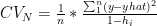
or K choose 1, there will be K such partitions. The K Fold Cross
Validation estimates the average validation error that we can expect on a new unseen test data.

The formula for K Fold Cross validation is as follows

MSE_{K} = \frac{\sum (y-yhat)^{2}}{n_{K}}
and
n_{K} = \frac{N}{K}
and
CV_{K} = \sum_{K=1}^{K} (\frac{n_{K}}{N}) MSE_{K}

where n_{K} is the number of elements in partition ‘K’ and N is the total number of elements
CV_{K} =\sum_{K=1}^{K} MSE_{K}

CV_{K} =\frac{\sum_{K=1}^{K} MSE_{K}}{K}
Leave Out one Cross Validation (LOOCV) is a special case of K Fold Cross Validation where N-1 data points are used to train the model and 1 data point is used to test the model. There are N such paritions of N-1 & 1 that are possible. The mean error is measured The Cross Valifation Error for LOOCV is

CV_{N} = \frac{1}{n} *\frac{\sum_{1}^{n}(y-yhat)^{2}}{1-h_{i}}
where h_{i} is the diagonal hat matrix

see [Statistical Learning]

The above formula is also included in this blog post

It took me a day and a half to implement the K Fold Cross Validation formula. I think it is correct. In any case do let me know if you think it is off

5a. Leave out one cross validation (LOOCV) – R Code

R uses the package ‘boot’ for performing Cross Validation error computation

library(boot)
library(reshape2)
# Read data
df=read.csv("auto_mpg.csv",stringsAsFactors = FALSE) # Data from UCI
df1 <- as.data.frame(sapply(df,as.numeric))
# Select complete cases
df2 <- df1 %>% dplyr::select(cylinder,displacement, horsepower,weight, acceleration, year,mpg)
df3 <- df2[complete.cases(df2),]
set.seed(17)
cv.error=rep(0,10)
# For polynomials 1,2,3... 10 fit a LOOCV model
for (i in 1:10){
    glm.fit=glm(mpg~poly(horsepower,i),data=df3)
    cv.error[i]=cv.glm(df3,glm.fit)$delta[1]
    
}
cv.error
##  [1] 24.23151 19.24821 19.33498 19.42443 19.03321 18.97864 18.83305
##  [8] 18.96115 19.06863 19.49093
# Create and display a plot
folds <- seq(1,10)
df <- data.frame(folds,cvError=cv.error)
ggplot(df,aes(x=folds,y=cvError)) + geom_point() +geom_line(color="blue") +
    xlab("Degree of Polynomial") + ylab("Cross Validation Error") +
    ggtitle("Leave one out Cross Validation - Cross Validation Error vs Degree of Polynomial")

5b. Leave out one cross validation (LOOCV) – Python Code

In Python there is no available function to compute Cross Validation error and we have to compute the above formula. I have done this after several hours. I think it is now in reasonable shape. Do let me know if you think otherwise. For LOOCV I use the K Fold Cross Validation with K=N

import numpy as np
import pandas as pd
import os
import matplotlib.pyplot as plt
from sklearn.linear_model import LinearRegression
from sklearn.cross_validation import train_test_split, KFold
from sklearn.preprocessing import PolynomialFeatures
from sklearn.metrics import mean_squared_error
# Read data
autoDF =pd.read_csv("auto_mpg.csv",encoding="ISO-8859-1")
autoDF.shape
autoDF.columns
autoDF1=autoDF[['mpg','cylinder','displacement','horsepower','weight','acceleration','year']]
autoDF2 = autoDF1.apply(pd.to_numeric, errors='coerce')
# Remove rows with NAs
autoDF3=autoDF2.dropna()
autoDF3.shape
X=autoDF3[['horsepower']]
y=autoDF3['mpg']

# For polynomial degree 1,2,3... 10
def computeCVError(X,y,folds):
    deg=[]
    mse=[]
    degree1=[1,2,3,4,5,6,7,8,9,10]
    
    nK=len(X)/float(folds)
    xval_err=0
    # For degree 'j'
    for j in degree1: 
        # Split as 'folds'
        kf = KFold(len(X),n_folds=folds)
        for train_index, test_index in kf:
            # Create the appropriate train and test partitions from the fold index
            X_train, X_test = X.iloc[train_index], X.iloc[test_index]
            y_train, y_test = y.iloc[train_index], y.iloc[test_index]  

            # For the polynomial degree 'j'
            poly = PolynomialFeatures(degree=j)        
            # Transform the X_train and X_test
            X_train_poly = poly.fit_transform(X_train)
            X_test_poly = poly.fit_transform(X_test)
            # Fit a model on the transformed data
            linreg = LinearRegression().fit(X_train_poly, y_train)
            # Compute yhat or ypred
            y_pred = linreg.predict(X_test_poly)   
            # Compute MSE * n_K/N
            test_mse = mean_squared_error(y_test, y_pred)*float(len(X_train))/float(len(X))     
            # Add the test_mse for this partition of the data
            mse.append(test_mse)
        # Compute the mean of all folds for degree 'j'   
        deg.append(np.mean(mse))
        
    return(deg)


df=pd.DataFrame()
print(len(X))
# Call the function once. For LOOCV K=N. hence len(X) is passed as number of folds
cvError=computeCVError(X,y,len(X))

# Create and plot LOOCV
df=pd.DataFrame(cvError)
fig3=df.plot()
fig3=plt.title("Leave one out Cross Validation - Cross Validation Error vs Degree of Polynomial")
fig3=plt.xlabel("Degree of Polynomial")
fig3=plt.ylabel("Cross validation Error")
fig3.figure.savefig('foo3.png', bbox_inches='tight')


6a K Fold Cross Validation – R code

Here K Fold Cross Validation is done for 4, 5 and 10 folds using the R package boot and the glm package

library(boot)
library(reshape2)
set.seed(17)
#Read data
df=read.csv("auto_mpg.csv",stringsAsFactors = FALSE) # Data from UCI
df1 <- as.data.frame(sapply(df,as.numeric))
df2 <- df1 %>% dplyr::select(cylinder,displacement, horsepower,weight, acceleration, year,mpg)
df3 <- df2[complete.cases(df2),]
a=matrix(rep(0,30),nrow=3,ncol=10)
set.seed(17)
# Set the folds as 4,5 and 10
folds<-c(4,5,10)
for(i in seq_along(folds)){
    cv.error.10=rep(0,10)
    for (j in 1:10){
        # Fit a generalized linear model
        glm.fit=glm(mpg~poly(horsepower,j),data=df3)
        # Compute K Fold Validation error
        a[i,j]=cv.glm(df3,glm.fit,K=folds[i])$delta[1]
        
    }
    
}

# Create and display the K Fold Cross Validation Error
b <- t(a)
df <- data.frame(b)
df1 <- cbind(seq(1,10),df)
names(df1) <- c("PolynomialDegree","4-fold","5-fold","10-fold")

df2 <- melt(df1,id="PolynomialDegree")
ggplot(df2) + geom_line(aes(x=PolynomialDegree, y=value, colour=variable),size=2) +
    xlab("Degree of Polynomial") + ylab("Cross Validation Error") +
    ggtitle("K Fold Cross Validation - Cross Validation Error vs Degree of Polynomial")

6b. K Fold Cross Validation – Python code

The implementation of K-Fold Cross Validation Error has to be implemented and I have done this below. There is a small discrepancy in the shapes of the curves with the R plot above. Not sure why!

import numpy as np
import pandas as pd
import os
import matplotlib.pyplot as plt
from sklearn.linear_model import LinearRegression
from sklearn.cross_validation import train_test_split, KFold
from sklearn.preprocessing import PolynomialFeatures
from sklearn.metrics import mean_squared_error
# Read data
autoDF =pd.read_csv("auto_mpg.csv",encoding="ISO-8859-1")
autoDF.shape
autoDF.columns
autoDF1=autoDF[['mpg','cylinder','displacement','horsepower','weight','acceleration','year']]
autoDF2 = autoDF1.apply(pd.to_numeric, errors='coerce')
# Drop NA rows
autoDF3=autoDF2.dropna()
autoDF3.shape
#X=autoDF3[['cylinder','displacement','horsepower','weight']]
X=autoDF3[['horsepower']]
y=autoDF3['mpg']

# Create Cross Validation function
def computeCVError(X,y,folds):
    deg=[]
    mse=[]
    # For degree 1,2,3,..10
    degree1=[1,2,3,4,5,6,7,8,9,10]
    
    nK=len(X)/float(folds)
    xval_err=0
    for j in degree1: 
        # Split the data into 'folds'
        kf = KFold(len(X),n_folds=folds)
        for train_index, test_index in kf:
            # Partition the data acccording the fold indices generated
            X_train, X_test = X.iloc[train_index], X.iloc[test_index]
            y_train, y_test = y.iloc[train_index], y.iloc[test_index]  

            # Scale the X_train and X_test as per the polynomial degree 'j'
            poly = PolynomialFeatures(degree=j)             
            X_train_poly = poly.fit_transform(X_train)
            X_test_poly = poly.fit_transform(X_test)
            # Fit a polynomial regression
            linreg = LinearRegression().fit(X_train_poly, y_train)
            # Compute yhat or ypred
            y_pred = linreg.predict(X_test_poly)  
            # Compute MSE *(nK/N)
            test_mse = mean_squared_error(y_test, y_pred)*float(len(X_train))/float(len(X))  
            # Append to list for different folds
            mse.append(test_mse)
        # Compute the mean for poylnomial 'j' 
        deg.append(np.mean(mse))
        
    return(deg)

# Create and display a plot of K -Folds
df=pd.DataFrame()
for folds in [4,5,10]:
    cvError=computeCVError(X,y,folds)
    #print(cvError)
    df1=pd.DataFrame(cvError)
    df=pd.concat([df,df1],axis=1)
    #print(cvError)
    
df.columns=['4-fold','5-fold','10-fold']
df=df.reindex([1,2,3,4,5,6,7,8,9,10])
df
fig2=df.plot()
fig2=plt.title("K Fold Cross Validation - Cross Validation Error vs Degree of Polynomial")
fig2=plt.xlabel("Degree of Polynomial")
fig2=plt.ylabel("Cross validation Error")
fig2.figure.savefig('foo2.png', bbox_inches='tight')

output

This concludes this 2nd part of this series. I will look into model tuning and model selection in R and Python in the coming parts. Comments, suggestions and corrections are welcome!
To be continued….
Watch this space!

Also see

  1. Design Principles of Scalable, Distributed Systems
  2. Re-introducing cricketr! : An R package to analyze performances of cricketers
  3. Spicing up a IBM Bluemix cloud app with MongoDB and NodeExpress
  4. Using Linear Programming (LP) for optimizing bowling change or batting lineup in T20 cricket
  5. Simulating an Edge Shape in Android

To see all posts see Index of posts

My travels through the realms of Data Science, Machine Learning, Deep Learning and (AI)

Then felt I like some watcher of the skies 
When a new planet swims into his ken; 
Or like stout Cortez when with eagle eyes 
He star’d at the Pacific—and all his men 
Look’d at each other with a wild surmise— 
Silent, upon a peak in Darien. 
On First Looking into Chapman’s Homer by John Keats

The above excerpt from John Keat’s poem captures the the exhilaration that one experiences, when discovering something for the first time. This also  summarizes to some extent my own as enjoyment while pursuing Data Science, Machine Learning and the like.

I decided to write this post, as occasionally youngsters approach me and ask me where they should start their adventure in Data Science & Machine Learning. There are other times, when the ‘not-so-youngsters’ want to know what their next step should be after having done some courses. This post includes my travels through the domains of Data Science, Machine Learning, Deep Learning and (soon to be done AI).

By no means, am I an authority in this field, which is ever-widening and almost bottomless, yet I would like to share some of my experiences in this fascinating field. I include a short review of the courses I have done below. I also include alternative routes through  courses which I did not do, but are probably equally good as well.  Feel free to pick and choose any course or set of courses. Alternatively, you may prefer to read books or attend bricks-n-mortar classes, In any case,  I hope the list below will provide you with some overall direction.

All my learning in the above domains have come from MOOCs and I restrict myself to the top 3 MOOCs, or in my opinion, ‘the original MOOCs’, namely Coursera, edX or Udacity, but may throw in some courses from other online sites if they are only available there. I would recommend these 3 MOOCs over the other numerous online courses and also over face-to-face classroom courses for the following reasons. These MOOCs

  • Are taken by world class colleges and the lectures are delivered by top class Professors who have a great depth of knowledge and a wealth of experience
  • The Professors, besides delivering quality content, also point out to important tips, tricks and traps
  • You can revisit lectures in online courses anytime to refresh your memory
  • Lectures are usually short between 8 -15 mins (Personally, my attention span is around 15-20 mins at a time!)

Here is a fair warning and something quite obvious. No amount of courses, lectures or books will help if you don’t put it to use through some language like Octave, R or Python.

The journey
My trip through Data Science, Machine Learning  started with an off-chance remark,about 3 years ago,  from an old friend of mine who spoke to me about having done a few  courses at Coursera, and really liked it.  He further suggested that I should try. This was the final push which set me sailing into this vast domain.

I have included the list of the courses I have done over the past 5 years (37+ certifications completed and another 9 audited-listened only without doing the assignments). For each of the courses I have included a short review of the course, whether I think the course is mandatory, the language in which the course is based on, and finally whether I have done the course myself etc. I have also included alternative courses, which I may have not done, but which I think are equally good. Finally, I suggest some courses which I have heard of and which are very good and worth taking.

1. Machine Learning, Stanford, Prof Andrew Ng, Coursera
(Requirement: Mandatory, Language:Octave,Status:Completed)
This course provides an excellent foundation to build your Machine Learning citadel on. The course covers the mathematical details of linear, logistic and multivariate regression. There is also a good coverage of topics like Neural Networks, SVMs, Anamoly Detection, underfitting, overfitting, regularization etc. Prof Andrew Ng presents the material in a very lucid manner. It is a great course to start with. It would be a good idea to brush up  some basics of linear algebra, matrices and a little bit of calculus, specifically computing the local maxima/minima. You should be able to take this course even if you don’t know Octave as the Prof goes over the key aspects of the language.

2. Statistical Learning, Prof Trevor Hastie & Prof Robert Tibesherani, Online Stanford– (Requirement:Mandatory, Language:R, Status;Completed) –
The course includes linear and polynomial regression, logistic regression. Details also include cross-validation and the bootstrap methods, how to do model selection and regularization (ridge and lasso). It also touches on non-linear models, generalized additive models, boosting and SVMs. Some unsupervised learning methods are  also discussed. The 2 Professors take turns in delivering lectures with a slight touch of humor.

3a. Data Science Specialization: Prof Roger Peng, Prof Brian Caffo & Prof Jeff Leek, John Hopkins University (Requirement: Option A, Language: R Status: Completed)
This is a comprehensive 10 module specialization based on R. This Specialization gives a very broad overview of Data Science and Machine Learning. The modules cover R programming, Statistical Inference, Practical Machine Learning, how to build R products and R packages and finally has a very good Capstone project on NLP

3b. Applied Data Science with Python Specialization: University of Michigan (Requirement: Option B, Language: Python, Status: Not done)
In this specialization I only did  the Applied Machine Learning in Python (Prof Kevyn-Collin Thomson). This is a very good course that covers a lot of Machine Learning algorithms(linear, logistic, ridge, lasso regression, knn, SVMs etc. Also included are confusion matrices, ROC curves etc. This is based on Python’s Scikit Learn

3c. Machine Learning Specialization, University Of Washington (Requirement:Option C, Language:Python, Status : Not completed). This appears to be a very good Specialization in Python

4. Statistics with R Specialization, Duke University (Requirement: Useful and a must know, Language R, Status:Not Completed)
I audited (listened only) to the following 2 modules from this Specialization.
a.Inferential Statistics
b.Linear Regression and Modeling
Both these courses are taught by Prof Mine Cetikya-Rundel who delivers her lessons with extraordinary clarity.  Her lectures are filled with many examples which she walks you through in great detail

5.Bayesian Statistics: From Concept to Data Analysis: Univ of California, Santa Cruz (Requirement: Optional, Language : R, Status:Completed)
This is an interesting course and provides an alternative point of view to frequentist approach

6. Data Science and Engineering with Spark, University of California, Berkeley, Prof Antony Joseph, Prof Ameet Talwalkar, Prof Jon Bates
(Required: Mandatory for Big Data, Status:Completed, Language; pySpark)
This specialization contains 3 modules
a.Introduction to Apache Spark
b.Distributed Machine Learning with Apache Spark
c.Big Data Analysis with Apache Spark

This is an excellent course for those who want to make an entry into Distributed Machine Learning. The exercises are fairly challenging and your code will predominantly be made of map/reduce and lambda operations as you process data that is distributed across Spark RDDs. I really liked  the part where the Prof shows how a matrix multiplication on a single machine is of the order of O(nd^2+d^3) (which is the basis of Machine Learning) is reduced to O(nd^2) by taking outer products on data which is distributed.

7. Deep Learning Prof Andrew Ng, Younes Bensouda Mourri, Kian Katanforoosh : Requirement:Mandatory,Language:Python, Tensorflow Status:Completed)

This course had 5 Modules which start from the fundamentals of Neural Networks, their derivation and vectorized Python implementation. The specialization also covers regularization, optimization techniques, mini batch normalization, Convolutional Neural Networks, Recurrent Neural Networks, LSTMs applied to a wide variety of real world problems

The modules are
a. Neural Networks and Deep Learning
In this course Prof Andrew Ng explains differential calculus, linear algebra and vectorized Python implementations of Deep Learning algorithms. The derivation for back-propagation is done and then the Prof shows how to compute a multi-layered DL network
b.Improving Deep Neural Networks: Hyperparameter tuning, Regularization and Optimization
Deep Neural Networks can be very flexible, and come with a lots of knobs (hyper-parameters) to tune with. In this module, Prof Andrew Ng shows a systematic way to tune hyperparameters and by how much should one tune. The course also covers regularization(L1,L2,dropout), gradient descent optimization and batch normalization methods. The visualizations used to explain the momentum method, RMSprop, Adam,LR decay and batch normalization are really powerful and serve to clarify the concepts. As an added bonus,the module also includes a great introduction to Tensorflow.
c.Structuring Machine Learning Projects
A very good module with useful tips, tricks and traps that need to be considered while working on Machine Learning and Deep Learning projects
d. Convolutional Neural Networks
This domain has a lot of really cool ideas, where images represented as 3D volumes, are compressed and stretched longitudinally before applying a multi-layered deep learning neural network to this thin slice for performing classification,detection etc. The Prof provides a glimpse into this fascinating world of image classification, detection andl neural art transfer with frameworks like Keras and Tensorflow.
e. Sequence Models
In this module covers in good detail concepts like RNNs, GRUs, LSTMs, word embeddings, beam search and attention model.

8. Neural Networks for Machine Learning, Prof Geoffrey Hinton,University of Toronto
(Requirement: Mandatory, Language;Octave, Status:Completed)
This is a broad course which starts from the basic of Perceptrons, all the way to Boltzman Machines, RNNs, CNNS, LSTMs etc The course also covers regularisation, learning rate decay, momentum method etc

9.Probabilistic Graphical Models, Stanford  Prof Daphne Koller(Language:Octave, Status: Partially completed)
This has 3 courses
a.Probabilistic Graphical Models 1: Representation – Done
b.Probabilistic Graphical Models 2: Inference – To do
c.Probabilistic Graphical Models 3: Learning – To do
This course discusses how a system, which can be represented as a complex interaction
of probability distributions, will behave. This is probably the toughest course I did.  I did manage to get through the 1st module, While I felt that grasped a few things, I did not wholly understand the import of this. However I feel this is an important domain and I will definitely revisit this in future

10. Reinforcement Specialization : University of Alberta, Prof Adam White and Prof Martha White
(Requirement: Very important, Language;Python, Status: Partially Completed)
This is a set of 4 courses. I did the first 2 of the 4. Reinforcement Learning appears deceptively simple, but it is anything but simple. Definitely a very critical area to learn.

a.Fundamentals of Reinforcement Learning: This course discusses Markov models, value functions and Bellman equations and dynamic programming.
b.Sample based learning Learning methods: This course touches on Monte Carlo methods, Temporal Difference methods, Q Learning etc.

Reinforcement Learning is a must-have in your AI arsenal.

11. Tensorflow in Practice Specialization – Prof Laurence Moroney – Deep Learning.AI
(Requirement: Important, Language;Python, Status: Completed)
This is a good course but definitely do the Deep Learning Specialization by Prof Andrew Ng
There are 4 courses in this Specialization. I completed all 4 courses. They are fairly straight forward
a. Introduction to TensorFlow – This course introduces you to Tensorflow, image recognition with brute-force method
b. Convolutional Neural Networks in Tensorflow – This course touches on how to build a CNN, image augmentation, transfer learning and multi-class classification
c. Natural Language Processing in Tensorflow – Word embeddings, sentiment analysis, LSTMs, RNNs are discussed.
d. Sequences, time series and prediction – This course discusses using RNNs for time series, auto correlation

12. Natural Language Processing  Specialization – Prof Younes Bensouda, Lukasz Kaiser from DeepLearning.AI
(Requirement: Very Important, Language;Python, Status: Partially Completed)
This is the latest specialization from Deep Learning.AI. I have completed the first 2 courses
a.Natural Language Processing with Classification and Vector Spaces -The first course deals with sentiment analysis with Naive Bayes, vector space models, capturing dependencies using PCA etc
b. Natural Language Processing with Probabilistic Models – In this course techniques for auto correction, Markov models and Viterbi algorithm for Parts of Speech tagging, auto completion and word embedding are discussed.

13. Mining Massive Data Sets Prof Jure Leskovec, Prof Anand Rajaraman and ProfJeff Ullman. Online Stanford, Status Partially done.,
I did quickly audit this course, a year back, when it used to be in Coursera. It now seems to have moved to Stanford online. But this is a very good course that discusses key concepts of Mining Big Data of the order a few Petabytes

14. Introduction to Artificial Intelligence, Prof Sebastian Thrun & Prof Peter Norvig, Udacity
This is a really good course. I have started on this course a couple of times and somehow gave up. Will revisit to complete in future. Quite extensive in its coverage.Touches BFS,DFS, A-Star, PGM, Machine Learning etc.

15.Deep Learning (with TensorFlow), Vincent Vanhoucke, Principal Scientist at Google Brain.
Got started on this one and abandoned some time back. In my to do list though

My learning journey is based on Lao Tzu’s dictum of ‘A good traveler has no fixed plans and is not intent on arriving’. You could have a goal and try to plan your courses accordingly.
And so my journey continues…

I hope you find this list useful.
Have a great journey ahead!!!

IBM Data Science Experience:  First steps with yorkr

Fresh, and slightly dizzy, from my foray into Quantum Computing with IBM’s Quantum Experience, I now turn my attention to IBM’s Data Science Experience (DSE).

I am on the verge of completing a really great 3 module ‘Data Science and Engineering with Spark XSeries’ from the University of California, Berkeley and I have been thinking of trying out some form of integrated delivery platform for performing analytics, for quite some time.  Coincidentally,  IBM comes out with its Data Science Experience. a month back. There are a couple of other collaborative platforms available for playing around with Apache Spark or Data Analytics namely Jupyter notebooks, Databricks, Data.world.

I decided to go ahead with IBM’s Data Science Experience as  the GUI is a lot cooler, includes shared data sets and integrates with Object Storage, Cloudant DB etc,  which seemed a lot closer to the cloud, literally!  IBM’s DSE is an interactive, collaborative, cloud-based environment for performing data analysis with Apache Spark. DSE is hosted on IBM’s PaaS environment, Bluemix. It should be possible to access in DSE the plethora of cloud services available on Bluemix. IBM’s DSE uses Jupyter notebooks for creating and analyzing data which can be easily shared and has access to a few hundred publicly available datasets

Disclaimer: This article represents the author’s viewpoint only and doesn’t necessarily represent IBM’s positions, strategies or opinions

In this post, I use IBM’s DSE and my R package yorkr, for analyzing the performance of 1 ODI match (Aus-Ind, 2 Feb 2012)  and the batting performance of Virat Kohli in IPL matches. These are my ‘first’ steps in DSE so, I use plain old “R language” for analysis together with my R package ‘yorkr’. I intend to  do more interesting stuff on Machine learning with SparkR, Sparklyr and PySpark in the weeks and months to come.

You can checkout the Jupyter notebooks created with IBM’s DSE Y at Github  – “Using R package yorkr – A quick overview’ and  on NBviewer at “Using R package yorkr – A quick overview

Working with Jupyter notebooks are fairly straight forward which can handle code in R, Python and Scala. Each cell can either contain code (Python or Scala), Markdown text, NBConvert or Heading. The code is written into the cells and can be executed sequentially. Here is a screen shot of the notebook.

Untitled

The ‘File’ menu can be used for ‘saving and checkpointing’ or ‘reverting’ to a checkpoint. The ‘kernel’ menu can be used to start, interrupt, restart and run all cells etc. Data Sources icon can be used to load data sources to your code. The data is uploaded to Object Storage with appropriate credentials. You will have to  import this data from Object Storage using the credentials. In my notebook with yorkr I directly load the data from Github.  You can use the sharing to share the notebook. The shared notebook has an extension ‘ipynb’. You can use the ‘Sharing’ icon  to share the notebook. The shared notebook has an extension ‘ipynb’. You an import this notebook directly into your environment and can get started with the code available in the notebook.

You can import existing R, Python or Scala notebooks as shown below. My notebook ‘Using R package yorkr – A quick overview’ can be downloaded using the link ‘yorkrWithDSE’ and clicking the green download icon on top right corner.

Untitled2

I have also uploaded the file to Github and you can download from here too ‘yorkrWithDSE’. This notebook can be imported into your DSE as shown below

Untitled1

Jupyter notebooks have been integrated with Github and are rendered directly from Github.  You can view my Jupyter notebook here  – “Using R package yorkr – A quick overview’. You can also view it on NBviewer at “Using R package yorkr – A quick overview

So there it is. You can download my notebook, import it into IBM’s Data Science Experience and then use data from ‘yorkrData” as shown. As already mentioned yorkrData contains converted data for ODIs, T20 and IPL. For details on how to use my R package yorkr  please my posts on yorkr at “Index of posts

Hope you have fun playing wit IBM’s Data Science Experience and my package yorkr.

I will be exploring IBM’s DSE in weeks and months to come in the areas of Machine Learning with SparkR,SparklyR or pySpark.

Watch this space!!!

Disclaimer: This article represents the author’s viewpoint only and doesn’t necessarily represent IBM’s positions, strategies or opinions

Also see

1. Introducing QCSimulator: A 5-qubit quantum computing simulator in R
2. Natural Processing Language : What would Shakespeare say?
3. Introducing cricket package yorkr:Part 1- Beaten by sheer pace!
4. A closer look at “Robot horse on a Trot! in Android”
5.  Re-introducing cricketr! : An R package to analyze performances of cricketers
6.   What’s up Watson? Using IBM Watson’s QAAPI with Bluemix, NodeExpress – Part 1
7.  Deblurring with OpenCV: Wiener filter reloaded

To see all my posts check
Index of posts

cricketr adapts to the Twenty20 International!

Introduction

This should be last in the series of posts based on my R package cricketr. That is, unless some bright idea comes trotting along and light bulbs go on around my head.

In this post cricketr adapts to the Twenty20 International format. Now cricketr can handle stats from all 3 formats of the game namely Test matches, ODIs and Twenty20 International from ESPN Cricinfo. You should be able to install the package from GitHub and use the many of the functions available in the package.

Please be mindful of the ESPN Cricinfo Terms of Use

Unititled2

If you are passionate about cricket, and love analyzing cricket performances, then check out my racy book on cricket ‘Cricket analytics with cricketr and cricpy – Analytics harmony with R & Python’! This book discusses and shows how to use my R package ‘cricketr’ and my Python package ‘cricpy’ to analyze batsmen and bowlers in all formats of the game (Test, ODI and T20). The paperback is available on Amazon at $21.99 and  the kindle version at $9.99/Rs 449/-. A must read for any cricket lover! Check it out!!

Untitled


Important note 1: The latest release of ‘cricketr’ now includes the ability to analyze performances of teams now!!  See Cricketr adds team analytics to its repertoire!!!

Important note 2 : Cricketr can now do a more fine-grained analysis of players, see Cricketr learns new tricks : Performs fine-grained analysis of players

Important note 3: Do check out the python avatar of cricketr, ‘cricpy’ in my post ‘Introducing cricpy:A python package to analyze performances of cricketers

You can also read this post at Rpubs as twenty20-cricketr. Download this report as a PDF file from twenty20-cricketr.pdf

Do check out my interactive Shiny app implementation using the cricketr package – Sixer – R package cricketr’s new Shiny avatar

Note: If you would like to do a similar analysis for a different set of batsman and bowlers, you can clone/download my skeleton cricketr template from Github (which is the R Markdown file I have used for the analysis below). You will only need to make appropriate changes for the players you are interested in. Just a familiarity with R and R Markdown only is needed.

Important note: Do check out my other posts using cricketr at cricketr-posts

I have chosen the Top 4 batsmen and top 4 bowlers based on ICC rankings and/or number of matches played.

Batsmen

  1. Virat Kohli (Ind)
  2. Faf du Plessis (SA)
  3. A J Finch (Aus)
  4. Brendon McCullum (Aus)

Bowlers

  1. Samuel Badree (WI)
  2. Sunil Narine (WI)
  3. Ravichander Ashwin (Ind)
  4. Ajantha Mendis (SL)

I have explained the plots and added my own observations. Please feel free to draw your conclusions!

The data for a particular player can be obtained with the getPlayerData() function. To do you will need to go to ESPN CricInfo Player and type in the name of the player for e.g Virat Kohli, Sunil Narine etc. This will bring up a page which have the profile number for the player e.g. for Virat Kohli this would be http://www.espncricinfo.com/india/content/player/253802.html.

The package can be installed directly from CRAN

if (!require("cricketr")){ 
    install.packages("cricketr",lib = "c:/test") 
} 
library(cricketr)

or from Github

library(devtools)
install_github("tvganesh/cricketr")
library(cricketr)

The data for a particular player can be obtained with the getPlayerData() function. To do you will need to go to ESPN CricInfo Player and type in the name of the player for e.g Virat Kohli, Sunil Narine etc. This will bring up a page which have the profile number for the player e.g. for Virat Kohli this would be http://www.espncricinfo.com/india/content/player/253802.html. Hence, Kohlis profile is 253802. This can be used to get the data for Virat Kohli as shown below

kohli <- getPlayerDataTT(253802,dir="..",file="kohli.csv",type="batting")

The analysis is included below

Analyses of Batsmen

The following plots gives the analysis of the 4 ODI batsmen

  1. Virat Kohli (Ind) – Innings-26, Runs-972, Average-46.28,Strike Rate-131.70
  2. Faf du Plessis (SA) – Innings-24, Runs-805, Average-42.36,Strike Rate-135.75
  3. A J Finch (Aus) – Innings-22, Runs-756, Average-39.78,Strike Rate-152.41
  4. Brendon McCullum (NZ) – Innings-70, Runs-2140, Average-35.66,Strike Rate-136.21

Plot of 4s, 6s and the scoring rate in ODIs

The 3 charts below give the number of

  1. 4s vs Runs scored
  2. 6s vs Runs scored
  3. Balls faced vs Runs scored A regression line is fitted in each of these plots for each of the ODI batsmen

A. Virat Kohli
– The 1st plot shows that Kohli approximately hits about 5 4’s on his way to the 50s
– The 2nd box plot of no of 6s and runs shows the range of runs when Kohli scored 1,2 or 4 6s. The dark line in the box shows the average runs when he scored those number of 6s. So when he scored 1 6 the average runs he scored was 45
– The 3rd plot shows the number of runs scored against the balls faced. It can be seen when Kohli faced 50 balls he had scored around ~ 70 runs

par(mfrow=c(1,3))
par(mar=c(4,4,2,2))
batsman4s("./kohli.csv","Kohli")
batsman6s("./kohli.csv","Kohli")
batsmanScoringRateODTT("./kohli.csv","Kohli")

kohli-4s6sSR-1

dev.off()
## null device 
##           1

B. Faf du Plessis

par(mfrow=c(1,3))
par(mar=c(4,4,2,2))
batsman4s("./plessis.csv","Du Plessis")
batsman6s("./plessis.csv","Du Plessis")
batsmanScoringRateODTT("./plessis.csv","Du Plessss")

plessis-4s6SR-1

dev.off()
## null device 
##           1

C. A J Finch

par(mfrow=c(1,3))
par(mar=c(4,4,2,2))
batsman4s("./finch.csv","A J Finch")
batsman6s("./finch.csv","A J Finch")
batsmanScoringRateODTT("./finch.csv","A J Finch")

finch-4s6sSR-1

dev.off()
## null device 
##           1

D. Brendon McCullum

par(mfrow=c(1,3))
par(mar=c(4,4,2,2))
batsman4s("./mccullum.csv","McCullum")
batsman6s("./mccullum.csv","McCullum")
batsmanScoringRateODTT("./mccullum.csv","McCullum")

mccullum-4s6sout-1

dev.off()
## null device 
##           1

Relative Mean Strike Rate

This plot shows the Mean Strike Rate of the batsman in each run range. It can be seen the A J Finch has the best strike rate followed by B McCullum.

par(mar=c(4,4,2,2))
frames <- list("./kohli.csv","./plessis.csv","finch.csv","mccullum.csv")
names <- list("Kohli","Du Plessis","Finch","McCullum")
relativeBatsmanSRODTT(frames,names)

plot-1-1

Relative Runs Frequency Percentage

The plot below provides the average runs scored in each run range 0-5,5-10,10-15 etc. Clearly Kohli has the most runs scored in most of the runs ranges. . This is also evident in the fact that Kohli has the highest average. He is followed by McCullum

frames <- list("./kohli.csv","./plessis.csv","finch.csv","mccullum.csv")
names <- list("Kohli","Du Plessis","Finch","McCullum")
relativeRunsFreqPerfODTT(frames,names)

plot-2-1

Percent 4’s,6’s in total runs scored

The plot below shows the percentage of runs scored by way of 4s and 6s for each batsman. Du Plessis has the highest percentage of 4s, McCullum has the highest 6s. Finch has the highest percentage of 4s & 6s – 25.37 + 15.64= 41.01%

rames <- list("./kohli.csv","./plessis.csv","finch.csv","mccullum.csv")
names <- list("Kohli","Du Plessis","Finch","McCullum")
runs4s6s <-batsman4s6s(frames,names)

plot-46s-1

print(runs4s6s)
##                Kohli Du Plessis Finch McCullum
## Runs(1s,2s,3s) 64.29      64.55 58.99    61.45
## 4s             27.78      24.38 25.37    22.87
## 6s              7.94      11.07 15.64    15.69

3D plot of Runs vs Balls Faced and Minutes at Crease

The plot is a scatter plot of Runs vs Balls faced and Minutes at Crease. A prediction plane is then fitted based on the Balls Faced and Minutes at Crease to give the runs scored

par(mfrow=c(1,2))
par(mar=c(4,4,2,2))
battingPerf3d("./kohli.csv","Kohli")
battingPerf3d("./plessis.csv","Du Plessis")

plot-3-1

dev.off()
## null device 
##           1
par(mfrow=c(1,2))
par(mar=c(4,4,2,2))
battingPerf3d("./finch.csv","A J Finch")
battingPerf3d("./mccullum.csv","McCullum")

plot-4-1

dev.off()
## null device 
##           1

Predicting Runs given Balls Faced and Minutes at Crease

A hypothetical Balls faced and Minutes at Crease is used to predict the runs scored by each batsman based on the computed prediction plane

BF <- seq( 5, 70,length=10)
Mins <- seq(5,70,length=10)
newDF <- data.frame(BF,Mins)

kohli <- batsmanRunsPredict("./kohli.csv","Kohli",newdataframe=newDF)
plessis <- batsmanRunsPredict("./plessis.csv","Du Plessis",newdataframe=newDF)
finch <- batsmanRunsPredict("./finch.csv","A J Finch",newdataframe=newDF)
mccullum <- batsmanRunsPredict("./mccullum.csv","McCullum",newdataframe=newDF)

The predicted runs is displayed. As can be seen Finch has the best overall strike rate followed by McCullum.

batsmen <-cbind(round(kohli$Runs),round(plessis$Runs),round(finch$Runs),round(mccullum$Runs))
colnames(batsmen) <- c("Kohli","Du Plessis","Finch","McCullum")
newDF <- data.frame(round(newDF$BF),round(newDF$Mins))
colnames(newDF) <- c("BallsFaced","MinsAtCrease")
predictedRuns <- cbind(newDF,batsmen)
predictedRuns
##    BallsFaced MinsAtCrease Kohli Du Plessis Finch McCullum
## 1           5            5     2          1     5        3
## 2          12           12    12         10    22       16
## 3          19           19    22         19    40       28
## 4          27           27    31         28    57       41
## 5          34           34    41         37    74       54
## 6          41           41    51         47    91       66
## 7          48           48    60         56   108       79
## 8          56           56    70         65   125       91
## 9          63           63    79         74   142      104
## 10         70           70    89         84   159      117

Highest runs likelihood

The plots below the runs likelihood of batsman. This uses K-Means Kohli has the highest likelihood of scoring runs 34.2% likely to score 66 runs. Du Plessis has 25% likelihood to score 53 runs, A. Virat Kohli

batsmanRunsLikelihood("./kohli.csv","Kohli")

kohli-lh-1

## Summary of  Kohli 's runs scoring likelihood
## **************************************************
## 
## There is a 23.08 % likelihood that Kohli  will make  10 Runs in  10 balls over 13  Minutes 
## There is a 42.31 % likelihood that Kohli  will make  29 Runs in  23 balls over  30  Minutes 
## There is a 34.62 % likelihood that Kohli  will make  66 Runs in  47 balls over 63  Minutes

B. Faf Du Plessis

batsmanRunsLikelihood("./plessis.csv","Du Plessis")

plessis-l-1

## Summary of  Du Plessis 's runs scoring likelihood
## **************************************************
## 
## There is a 62.5 % likelihood that Du Plessis  will make  14 Runs in  11 balls over 19  Minutes 
## There is a 25 % likelihood that Du Plessis  will make  53 Runs in  40 balls over  50  Minutes 
## There is a 12.5 % likelihood that Du Plessis  will make  94 Runs in  61 balls over 90  Minutes

C. A J Finch

batsmanRunsLikelihood("./finch.csv","A J Finch")

finch-lh,cache-TRUE-1

## Summary of  A J Finch 's runs scoring likelihood
## **************************************************
## 
## There is a 20 % likelihood that A J Finch  will make  95 Runs in  54 balls over 70  Minutes 
## There is a 25 % likelihood that A J Finch  will make  42 Runs in  27 balls over  35  Minutes 
## There is a 55 % likelihood that A J Finch  will make  8 Runs in  8 balls over 12  Minutes

D. Brendon McCullum

batsmanRunsLikelihood("./mccullum.csv","McCullum")

mccullum-1

## Summary of  McCullum 's runs scoring likelihood
## **************************************************
## 
## There is a 50.72 % likelihood that McCullum  will make  11 Runs in  10 balls over 13  Minutes 
## There is a 28.99 % likelihood that McCullum  will make  36 Runs in  27 balls over  37  Minutes 
## There is a 20.29 % likelihood that McCullum  will make  74 Runs in  48 balls over 70  Minutes

Moving Average of runs over career

The moving average for the 4 batsmen indicate the following. It must be noted that there is not sufficient data yet on Twenty20 Internationals. Kpohli, Du Plessis and Finch average only 26 innings while McCullum has close to 70. So the moving average while an indication will regress towards the mean over time.

  1. The moving average of Kohli and Du Plessis is on the way up.
  2. McCullum has a consistent performance while Finch had a brief burst in 2013-2014
par(mfrow=c(2,2))
par(mar=c(4,4,2,2))
batsmanMovingAverage("./kohli.csv","Kohli")
batsmanMovingAverage("./plessis.csv","Du Plessis")
batsmanMovingAverage("./finch.csv","A J Finch")
batsmanMovingAverage("./mccullum.csv","McCullum")

sdgm-ma-1

dev.off()
## null device 
##           1

Analysis of bowlers

  1. Samuel Badree (WI) – Innings-22, Runs -464, Wickets – 31, Econ Rate : 5.39
  2. Sunil Narine (WI)- Innings-31,Runs-666, Wickets – 38 , Econ Rate : 5.70
  3. Ravichander Ashwin (Ind)- Innings-26, Runs- 732, Wickets – 25, Econ Rate : 7.32
  4. Ajantha Mendis (SL)- Innings-39, Runs – 952,Wickets – 66, Econ Rate : 6.45

The plot shows the frequency with which the bowlers have taken 1,2,3 etc wickets. The most wickets taken is by Ajantha Mendis (6 wickets)

Wicket Frequency percentage

This plot gives the percentage of wickets for each wickets (1,2,3…etc)

par(mfrow=c(1,4))
par(mar=c(4,4,2,2))
bowlerWktsFreqPercent("./badree.csv","Badree")
bowlerWktsFreqPercent("./mendis.csv","Mendis")
bowlerWktsFreqPercent("./narine.csv","Narine")
bowlerWktsFreqPercent("./ashwin.csv","Ashwin")

relBowlFP-1

dev.off()
## null device 
##           1

Wickets Runs plot

The plot below gives a boxplot of the runs ranges for each of the wickets taken by the bowlers. The ends of the box indicate the 25% and 75% percentile of runs scored for the wickets taken and the dark balck line is the average runs conceded.

par(mfrow=c(1,4))
par(mar=c(4,4,2,2))
bowlerWktsRunsPlot("./badree.csv","Badree")
bowlerWktsRunsPlot("./mendis.csv","Mendis")
bowlerWktsRunsPlot("./narine.csv","Narine")
bowlerWktsRunsPlot("./ashwin.csv","Ashwin")

wktsrun-1

dev.off()
## null device 
##           1

This plot below shows the average number of deliveries needed by the bowler to take the wickets (1,2,3 etc)

par(mfrow=c(1,2))
par(mar=c(4,4,2,2))
bowlerWktRateTT("./badree.csv","Badree")
bowlerWktRateTT("./mendis.csv","Mendis")

wktsrate1-1

dev.off()
## null device 
##           1
par(mfrow=c(1,2))
par(mar=c(4,4,2,2))
bowlerWktRateTT("./narine.csv","Narine")
bowlerWktRateTT("./ashwin.csv","Ashwin")

wktsrate2-1

dev.off()
## null device 
##           1

Relative bowling performance

The plot below shows that Narine has the most wickets in the 2 -4 range followed by Mendis

frames <- list("./badree.csv","./mendis.csv","narine.csv","ashwin.csv")
names <- list("Badree","Mendis","Narine","Ashwin")
relativeBowlingPerf(frames,names)

relBowlPerf-1

Relative Economy Rate against wickets taken

The economy rate can be deduced as follows from the plot below. Narine has a good economy rate around 1 & 4 wickets, Ashwin around 2 wickets and Badree around 3. wickets

frames <- list("./badree.csv","./mendis.csv","narine.csv","ashwin.csv")
names <- list("Badree","Mendis","Narine","Ashwin")
relativeBowlingERODTT(frames,names)

relBowlER-1

Relative Wicket Rate

The relative wicket rate plots the mean number of deliveries needed to take the wickets namely (1,2,3,4). For e.g. Narine needed an average of 22 deliveries to take 1 wicket and 22.5,23.2, 24 deliveries to take 2,3 & 4 wickets respectively

frames <- list("./badree.csv","./mendis.csv","narine.csv","ashwin.csv")
names <- list("Badree","Mendis","Narine","Ashwin")
relativeWktRateTT(frames,names)

relBowlWktRate-1

Moving average of wickets over career

par(mfrow=c(2,2))
par(mar=c(4,4,2,2))
bowlerMovingAverage("./badree.csv","Badree")
bowlerMovingAverage("./mendis.csv","Mendis")
bowlerMovingAverage("./narine.csv","Narine")
bowlerMovingAverage("./ashwin.csv","Ashwin")
## null device 
##           1

jsba-bowlma-1

Key findings

Here are some key conclusions

Twenty 20 batsmen

  1. Kohli has the a very consistent performance scoring high runs in the different run ranges. Kohli also has a 34.2% likelihood to score 6 runs. He is followed by McCullum for consisten performance
  2. Finch has a best strike rate followed by McCullum.
  3. Du Plessis has the highest percentage of 4s and McCullum has the percentage of 6s. Finch is superior in the percentage of runs scored in 4s and 6s
  4. For a hypothetical balls faced and minutes at crease, Finch does best followed by McCullum
  5. Kohli’s & Du Plessis Twenty20 career is on a upswing. Can they maintain the momentum. McCullum is consistent

Twenty20 bowlers

  1. Narine has the highest wickets percentage for different wickets taken followed by Mendis
  2. Mendis has taken 1,2,3,4,6 wickets in 24 deliveries
  3. Narine has the lowest economy rate for 1 & 4 wickets, Ashwin for 2 wickets and Badree for 3 wickets. Mendis is comparatively expensive
  4. Narine needed the least deliveries to get 1 (22.5) & 2 (23.2) wickets, Mendis needed 20.5 deliveries and Ashwin 19 deliveries for 4 wickets

Key takeaways 1. If all the above batsment and bowlers were in the same team we expect

  1. Finch would be most useful when the run rate has to be greatly accelerated followed by McCullum
  2. If the need is to consolidate, then Kohli is the best man for the job followed by McCullum
  3. Overall McCullum is the best bet for Twenty20
  4. When it comes to bowling Narine wins hands down as he has the most wickets, a good economy rate and a very good attack rate. So Narine is great bet for providing a vital breakthrough.

Also see my other posts in R

  1. Introducing cricketr! : An R package to analyze performances of cricketers
  2. cricketr plays the ODIs!
  3. A peek into literacy in India: Statistical Learning with R
  4. A crime map of India in R – Crimes against women
  5. Analyzing cricket’s batting legends – Through the mirage with R
  6. Mirror, mirror . the best batsman of them all?

You may also like

  1. A closer look at “Robot Horse on a Trot” in Android
  2. What’s up Watson? Using IBM Watson’s QAAPI with Bluemix, NodeExpress – Part 1
  3. Bend it like Bluemix, MongoDB with autoscaling – Part 2
  4. Informed choices through Machine Learning : Analyzing Kohli, Tendulkar and Dravid
  5. TWS-4: Gossip protocol: Epidemics and rumors to the rescue
  6. Deblurring with OpenCV:Weiner filter reloaded
  7. Architecting a cloud based IP Multimedia System (IMS)

Taking cricketr for a spin – Part 1

“Curiouser and curiouser!” cried Alice
“The time has come,” the walrus said, “to talk of many things: Of shoes and ships – and sealing wax – of cabbages and kings”
“Begin at the beginning,”the King said, very gravely,“and go on till you come to the end: then stop.”
“And what is the use of a book,” thought Alice, “without pictures or conversation?”

            Excerpts from Alice in Wonderland by Lewis Carroll

Introduction

This post is a continuation of my previous post “Introducing cricketr! A R package to analyze the performances of cricketers.” In this post I take my package cricketr for a spin. For this analysis I focus on the Indian batting legends

– Sachin Tendulkar (Master Blaster)
– Rahul Dravid (The Will)
– Sourav Ganguly ( The Dada Prince)
– Sunil Gavaskar (Little Master)

This post is also hosted on RPubs – cricketr-1

If you are passionate about cricket, and love analyzing cricket performances, then check out my 2 racy books on cricket! In my books, I perform detailed yet compact analysis of performances of both batsmen, bowlers besides evaluating team & match performances in Tests , ODIs, T20s & IPL. You can buy my books on cricket from Amazon at $12.99 for the paperback and $4.99/$6.99 respectively for the kindle versions. The books can be accessed at Cricket analytics with cricketr  and Beaten by sheer pace-Cricket analytics with yorkr  A must read for any cricket lover! Check it out!!

1

d $4.99/Rs 320 and $6.99/Rs448 respectively

Important note 1: The latest release of ‘cricketr’ now includes the ability to analyze performances of teams now!!  See Cricketr adds team analytics to its repertoire!!!

Important note 2 : Cricketr can now do a more fine-grained analysis of players, see Cricketr learns new tricks : Performs fine-grained analysis of players

Important note 3: Do check out the python avatar of cricketr, ‘cricpy’ in my post ‘Introducing cricpy:A python package to analyze performances of cricketers

(Do check out my interactive Shiny app implementation using the cricketr package – Sixer – R package cricketr’s new Shiny avatar)

Note: If you would like to do a similar analysis for a different set of batsman and bowlers, you can clone/download my skeleton cricketr template from Github (which is the R Markdown file I have used for the analysis below). You will only need to make appropriate changes for the players you are interested in. Just a familiarity with R and R Markdown only is needed.

The package can be installed directly from CRAN

if (!require("cricketr")){ 
    install.packages("cricketr",lib = "c:/test") 
} 
library(cricketr)

or from Github

library(devtools)
install_github("tvganesh/cricketr")
library(cricketr)

Box Histogram Plot

This plot shows a combined boxplot of the Runs ranges and a histogram of the Runs Frequency The plot below indicate the Tendulkar’s average is the highest. He is followed by Dravid, Gavaskar and then Ganguly

batsmanPerfBoxHist("./tendulkar.csv","Sachin Tendulkar")
tkps-boxhist-1
batsmanPerfBoxHist("./dravid.csv","Rahul Dravid")
tkps-boxhist-2
batsmanPerfBoxHist("./ganguly.csv","Sourav Ganguly")
tkps-boxhist-3
batsmanPerfBoxHist("./gavaskar.csv","Sunil Gavaskar")
tkps-boxhist-4

Relative Mean Strike Rate

In this first plot I plot the Mean Strike Rate of the batsmen. Tendulkar leads in the Mean Strike Rate for each runs in the range 100- 180. Ganguly has a very good Mean Strike Rate for runs range 40 -80

frames <- list("./tendulkar.csv","./dravid.csv","ganguly.csv","gavaskar.csv")
names <- list("Tendulkar","Dravid","Ganguly","Gavaskar")
relativeBatsmanSR(frames,names)

plot-1-1

Relative Runs Frequency Percentage

The plot below show the percentage contribution in each 10 runs bucket over the entire career.The percentage Runs Frequency is fairly close but Gavaskar seems to lead most of the way

frames <- list("./tendulkar.csv","./dravid.csv","ganguly.csv","gavaskar.csv")
names <- list("Tendulkar","Dravid","Ganguly","Gavaskar")
relativeRunsFreqPerf(frames,names)

plot-2-1

Moving Average of runs over career

The moving average for the 4 batsmen indicate the following – Tendulkar and Ganguly’s career has a downward trend and their retirement didn’t come too soon – Dravid and Gavaskar’s career definitely shows an upswing. They probably had a year or two left.

par(mfrow=c(2,2))
par(mar=c(4,4,2,2))
batsmanMovingAverage("./tendulkar.csv","Tendulkar")
batsmanMovingAverage("./dravid.csv","Dravid")
batsmanMovingAverage("./ganguly.csv","Ganguly")
batsmanMovingAverage("./gavaskar.csv","Gavaskar")

tdsg-ma-1

dev.off()
## null device 
##           1

Runs forecast

The forecast for the batsman is shown below. The plots indicate that only Tendulkar seemed to maintain a consistency over the period while the rest seem to score less than their forecasted runs in the last 10% of the career

par(mfrow=c(2,2))
par(mar=c(4,4,2,2))
batsmanPerfForecast("./tendulkar.csv","Sachin Tendulkar")
batsmanPerfForecast("./dravid.csv","Rahul Dravid")
batsmanPerfForecast("./ganguly.csv","Sourav Ganguly")
batsmanPerfForecast("./gavaskar.csv","Sunil Gavaskar")

tdsg-perf-1

dev.off()
## null device 
##           1

Check for batsman in-form/out-of-form

The following snippet checks whether the batsman is in-inform or ouyt-of-form during the last 10% innings of the career. This is done by choosing the null hypothesis (h0) to indicate that the batsmen are in-form. Ha is the alternative hypothesis that they are not-in-form. The population is based on the 1st 90% of career runs. The last 10% is taken as the sample and a check is made on the lower tail to see if the sample mean is less than 95% confidence interval. If this difference is >0.05 then the batsman is considered out-of-form.

The computation show that Tendulkar was out-of-form while the other’s weren’t. While Dravid and Gavaskar’s moving average do show an upward trend the surprise is Ganguly. This could be that Ganguly was able to keep his average in the last 10% to with the 95$ confidence interval. It has to be noted that Ganguly’s average was much lower than Tendulkar

checkBatsmanInForm("./tendulkar.csv","Tendulkar")
## *******************************************************************************************
## 
## Population size: 294  Mean of population: 50.48 
## Sample size: 33  Mean of sample: 32.42 SD of sample: 29.8 
## 
## Null hypothesis H0 : Tendulkar 's sample average is within 95% confidence interval 
##         of population average
## Alternative hypothesis Ha : Tendulkar 's sample average is below the 95% confidence
##         interval of population average
## 
## [1] "Tendulkar 's Form Status: Out-of-Form because the p value: 0.000713  is less than alpha=  0.05"
## *******************************************************************************************
checkBatsmanInForm("./dravid.csv","Dravid")
## *******************************************************************************************
## 
## Population size: 256  Mean of population: 46.98 
## Sample size: 29  Mean of sample: 43.48 SD of sample: 40.89 
## 
## Null hypothesis H0 : Dravid 's sample average is within 95% confidence interval 
##         of population average
## Alternative hypothesis Ha : Dravid 's sample average is below the 95% confidence
##         interval of population average
## 
## [1] "Dravid 's Form Status: In-Form because the p value: 0.324138  is greater than alpha=  0.05"
## *******************************************************************************************
checkBatsmanInForm("./ganguly.csv","Ganguly")
## *******************************************************************************************
## 
## Population size: 169  Mean of population: 38.94 
## Sample size: 19  Mean of sample: 33.21 SD of sample: 32.97 
## 
## Null hypothesis H0 : Ganguly 's sample average is within 95% confidence interval 
##         of population average
## Alternative hypothesis Ha : Ganguly 's sample average is below the 95% confidence
##         interval of population average
## 
## [1] "Ganguly 's Form Status: In-Form because the p value: 0.229006  is greater than alpha=  0.05"
## *******************************************************************************************
checkBatsmanInForm("./gavaskar.csv","Gavaskar")
## *******************************************************************************************
## 
## Population size: 125  Mean of population: 44.67 
## Sample size: 14  Mean of sample: 57.86 SD of sample: 58.55 
## 
## Null hypothesis H0 : Gavaskar 's sample average is within 95% confidence interval 
##         of population average
## Alternative hypothesis Ha : Gavaskar 's sample average is below the 95% confidence
##         interval of population average
## 
## [1] "Gavaskar 's Form Status: In-Form because the p value: 0.793276  is greater than alpha=  0.05"
## *******************************************************************************************
dev.off()
## null device 
##           1

3D plot of Runs vs Balls Faced and Minutes at Crease

The plot is a scatter plot of Runs vs Balls faced and Minutes at Crease. A prediction plane is fitted

par(mfrow=c(1,2))
par(mar=c(4,4,2,2))
battingPerf3d("./tendulkar.csv","Tendulkar")
battingPerf3d("./dravid.csv","Dravid")

plot-3-1

par(mfrow=c(1,2))
par(mar=c(4,4,2,2))
battingPerf3d("./ganguly.csv","Ganguly")
battingPerf3d("./gavaskar.csv","Gavaskar")

plot-4-1

dev.off()
## null device 
##           1

Predicting Runs given Balls Faced and Minutes at Crease

A multi-variate regression plane is fitted between Runs and Balls faced +Minutes at crease.

BF <- seq( 10, 400,length=15)
Mins <- seq(30,600,length=15)
newDF <- data.frame(BF,Mins)
tendulkar <- batsmanRunsPredict("./tendulkar.csv","Tendulkar",newdataframe=newDF)
dravid <- batsmanRunsPredict("./dravid.csv","Dravid",newdataframe=newDF)
ganguly <- batsmanRunsPredict("./ganguly.csv","Ganguly",newdataframe=newDF)
gavaskar <- batsmanRunsPredict("./gavaskar.csv","Gavaskar",newdataframe=newDF)

The fitted model is then used to predict the runs that the batsmen will score for a given Balls faced and Minutes at crease. It can be seen Tendulkar has a much higher Runs scored than all of the others.

Tendulkar is followed by Ganguly who we saw earlier had a very good strike rate. However it must be noted that Dravid and Gavaskar have a better average.

batsmen <-cbind(round(tendulkar$Runs),round(dravid$Runs),round(ganguly$Runs),round(gavaskar$Runs))
colnames(batsmen) <- c("Tendulkar","Dravid","Ganguly","Gavaskar")
newDF <- data.frame(round(newDF$BF),round(newDF$Mins))
colnames(newDF) <- c("BallsFaced","MinsAtCrease")
predictedRuns <- cbind(newDF,batsmen)
predictedRuns
##    BallsFaced MinsAtCrease Tendulkar Dravid Ganguly Gavaskar
## 1          10           30         7      1       7        4
## 2          38           71        23     14      21       17
## 3          66          111        39     27      35       30
## 4          94          152        54     40      50       43
## 5         121          193        70     54      64       56
## 6         149          234        86     67      78       69
## 7         177          274       102     80      93       82
## 8         205          315       118     94     107       95
## 9         233          356       134    107     121      108
## 10        261          396       150    120     136      121
## 11        289          437       165    134     150      134
## 12        316          478       181    147     165      147
## 13        344          519       197    160     179      160
## 14        372          559       213    173     193      173
## 15        400          600       229    187     208      186

Contribution to matches won and lost

par(mfrow=c(2,2))
par(mar=c(4,4,2,2))
batsmanContributionWonLost(35320,"Tendulkar")
batsmanContributionWonLost(28114,"Dravid")
batsmanContributionWonLost(28779,"Ganguly")
batsmanContributionWonLost(28794,"Gavaskar")

tdgg-1

Home and overseas performance

From the plot below Tendulkar and Dravid have a lot more matches both home and abroad and their performance has good both at home and overseas. Tendulkar has the best performance home and abroad and is consistent all across. Dravid is also cossistent at all venues. Gavaskar played fewer matches than Tendulkar & Dravid. The range of runs at home is higher than overseas, however the average is consistent both at home and abroad. Finally we have Ganguly.

par(mfrow=c(2,2))
par(mar=c(4,4,2,2))
batsmanPerfHomeAway(35320,"Tendulkar")
batsmanPerfHomeAway(28114,"Dravid")
batsmanPerfHomeAway(28779,"Ganguly")
batsmanPerfHomeAway(28794,"Gavaskar")
tdgg-ha-1

Average runs at ground and against opposition

Tendulkar has above 50 runs average against Sri Lanka, Bangladesh, West Indies and Zimbabwe. The performance against Australia and England average very close to 50. Sydney, Port Elizabeth, Bloemfontein, Collombo are great huntings grounds for Tendulkar

par(mfrow=c(1,2))
par(mar=c(4,4,2,2))
batsmanAvgRunsGround("./tendulkar.csv","Tendulkar")
batsmanAvgRunsOpposition("./tendulkar.csv","Tendulkar")
avgrg-1-1
dev.off()
## null device 
##           1

Dravid plundered runs at Adelaide, Georgetown, Oval, Hamiltom etc. Dravid has above average against England, Bangaldesh, New Zealand, Pakistan, West Indies and Zimbabwe

par(mfrow=c(1,2))
par(mar=c(4,4,2,2))
batsmanAvgRunsGround("./dravid.csv","Dravid")
batsmanAvgRunsOpposition("./dravid.csv","Dravid")
avgrg-2-1
dev.off()
## null device 
##           1

Ganguly has good performance at the Oval, Rawalpindi, Johannesburg and Kandy. Ganguly averages 50 runs against England and Bangladesh.

par(mfrow=c(1,2))
par(mar=c(4,4,2,2))
batsmanAvgRunsGround("./ganguly.csv","Ganguly")
batsmanAvgRunsOpposition("./ganguly.csv","Ganguly")
avgrg-3-1
dev.off()
## null device 
##           1

The Oval, Sydney, Perth, Melbourne, Brisbane, Manchester are happy hunting grounds for Gavaskar. Gavaskar averages around 50 runs Australia, Pakistan, Sri Lanka, West Indies.

par(mfrow=c(1,2))
par(mar=c(4,4,2,2))
batsmanAvgRunsGround("./gavaskar.csv","Gavaskar")
batsmanAvgRunsOpposition("./gavaskar.csv","Gavaskar")
avgrg-4-1
dev.off()
## null device 
##           1

Key findings

Here are some key conclusions

  1. Tendulkar has the highest average among the 4. He is followed by Dravid, Gavaskar and Ganguly.
  2. Tendulkar’s predicted performance for a given number of Balls Faced and Minutes at Crease is superior to the rest
  3. Dravid averages above 50 against 6 countries
  4. West Indies and Australia are Gavaskar’s favorite batting grounds
  5. Ganguly has a very good Mean Strike Rate for the range 40-80 and Tendulkar from 100-180
  6. In home and overseas performance, Tendulkar is the best. Dravid and Gavaskar also have good performance overseas.
  7. Dravid and Gavaskar probably retired a year or two earlier while Tendulkar and Ganguly’s time was clearly up

Final thoughts

Tendulkar is clearly the greatest batsman India has produced as he leads in almost all aspects of batting – number of centuries, strike rate, predicted runs and home and overseas performance. Dravid follows Tendulkar with 48 centuries, consistent performance home and overseas and a career that was still green. Gavaskar has fewer matches than rest but his performance overseas is very good in those helmetless times. Finally we have Ganguly.

Dravid and Gavaskar had a few more years of great batting while Tendulkar and Ganguly’s career was on a decline.

Note:It is really not fair to include Gavaskar in the analysis as he played in a different era when helmets were not used, even against the fiery pace of Thomson, Lillee, Roberts, Holding etc. In addition Gavaskar did not play against some of the newer countries like Bangladesh and Zimbabwe where he could have amassed runs. Yet I wanted to include him and his performance is clearly excellent

Also see my other posts in R

  1. A peek into literacy in India: Statistical Learning with R
  2. A crime map of India in R – Crimes against women
  3. Analyzing cricket’s batting legends – Through the mirage with R
  4. Masters of Spin: Unraveling the web with R
  5. Mirror, mirror . the best batsman of them all?

You may also like

  1. A crime map of India in R: Crimes against women
  2. What’s up Watson? Using IBM Watson’s QAAPI with Bluemix, NodeExpress – Part 1
  3. Bend it like Bluemix, MongoDB with autoscaling – Part 2
  4. Informed choices through Machine Learning : Analyzing Kohli, Tendulkar and Dravid
  5. Thinking Web Scale (TWS-3): Map-Reduce – Bring compute to data
  6. Deblurring with OpenCV:Weiner filter reloaded

Into the Telecom vortex

“Ten little Indian boys went out to dine,
One choked his little self and then there were nine
Nine little Indian boys sat up very late;
One overslept himself and then there were eight…”

From the poem “Ten Little Indians”

a

You don’t need to be particularly observant to notice that the telecom landscape over the last decade and a half is full of dead organizations, bloodshed and gore. Organizations have been slain by ruthless times and bigger ones have devoured the weaker, fallen ones. Telecom titans have vanished, giants have been reduced to dwarfs.

Some telecom companies have merged in a deadly embrace trying to beat the market forces only to capitulate to its inexorable death march.

The period from the early 1980s to the late 1990’s were the glorious periods for telecommunication. Digital switches (1972-1982), ISDN (1988), international calling, trunk protocols, mobile (~1991), 2G, 2.5G, and 3G moved in succession, one after another.

Advancement came after advancement. The future had never looked so bright for telecom companies.

The late 1990’s were heady years, not just for telecom companies, but to all technology companies. Stock prices soared. Many stocks were over-valued.  This was mainly due to what was described as the ‘irrational exuberance’ of the stock market.

Lucent, Alcatel, Ericsson, Nortel Networks, Nokia, Siemens, Telecordia all ruled supreme.

1997-2000. then the inevitable happened. There was the infamous dot-com bust of the 2000 which sent reduced many technology stocks to penny stocks. Telecom company stocks went into a major tail spin.  Stock prices of telecom organizations plummeted. This situation, many felt, was further exacerbated by the fact that nothing important or earth shattering was forth-coming from the telecom. In other words, there was no ‘killer app’ from the telecommunication domain.

From 2000 onwards 3G, HSDPA, LTE etc. have all come and gone by. But the markets were largely unimpressed. This was also the period of the downward slide for telecom. The last decade and a half has been extra-ordinarily violent. Technology units of dying organizations have been cannibalized by the more successful ones.

Stellar organizations collapsed, others transformed into ‘white dwarfs’, still others shattered with the ferocity of a super nova.

Here is a short recap of the major events.

  • 2006 – After a couple of unsuccessful attempts Alcatel and Lucent finally decide to merge
  • 2006 – Nokia marries Siemens in a 20 billion Euro deal. N
  • 2009-10 – Ericsson purchases Nortel’s CDMA and LTE business for $1.13 billion
  • 2009-10 – Nortel implodes
  • 2010 – Motorola sells networking unit to Nokia for $1.2 Billion
  • 2011 – Internet giant Google mops up Motorola’s handset division for $12.5 billion, largely for the patents
  • 2012 – Ericsson closes a deal with Telcordia for $1.15 billion
  • 2013 – Nokia sells its handset division to Microsoft after facing a serious beating from smartphones
  • 2015 – Nokia agrees to a $16.6 billion takeover of Alcatel Lucent

And so the story continues like the rhyme in Agatha Christie’s mystery novel

And then there were none

Ten little Indian boys went out to dine,                                                                                                                
One choked his little self and then there were nine…”

The Telecom companies continue their search for the elusive ‘killer app’ as progress comes in small increments – 3G, 3.5G, 3.75G, 4G, and 5G etc.

Personally I think the future of Telecom companies, lies in its ability to embrace the latest technologies of Cloud Computing, Big Data, Software Defined Networks, and Software Defined Datacenters and re-invent themselves. Rather than looking for some elusive ‘killer app’ they have to re-enter the technology scene with a Big Bang

As I referred to in one of my earlier posts “Architecting a cloud Based IP Multimedia System” the proverbial pot at the end of the rainbow may be in

  1. Virtualizing IP Multimedia Switches (IMS) namely the CSCFs (P-CSCF, S-CSCF, I-CSCF etc.),
  2. Using the features of the cloud like Software Defined Storage (SDS) , Load balancers and auto-scaling to elastically scale-up or scale down the CSCF instances to handle varying ‘call traffic’
  3. Having equipment manufacturers (Nokia, Ericsson, and Huawei) will have to use innovating pricing models with the carriers like AT&T, MCI, Airtel or Vodafone. Instead of a one-time cost for hardware and software, the equipment manufacturers will need to charge based on usage or call traffic (utility charging). This will be a win-win for both the equipment manufacturer and carrier
  4. Using SDN to provide the necessary virtualized pipes between users with the necessary policies for advanced services like video-chat, white-boarding, real-time gaming etc.
  5. Using Big Data and Hadoop to analyze Call Detail Records (CDRs) and provide advanced services to customers like differential rates for calls etc

Clearly there will be challenges in this virtualized view of things. Telecom equipment is renowned for its 5 9’s availability. The challenge will be achieving this resiliency, high availability and fault-tolerance with cloud servers. How can WAN latencies be mitigated? How to can SDN provide the QoS required for voice, video and data traffic in IMS?

IMS has many interesting services where video calls from laptops can be transferred as data calls to mobile phones and vice versa, from mobile networks to WiFi  and so on.

Many hurdles will have to be crossed. But this is, in my opinion, will be the path forward.

While the last decade and a half have been bad for the telecom industry, I personally feel we are on the verge on the next big breakthrough in telecom in the next year or two. Telecom will rise like the phoenix from its ashes in the next couple of years

Also see
1. A crime map of India in R: Crimes against women
2.  What’s up Watson? Using IBM Watson’s QAAPI with Bluemix, NodeExpress – Part 1
3.  Bend it like Bluemix, MongoDB with autoscaling – Part 2
4. Informed choices through Machine Learning : Analyzing Kohli, Tendulkar and Dravid
5. Thinking Web Scale (TWS-3): Map-Reduce – Bring compute to data
6. Deblurring with OpenCV:Weiner filter reloaded

Thinking Web Scale (TWS-3): Map-Reduce – Bring compute to data

In the last decade and a half, there has arisen a class of problem that are becoming very critical in the computing domain. These problems deal with computing in a highly distributed environments. A key characteristic of this domain is the need to grow elastically with increasing workloads while tolerating failures without missing a beat.  In short I would like to refer to this as ‘Web Scale Computing’ where the number of servers exceeds several 100’s and the data size is of the order of few hundred terabytes to several Exabytes.

There are several features that are unique to large scale distributed systems

  1. The servers used are not specialized machines but regular commodity, off-the-shelf servers
  2. Failures are not the exception but the norm. The design must be resilient to failures
  3. There is no global clock. Each individual server has its own internal clock with its own skew and drift rates. Algorithms exist that can create a notion of a global clock
  4. Operations happen at these machines concurrently. The order of the operations, things like causality and concurrency, can be evaluated through special algorithms like Lamport or Vector clocks
  5. The distributed system must be able to handle failures where servers crash, disk fails or there is a network problem. For this reason data is replicated across servers, so that if one server fails the data can still be obtained from copies residing on other servers.
  6. Since data is replicated there are associated issues of consistency. Algorithms exist that ensure that the replicated data is either ‘strongly’ consistent or ‘eventually’ consistent. Trade-offs are often considered when choosing one of the consistency mechanisms
  7. Leaders are elected democratically.  Then there are dictators who get elected through ‘bully’ing.

In some ways distributed systems behave like a murmuration of starlings (or a school of fish),  where a leader is elected on the fly (pun unintended) and the starlings or fishes change direction based on a few (typically 6) closest neighbors.

This series of posts, Thinking Web Scale (TWS) ,  will be about Web Scale problems and the algorithms designed to address this.  I would like to keep these posts more essay-like and less pedantic.

In the early days,  computing used to be done in a single monolithic machines with its own CPU, RAM and a disk., This situation was fine for a long time,  as technology promptly kept its date with Moore’s Law which stated that the “ computing power  and memory capacity’ will  double every 18 months. However this situation changed drastically as the data generated from machines grew exponentially – whether it was the call detail records, records from retail stores, click streams, tweets, and status updates of social networks of today

These massive amounts of data cannot be handled by a single machine. We need to ‘divide’ and ‘conquer this data for processing. Hence there is a need for a hundreds of servers each handling a slice of the data.

The first post is about the fairly recent computing paradigm “Map-Reduce”.  Map- Reduce is a product of Google Research and was developed to solve their need to calculate create an Inverted Index of Web pages, to compute the Page Rank etc. The algorithm was initially described in a white paper published by Google on the Map-Reduce algorithm. The Page Rank algorithm now powers Google’s search which now almost indispensable in our daily lives.

The Map-Reduce assumes that these servers are not perfect, failure-proof machines. Rather Map-Reduce folds into its design the assumption that the servers are regular, commodity servers performing a part of the task. The hundreds of terabytes of data is split into 16MB to 64MB chunks and distributed into a file system known as ‘Distributed File System (DFS)’.  There are several implementations of the Distributed File System. Each chunk is replicated across servers. One of the servers is designated as the “Master’. This “Master’ allocates tasks to ‘worker’ nodes. A Master Node also keeps track of the location of the chunks and their replicas.

When the Map or Reduce has to process data, the process is started on the server in which the chunk of data resides.

The data is not transferred to the application from another server. The Compute is brought to the data and not the other way around. In other words the process is started on the server where the data, intermediate results reside

The reason for this is that it is more expensive to transmit data. Besides the latencies associated with data transfer can become significant with increasing distances

Map-Reduce had its genesis from a Lisp Construct of the same name

Where one could apply a common operation over a list of elements and then reduce the resulting list of elements with a reduce operation

The Map-Reduce was originally created by Google solve Page Rank problem Now Map-Reduce is used across a wide variety of problems.

The main components of Map-Reduce are the following

  1. Mapper: Convert all d ∈ D to (key (d), value (d))
  2. Shuffle: Moves all (k, v) and (k’, v’) with k = k’ to same machine.
  3. Reducer: Transforms {(k, v1), (k, v2) . . .} to an output D’ k = f(v1, v2, . . .). …
  4. Combiner: If one machine has multiple (k, v1), (k, v2) with same k then it can perform part of Reduce before Shuffle

A schematic of the Map-Reduce is included below\

2

Map Reduce is usually a perfect fit for problems that have an inherent property of parallelism. To these class of problems the map-reduce paradigm can be applied in simultaneously to a large sets of data.  The “Hello World” equivalent of Map-Reduce is the Word count problem. Here we simultaneously count the occurrences of words in millions of documents

The map operation scans the documents in parallel and outputs a key-value pair. The key is the word and the value is the number of occurrences of the word. E.g. In this case ‘map’ will scan each word and emit the word and the value 1 for the key-value pair

So, if the document contained

“All men are equal. Some men are more equal than others”

Map would output

(all,1),  (men,1), (are,1), (equal,1), (some,1), (men,1), (are,1),  (equal,1), (than,1), (others,1)

The Reduce phase will take the above output and give sum all key value pairs with the same key

(all,1),  (men,2), (are,2),(equal,2), (than,1), (others,1)

So we get to count all the words in the document

In the Map-Reduce the Master node assigns tasks to Worker nodes which process the data on the individual chunks

3

Map-Reduce also makes short work of dealing with large matrices and can crunch matrix operations like matrix addition, subtraction, multiplication etc.

Matrix-Vector multiplication

As an example if we consider a Matrix-Vector multiplication (taken from the book Mining Massive Data Sets by Jure Leskovec, Anand Rajaraman et al

For a n x n matrix if we have M with the value mij in the ith row and jth column. If we need to multiply this with a vector vj, then the matrix-vector product of M x vj is given by xi

1

Here the product of mij x vj   can be performed by the map function and the summation can be performed by a reduce operation. The obvious question is, what if the vector vj or the matrix mij did not fit into memory. In such a situation the vector and matrix are divided into equal sized slices and performed acorss machines. The application would have to work on the data to consolidate the partial results.

Fortunately, several problems in Machine Learning, Computer Vision, Regression and Analytics which require large matrix operations. Map-Reduce can be used very effectively in matrix manipulation operations. Computation of Page Rank itself involves such matrix operations which was one of the triggers for the Map-Reduce paradigm.

Handling failures:  As mentioned earlier the Map-Reduce implementation must be resilient to failures where failures are the norm and not the exception. To handle this the ‘master’ node periodically checks the health of the ‘worker’ nodes by pinging them. If the ping response does not arrive, the master marks the worker as ‘failed’ and restarts the task allocated to worker to generate the output on a server that is accessible.

Stragglers: Executing a job in parallel brings forth the famous saying ‘A chain is as strong as the weakest link’. So if there is one node which is straggler and is delayed in computation due to disk errors, the Master Node starts a backup worker and monitors the progress. When either the straggler or the backup complete, the master kills the other process.

Mining Social Networks, Sentiment Analysis of Twitterverse also utilize Map-Reduce.

However, Map-Reduce is not a panacea for all of the industry’s computing problems (see To Hadoop, or not to Hadoop)

But the Map-Reduce is a very critical paradigm in the distributed computing domain as it is able to handle mountains of data, can handle multiple simultaneous failures, and is blazingly fast.

Also see
1. A crime map of India in R: Crimes against women
2.  What’s up Watson? Using IBM Watson’s QAAPI with Bluemix, NodeExpress – Part 1
3.  Bend it like Bluemix, MongoDB with autoscaling – Part 2
4. Informed choices through Machine Learning : Analyzing Kohli, Tendulkar and Dravid

To see all posts click ‘Index of Posts

Mirror, mirror … the best batsman of them all?

“Full many a gem of purest serene
The dark oceans of cave bear.”
Thomas Gray – Elegy in country churchyard

In this post I do a fine grained analysis of the batting performances of cricketing icons from India and also from the international scene to determine how they stack up against each other.  I perform 2 separate analyses 1) Between Indian legends (Sunil Gavaskar, Sachin Tendulkar & Rahul Dravid) and another 2) Between contemporary cricketing stars (Brian Lara, Sachin Tendulkar, Ricky Ponting and A B De Villiers)

In the world and more so in India, Tendulkar is probably placed on a higher pedestal than all other cricketers. I was curious to know how much of this adulation is justified. In “Zen and the art of motorcycle maintenance” Robert Pirsig mentions that while we cannot define Quality (in a book, music or painting) we usually know it when we see it. So do the people see an ineffable quality in Tendulkar or are they intuiting his greatness based on overall averages?

In this context, we need to keep in mind the warning that Daniel Kahnemann highlights in his book, ‘Thinking fast and slow’. Kahnemann suggests that we should regard “statistical intuition with proper suspicion and replace impression formation by computation wherever possible”. This is because our minds usually detects patterns and associations  even when none actually exist.

So this analysis tries to look deeper into these aspects by performing a detailed statistical analysis.

The data for all the batsman has been taken from ESPN Cricinfo. The data is then cleaned to remove ‘DNB’ (did not bat), ‘TDNB’ (Team did not bat) etc before generating the graphs.

The code, data and the plots can be cloned,forked from Github at the following link bestBatsman. You should be able to use the code as-is for any other batsman you choose to.

Feel free to agree, disagree, dispute or argue with my analysis.

If you are passionate about cricket, and love analyzing cricket performances, then check out my 2 racy books on cricket! In my books, I perform detailed yet compact analysis of performances of both batsmen, bowlers besides evaluating team & match performances in Tests , ODIs, T20s & IPL. You can buy my books on cricket from Amazon at $12.99 for the paperback and $4.99/$6.99 respectively for the kindle versions. The books can be accessed at Cricket analytics with cricketr  and Beaten by sheer pace-Cricket analytics with yorkr  A must read for any cricket lover! Check it out!!

1


Important note: Do check out the python avatar of cricketr, ‘cricpy’ in my post ‘Introducing cricpy:A python package to analyze performances of cricketers

The batting performances of the each of the cricketers is described in 3 plots a) Combined boxplot & histogram b) Runs frequency vs Runs plot c) Mean Strike Rate vs Runs plot

A) Batting performance of Sachin Tendulkar

a) Combined Boxplot and histogram of runs scored
srt-boxhist1

The above graph is combined boxplot and a histogram. The boxplot at the top shows the 1st quantile (25th percentile) which is the left side of the green rectangle, the 3rd quantile( 75% percentile) right side of the green rectangle and the mean and the median. These values are also shown in the histogram below. The histogram gives the frequency of Runs scored in the given range for e.g (0-10, 11-20, 21-30 etc) for Tendulkar

b) Batting performance – Runs frequency vs Runs
srt-perf

The graph above plots the  best fitting curve for Runs scored in the frequency ranges.

c) Mean Strike Rate vs Runs
srt-sr

This plot computes the Mean Strike Rate for each interval for e.g if between the ranges 11-21 the Strike Rates were 40.5, 48.5, 32.7, 56.8 then the average of these values is computed for the range 11-21 = (40.5 + 48.5 + 32.7 + 56.8)/4. This is done for all ranges and the Mean Strike Rate in each range is plotted and the loess curve is fitted for this data.

B) Batting performance of Rahul Dravid
a) Combined Boxplot and histogram of runs scored
dravid-boxhist1

The mean, median, the 25th and 75 th percentiles for the runs scored by Rahul Dravid are shown above

b) Batting performance – Runs frequency vs Runs
dravid-perf

c) Mean Strike Rate vs Runs
dravid-sr

C) Batting performance of Sunil Gavaskar
a) Combined Boxplot and histogram of runs scored
gavaskar-boxhist1

The mean, median, the 25th and 75 th percentiles for the runs scored by Sunil Gavaskar are shown above
b) Batting performance – Runs frequency vs Runs
gavaskar-perf

c) Mean Strike Rate vs Runs
gavaskar-sr
D) Relative performances of Tendulkar, Dravid and Gavaskar
relative-perf1

The above plot computes the percentage of the total career runs scored in a given range for each of the batsman.
For e.g if Dravid scored the runs 23, 22, 28, 21, 25 in the range 21-30 then the
Range 21 – 20 => percentageRuns = ( 23 + 22 + 28 + 21 + 25)/ Total runs in career * 100
The above plot shows that Rahul Dravid’s has a higher contribution in the range 20-70 while Tendulkar has a larger percentahe in the range 150-230

E) Relative Strike Rates of Tendulkar, Dravid and Gavaskar
relative-SR

With respect to the Mean Strike Rate Tendulkar is clearly superior to both Gavaskar & Dravid

F) Analysis of Tendulkar, Dravid and Gavaskar
rel-perf1

The above table captures the the career details of each of the batsman
The following points can be noted
1) The ‘number of innings’ is the data you get after removing rows with DNB, TDNB etc
2) Tendulkar has the higher average 48.39 > Gavaskar (47.3) > Dravid (46.46)
3) The skew of  Dravid (1.67) is greater which implies that there the runs scored are more skewed to right (greater runs) in comparison to mean

G) Batting performance of Brian Lara
a) Combined Boxplot and histogram of runs scored
lara-boxhist1
The mean, median, 1st and 3rd quartile are shown above

b) Batting performance – Runs frequency vs Runs
lara-perf

c) Mean Strike Rate vs Runs
lara-sr

H) Batting performance of Ricky Ponting
a) Combined Boxplot and histogram of runs scored
ponting-boxhist1

b) Batting performance – Runs frequency vs Runs
ponting-perf

c) Mean Strike Rate vs Runs
ponting-SR

I) Batting performance of AB De Villiers
a) Combined Boxplot and histogram of runs scored
devilliers-boxhist1

b) Batting performance – Runs frequency vs Runs
devillier-perf

c) Mean Strike Rate vs Runs
devilliers-SR

J) Relative performances of Tendulkar, Lara, Ponting and De Villiers
relative-perf-intl1

Clearly De Villiers is ahead in the percentage Runs scores in the range 30-80. Tendulkar is better in the range between 80-120. Lara’s career has a long tail.

K) Relative Strike Rates of Tendulkar, Lara, Ponting and De Villiers
relative-SR-intl

The Mean Strike Rate of Lara is ahead of the lot, followed by De Villiers, Ponting and then Tendulkar
L) Analysis of Tendulkar, Lara, Ponting and De Villiers
rel-perf-intl1
The following can be observed from the above table
1) Brian Lara has the highest average (51.52) > Sachin Tendulkar (48.39 > Ricky Ponting (46.61) > AB De Villiers (46.55)
2) Brian Lara also the highest skew which means that the data is more skewed to the right of the mean than the others

You can clone the code rom Github at the following link bestBatsman. You should be able to use the code as-is for any other batsman you choose to.

Also see
1. Informed choices through Machine Learning : Analyzing Kohli, Tendulkar and Dravid
2. Informed choices through Machine Learning-2: Pitting together Kumble, Kapil, Chandra
3. Analyzing cricket’s batting legends – Through the mirage with R
4. Masters of spin – Unraveling the web with R

You may also like
1. A peek into literacy in India:Statistical learning with R
2. A crime map of India in R: Crimes against women
3.  What’s up Watson? Using IBM Watson’s QAAPI with Bluemix, NodeExpress – Part 1
4.  Bend it like Bluemix, MongoDB with autoscaling – Part 2

Analyzing cricket’s batting legends – Through the mirage with R

In this post I do a deep dive into the records of the all-time batting legends of cricket to identify interesting information about their achievements. In my opinion, the usual currency for batsman’s performance like most number of centuries or highest batting average are too gross in their significance. I wanted something finer where we can pin-point specific strengths of different  players

This post will answer the following questions.
– How many times has a batsman scored runs in a specific range say 20-40 or 80-100 and so on?
– How do different batsmen compare against each other?
– Which of the batsmen stayed well beyond their sell-by date?
– Which of the batsmen retired too soon?
– What is the propensity for a batsman to get caught, bowled run out etc?

For this analysis I have chosen the batsmen below for the following reasons
Sir Don Bradman : With a  batting average of 99.94 Bradman was an obvious choice
Sunil Gavaskar is one of India’s batting icons who amassed 774 runs in his debut against the formidable West Indies in West Indies
Brian Lara : A West Indian batting hero who has double, triple and quadruple centuries under his belt
Sachin Tendulkar: A prolific run getter, India’s idol, who holds the record for most test centuries by any batsman (51 centuries)
Ricky Ponting:A dangerous batsman against any bowling attack and who can demolish any bowler on his day
Rahul Dravid: He was India’s most dependable batsman who could weather any storm in a match single-handedly
AB De Villiers : The destructive South African batsman who can pulverize any attack when he gets going

The analysis has been performed on these batsmen on various parameters. Clearly different batsmen have shone in different batting aspects. The analysis focuses on each of these to see how the different players stack up against each other.

The data for the above batsmen has been taken from ESPN Cricinfo. Only the batting statistics of the above batsmen in Test cricket has been taken. The implementation for this analysis has been done using the R language.  The R implementation, datasets and the plots can be accessed at GitHub at analyze-batting-legends. Feel free to fork or clone the code. You should be able to use the code with minor modifications on other players. Also go ahead make your own modifications and hack away!

If you are passionate about cricket, and love analyzing cricket performances, then check out my 2 racy books on cricket! In my books, I perform detailed yet compact analysis of performances of both batsmen, bowlers besides evaluating team & match performances in Tests , ODIs, T20s & IPL. You can buy my books on cricket from Amazon at $12.99 for the paperback and $4.99/$6.99 respectively for the kindle versions. The books can be accessed at Cricket analytics with cricketr  and Beaten by sheer pace-Cricket analytics with yorkr  A must read for any cricket lover! Check it out!!

1

Important note: Do check out the python avatar of cricketr, ‘cricpy’ in my post ‘Introducing cricpy:A python package to analyze performances of cricketers

Key insights from my analysis below
a) Sir Don Bradman’s unmatchable record of 99.94 test average with several centuries, double and triple centuries makes him the gold standard of test batting as seen in the ‘All-time best batsman below’
b) Sunil Gavaskar is the king of batting in India, followed by Rahul Dravid and finally Sachin Tendulkar. See the charts below for details
c) Sunil Gavaskar and Rahul Dravid had at least 2 more years of good test cricket in them. Their retirement was premature. This is based on the individual batsmen’s career graph (moving average below)
d) Brian Lara, Sachin Tendulkar, Ricky Ponting, Vivian Richards retired at a time when their batting was clearly declining. The writing on the wall was clear and they had to go (see moving average below)
e) The biggest hitter of 4’s was Vivian Richards. In the 2nd place is Brian Lara. Tendulkar & Dravid follow behind. Dravid is a surprise as he has the image of a defender.
e) While Sir Don Bradman made huge scores, the number of 4’s in his innings was significantly less. This could be because the ground in those days did not carry the ball far enough
f) With respect to dismissals  Richards was able to keep his wicket intact (11%) of the times , followed by Ponting  Tendulkar, De Villiers, Dravid (10%) who carried the bat, and Gavaskar & Bradman (7%)

A) Runs frequency table and charts
These plots normalize the batting performance of different batsman, since the number of innings played ranges from 89 (Bradman) to 348 (Tendulkar), by calculating the percentage frequency the batsman scores runs in a particular range.   For e.g. Sunil Gavaskar made scores between 60-80 10% of his total innings

This is shown in a tabular form below

runs-frequency
The individual charts for each of the players are shwon belowThe top performers after  removing ranges 0-20 & 20-40 are
Between 40-60 runs – 1) Ricky Ponting (16.4%) 2) Brian lara (15.8%) 3) AB De Villiers (14.6%)
Between 60-80 runs – 1) Vivian Richards (18%) 2) AB De Villiers (10.2%) 3) Sunil Gavaskar (10%)
Between 80-100 runs – 1) Rahul Dravid (7.6%) 2) Brian Lara (7.4%) 3) AB De Villiers (6.4%)
Between 100 -120 runs – 1) Sunil Gavaskar (7.5%) 2) Sir Don Bradman (6.8%) 3) Vivian Richards (5.8%)
Between 120-140 runs – 1) Sir Don Bradman (6.8%) 2) Sachin Tendulkar (2.5%) 3) Vivian Richards (2.3%)

The percentage frequency for Brian Lara is included below
1) Brian Lara
lara-run-freq

The above chart shows out of the total number of innings played by Brian Lara he scored runs in the range (40-60) 16% percent of the time. The chart also shows that Lara scored between 0-20, 40%  while also scoring in the ranges 360-380 & 380-400 around 1%.
The same chart is displayed as continuous graph below
lara-run-perf

The run frequency charts for other batsman are
2) Sir Don Bradman
a) Run frequency
bradman-freq
Note: Notice the significant contributions by Sir Don Bradman in the ranges 120-140,140-160,220-240,all the way up to 340
b) Performance
bradman-perf
3) Sunil Gavaskar
a) Runs frequency chart
gavaskar-freq
b) Performance chart
gavaskar-perf
4) Sachin Tendulkar
a) Runs frequency chart
tendulkar-freq
b) Performance chart
tendulkar-perf
5) Ricky Ponting
a) Runs frequency
ponting-freq
b) Performance
ponting-perf
6) Rahul Dravid
a) Runs frequency chart
dravid-freq
b) Performance chart
dravid-perf
7) Vivian Richards
a) Runs frequency chart
richards-freq
b) Performance chart
richards-perf
8) AB De Villiers
a) Runs frequency chart
villiers-freq
b)  Performance chart
villier-perf

 B) Relative performance of the players
In this section I try to measure the relative performance of the players by superimposing the performance graphs obtained above.  You may say that “comparisons are odious!”. But equally odious are myths that are based on gross facts like highest runs, average or most number of centuries.
a) All-time best batsman
(Sir Don Bradman, Sunil Gavaskar, Vivian Richards, Sachin Tendulkar, Ricky Ponting, Brian Lara, Rahul Dravid, AB De Villiers)
overall-batting-perf
From the above chart it is clear that Sir Don Bradman is the ‘gold’ standard in batting. He is well above others for run ranges above 100 – 350
b) Best Indian batsman (Sunil Gavaskar, Sachin Tendulkar, Rahul Dravid)
srt-sg-dravid-perf
The above chart shows that Gavaskar is ahead of the other two for key ranges between 100 – 130 with almost 8% contribution of total runs. This followed by Dravid who is ahead of Tendulkar in the range 80-120. According to me the all time best Indian batsman is 1) Sunil Gavaskar 2) Rahul Dravid 3) Sachin Tendulkar

c) Best batsman -( Brian Lara, Ricky Ponting, Sachin Tendulkar, AB De Villiers)
This chart was prepared since this comparison was often made in recent times

rel

This chart shows the following ranking 1) AB De Villiers 2) Sachin Tendulkar 3) Brian Lara/Ricky Ponting
C) Chart of 4’s

fours-batsman
This chart is plotted with a 2nd order curve of the number of  4’s versus the total runs in the innings
1) Brian Lara
bradman-4s
2) Sir Don Bradman
bradman-4s
3) Sunil Gavaskar
gavaskar-4s
4) Sachin Tendulkar
tendulkar-4s
5) Ricky Ponting
ponting-4s
6) Rahul Dravid
dravid-4s
7) Vivian Richards
richards-4s
8) AB De Villiers
villiers-4s
D) Proclivity for type of dismissal
The below charts show how often the batsman was out bowled, caught, run out etc
1) Brian Lara
lara-dismissals
2) Sir Don Bradman
bradman-dismissals
3) Sunil  Gavaskar
gavaskar-dismissals
4) Sachin Tendulkar
tendulkar-dismissals
5) Ricky Ponting
ponting-dismissals
6) Rahul Dravid
dravid-dismissals
7) Vivian Richard
richards-dismissals
8) AB De Villiers
villiers-dismissals
E) Moving Average
The plots below provide the performance of the batsman as a time series (chronological) and is displayed as the continuous gray lines. A moving average is computed using ‘loess regression’ and is shown as the dark line. This dark line represents the players performance improvement or decline. The moving average plots are shown below
1) Brian Lara
lara-ma
2) Sir Don Bradman
bradman-ma
Sir Don Bradman’s moving average shows a remarkably consistent performance over the years. He probably could have a continued for a couple more years
3)Sunil Gavaskar

2

Gavaskar moving average does show a good improvement from a dip around 1983. Gavaskar retired bowing to public pressure on a mistaken belief that he was under performing. Gavaskar could have a continued for a couple of more years
4) Sachin Tendulkar

1

Tendulkar’s performance is clearly on the decline from 2011.  He could have announced his retirement at least 2 years prior
5) Ricky Ponting
ponting-ma
Ponting peak performance was around 2005 and does go steeply downward from then on. Ponting could have also retired around 2012
6) Rahul Dravid

1

Dravid seems to have recovered very effectively from his poor for around 2009. His overall performance shows steady improvement. Dravid’s announcement appeared impulsive. Dravid had another 2 good years of test cricket in him
7) Vivian Richards
richards-ma
Richard’s performance seems to have dropped around 1984 and seems to remain that way.
8) AB De Villiers
villiers-ma
AB De Villiers moving average shows a steady upward swing from 2009 onwards. De Villiers has at least 3-4 years of great test cricket ahead of him.

Finally as mentioned above the dataset, the R implementation and all the charts are available at GitHub at analyze-batting-legends. Feel free to fork and clone the code. The code should work for other batsman as-is. Also go ahead and make any modifications for obtaining further insights.

Conclusion: The batting legends have been analyzed from various angles namely i)  What is the frequency of runs scored in a particular range ii) How each batsman compares with others for relative runs in a specified range iii) How does the batsman get out?  iv) What were the peak and lean period of the batsman and whether they recovered or slumped from these periods.  While the batsman themselves have played in different time periods I think in an overall sense the performance under the conditions of the time will be similar.
Anyway feel free to let me know your thoughts. If you see other patterns in the data also do drop in your comment.

You may also like
1. Informed choices through Machine Learning : Analyzing Kohli, Tendulkar and Dravid
2. Informed choices through Machine Learning-2: Pitting together Kumble, Kapil,

Also see
– A crime map of India in R – Crimes against women
– What’s up Watson? Using IBM Watson’s QAAPI with Bluemix, NodeExpress – Part 1
– Bend it like Bluemix, MongoDB with autoscaling – Part 1