Note: I had written a post about 3 years back on World Bank Data Analysis using World Development Indicators (WDI) & gVisMotionCharts. But the motion charts stopped working some time ago. I have always been wanting to fix this and I now got to actually doing it. The issue was 2 of the WDI indicators had changed. After I fixed this I was able to host the generated motion chart using github.io pages. Please make sure that you enable flash player if you open the motion charts with Google Chrome. You may also have to enable flash if using Firefox, IE etc
Please check out the 2 motions charts with World Bank data
1. World Bank Chart 1
2. World Bank Chart 2
If you are using Chrome please enable (Allow) ‘flash player’ by
a) Clicking on the lock sign in the URL as shown and if Flash is shown set it to ‘Allow’ and press ‘Reload’

b) Or click the lock and then click on site settings and set Flash to ‘Allow’ as below and then press ‘Reload’

and then reload the page.
Introduction
Recently I was surfing the web, when I came across a real cool post New R package to access World Bank data, by Markus Gesmann on using googleVis and motion charts with World Bank Data. The post also introduced me to Hans Rosling, Professor of Sweden’s Karolinska Institute. Hans Rosling, the creator of the famous Gapminder chart, the “Heath and Wealth of Nations” displays global trends through animated charts (A must see!!!). As they say, in Hans Rosling’s hands, data dances and sings. Take a look at his Ted talks for e.g. Hans Rosling:New insights on poverty. Prof Rosling developed the breakthrough software behind the visualizations, in the Gapminder. The free software, which can be loaded with any data – was purchased by Google in March 2007.
In this post, I recreate some of the Gapminder charts with the help of R packages WDI and googleVis. The WDI package of Vincent Arel-Bundock, provides a set of really useful functions to get to data based on the World Bank Data indicators. googleVis provides motion charts with which you can animate the data.
You can clone/download the code from Github at worldBankAnalysis which is in the form of an Rmd file.
library(WDI)
library(ggplot2)
library(googleVis)
library(plyr)
1.Get the data from 1960 to 2019 for the following
- Population – SP.POP.TOTL
- GDP in US $ – NY.GDP.MKTP.CD
- Life Expectancy at birth (Years) – SP.DYN.LE00.IN
- GDP Per capita income – NY.GDP.PCAP.PP.CD
- Fertility rate (Births per woman) – SP.DYN.TFRT.IN
- Poverty headcount ratio – SI.POV.NAHC
population = WDI(indicator='SP.POP.TOTL', country="all",start=1960, end=2019)
gdp= WDI(indicator='NY.GDP.MKTP.CD', country="all",start=1960, end=2019)
lifeExpectancy= WDI(indicator='SP.DYN.LE00.IN', country="all",start=1960, end=2019)
income = WDI(indicator='NY.GDP.PCAP.PP.CD', country="all",start=1960, end=2019)
fertility = WDI(indicator='SP.DYN.TFRT.IN', country="all",start=1960, end=2019)
poverty= WDI(indicator='SI.POV.NAHC', country="all",start=1960, end=2019)
2.Rename the columns
names(population)[3]="Total population"
names(lifeExpectancy)[3]="Life Expectancy (Years)"
names(gdp)[3]="GDP (US$)"
names(income)[3]="GDP per capita income"
names(fertility)[3]="Fertility (Births per woman)"
names(poverty)[3]="Poverty headcount ratio"
3.Join the data frames
Join the individual data frames to one large wide data frame with all the indicators for the countries
j1 <- join(population, gdp)
j2 <- join(j1,lifeExpectancy)
j3 <- join(j2,income)
j4 <- join(j3,poverty)
wbData <- join(j4,fertility)
4.Use WDI_data
Use WDI_data to get the list of indicators and the countries. Join the countries and region
wdi_data =WDI_data
indicators=wdi_data[[1]]
countries=wdi_data[[2]]
df = as.data.frame(countries)
aa <- df$region != "Aggregates"
countries_df <- df[aa,]
bb = subset(wbData, country %in% countries_df$country)
cc = join(bb,countries_df)
dd = complete.cases(cc)
developmentDF = cc[dd,]
5.Create and display the motion chart
gg<- gvisMotionChart(cc,
                                idvar = "country",
                                timevar = "year",
                                xvar = "GDP",
                                yvar = "Life Expectancy",
                                sizevar ="Population",
                                colorvar = "region")
plot(gg)
cat(gg$html$chart, file="chart1.html")
Note: Unfortunately it is not possible to embed the motion chart in WordPress. It is has to hosted on a server as a Webpage. After exploring several possibilities I came up with the following process to display the animation graph. The plot is saved as a html file using ‘cat’ as shown above. The WorldBank_chart1.html page is then hosted as a Github page (gh-page) on Github.
Here is the ggvisMotionChart
Do give World Bank Motion Chart1 a spin. Here is how the Motion Chart has to be used
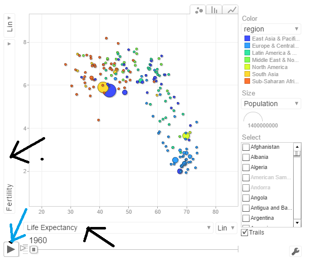
You can select Life Expectancy, Population, Fertility etc by clicking the black arrows. The blue arrow shows the ‘play’ button to set animate the motion chart. You can also select the countries and change the size of the circles. Do give it a try. Here are some quick analysis by playing around with the motion charts with different parameters chosen
The set of charts below are screenshots captured by running the motion chart World Bank Motion Chart1
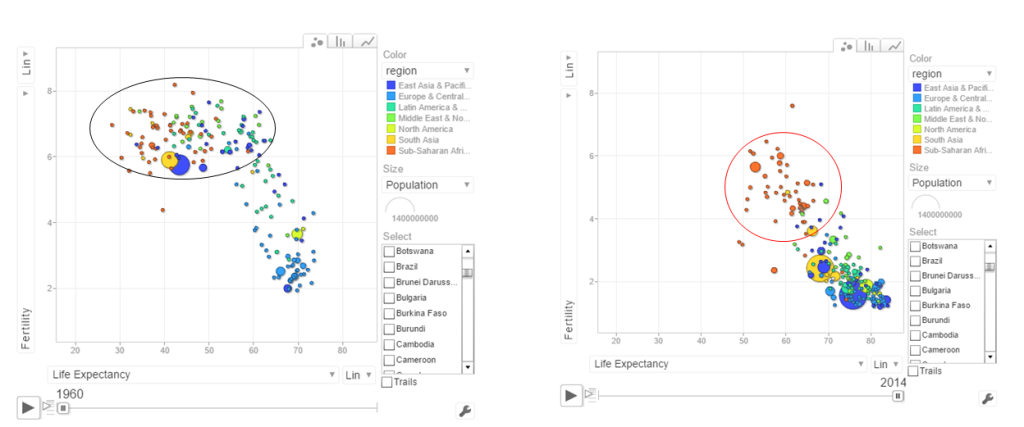
a. Life Expectancy vs Fertility chart
This chart is used by Hans Rosling in his Ted talk. The left chart shows low life expectancy and high fertility rate for several sub Saharan and East Asia Pacific countries in the early 1960’s. Today the fertility has dropped and the life expectancy has increased overall. However the sub Saharan countries still have a high fertility rate
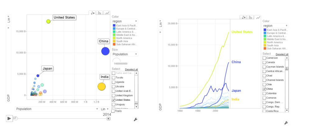
b. Population vs GDP
The chart below shows that GDP of India and China have the same GDP from 1973-1994 with US and Japan well ahead.
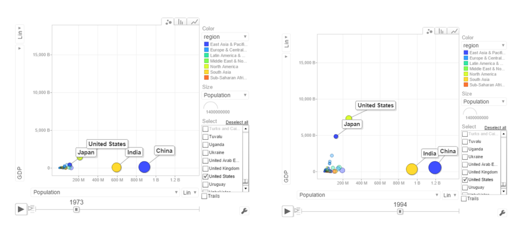
From 1998- 2014 China really pulls away from India and Japan as seen below
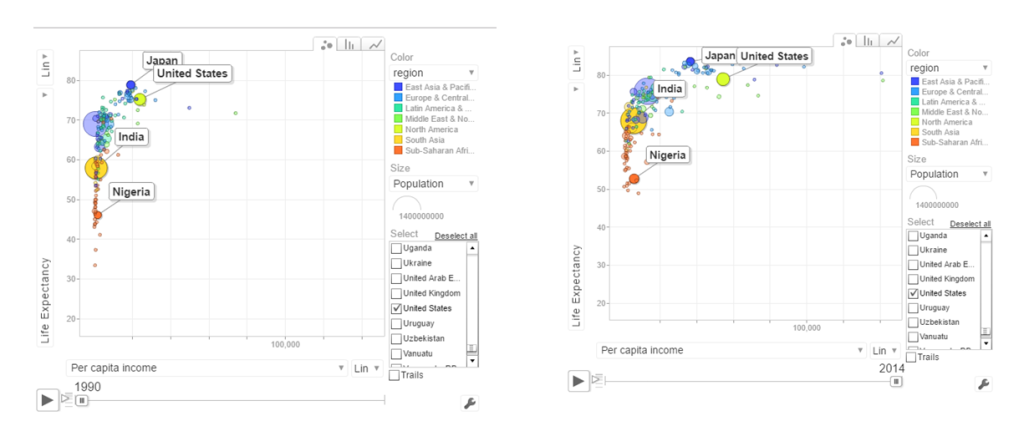
c. Per capita income vs Life Expectancy
In the 1990’s the per capita income and life expectancy of the sub -saharan countries are low (42-50). Japan and US have a good life expectancy in 1990’s. In 2014 the per capita income of the sub-saharan countries are still low though the life expectancy has marginally improved.
d. Population vs Poverty headcount
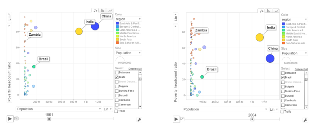
In the early 1990’s China had a higher poverty head count ratio than India. By 2004 China had this all figured out and the poverty head count ratio drops significantly. This can also be seen in the chart below.
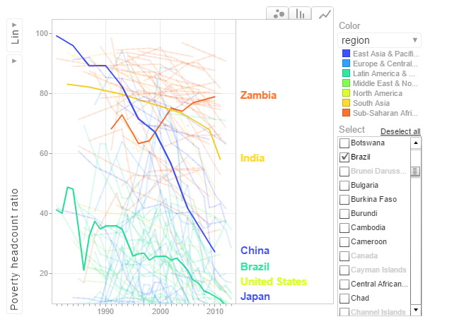
In the chart above China shows a drastic reduction in poverty headcount ratio vs India. Strangely Zambia shows an increase in the poverty head count ratio.
6.Get the data for the 2nd set of indicators
- Total population – SP.POP.TOTL
- GDP in US$ – NY.GDP.MKTP.CD
- Access to electricity (% population) – EG.ELC.ACCS.ZS
- Electricity consumption KWh per capita -EG.USE.ELEC.KH.PC
- CO2 emissions -EN.ATM.CO2E.KT
- Basic Sanitation Access – SH.STA.BASS.ZS
population = WDI(indicator='SP.POP.TOTL', country="all",start=1960, end=2016)
gdp= WDI(indicator='NY.GDP.MKTP.CD', country="all",start=1960, end=2016)
elecAccess= WDI(indicator='EG.ELC.ACCS.ZS', country="all",start=1960, end=2016)
elecConsumption= WDI(indicator='EG.USE.ELEC.KH.PC', country="all",start=1960, end=2016)
co2Emissions= WDI(indicator='EN.ATM.CO2E.KT', country="all",start=1960, end=2016)
sanitationAccess= WDI(indicator='SH.STA.ACSN', country="all",start=1960, end=2016)
7.Rename the columns
names(population)[3]="Total population"
names(gdp)[3]="GDP US($)"
names(elecAccess)[3]="Access to Electricity (% popn)"
names(elecConsumption)[3]="Electric power consumption (KWH per capita)"
names(co2Emissions)[3]="CO2 emisions"
names(sanitationAccess)[3]="Access to sanitation(% popn)"
8.Join the individual data frames
Join the individual data frames to one large wide data frame with all the indicators for the countries
j1 <- join(population, gdp)
j2 <- join(j1,elecAccess)
j3 <- join(j2,elecConsumption)
j4 <- join(j3,co2Emissions)
wbData1 <- join(j3,sanitationAccess)
9.Use WDI_data
Use WDI_data to get the list of indicators and the countries. Join the countries and region
wdi_data =WDI_data
indicators=wdi_data[[1]]
countries=wdi_data[[2]]
df = as.data.frame(countries)
aa <- df$region != "Aggregates"
countries_df <- df[aa,]
ee = subset(wbData1, country %in% countries_df$country)
ff = join(ee,countries_df)
## Joining by: iso2c, country
10.Create and display the motion chart
gg1<- gvisMotionChart(ff,
                                idvar = "country",
                                timevar = "year",
                                xvar = "GDP",
                                yvar = "Access to Electricity",
                                sizevar ="Population",
                                colorvar = "region")
plot(gg1)
cat(gg1$html$chart, file="chart2.html")
This is World Bank Motion Chart2 which has a different set of parameters like Access to Energy, CO2 emissions etc
The set of charts below are screenshots of the motion chart World Bank Motion Chart 2
a. Access to Electricity vs Population
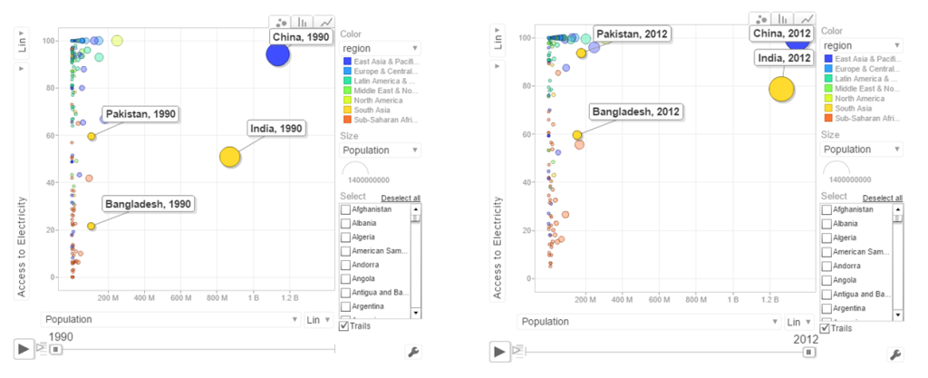 The above chart shows that in China 100% population have access to electricity. India has made decent progress from 50% in 1990 to 79% in 2012. However Pakistan seems to have been much better in providing access to electricity. Pakistan moved from 59% to close 98% access to electricity
b. Power consumption vs population
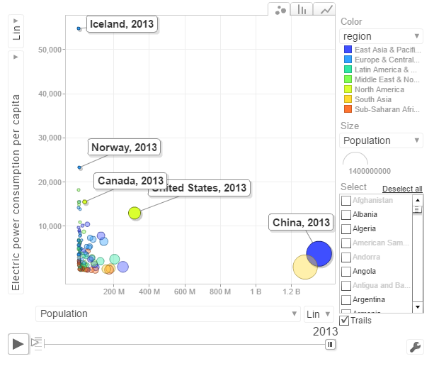
The above chart shows the Power consumption vs Population. China and India have proportionally much lower consumption that Norway, US, Canada
c. CO2 emissions vs Population
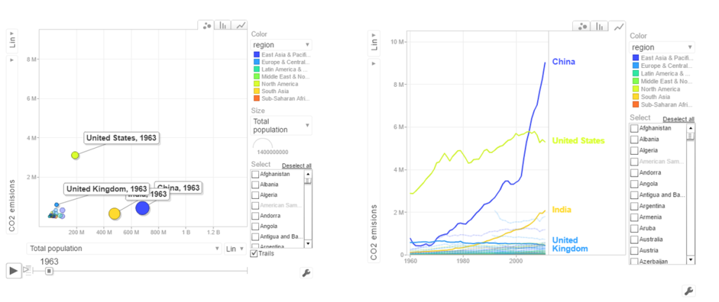
In 1963 the CO2 emissions were fairly low and about comparable for all countries. US, India have shown a steady increase while China shows a steep increase. Interestingly UK shows a drop in CO2 emissions
d. Access to sanitation
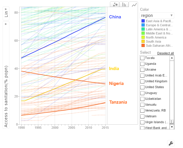
India shows an improvement but it has a long way to go with only 40% of population with access to sanitation. China has made much better strides with 80% having access to sanitation in 2015. Strangely Nigeria shows a drop in sanitation by almost about 20% of population.
The code is available at Github at worldBankAnalysis
Conclusion: So there you have it. I have shown some screenshots of some sample parameters of the World indicators. Please try to play around with World Bank Motion Chart1 & World Bank Motion Chart 2 with your own set of parameters and countries. You can also create your own motion chart from the 100s of WDI indicators avaialable at World Bank Data indicator.
Also see
1. My book ‘Deep Learning from first principles:Second Edition’ now on Amazon
2. Dabbling with Wiener filter using OpenCV
3. My book ‘Practical Machine Learning in R and Python: Third edition’ on Amazon
4. Design Principles of Scalable, Distributed Systems
5. Re-introducing cricketr! : An R package to analyze performances of cricketers
6. Natural language processing: What would Shakespeare say?
7. Brewing a potion with Bluemix, PostgreSQL, Node.js in the cloud
8. Simulating an Edge Shape in Android
To see all posts Index of posts
 ‘Cricket analytics with cricketr and cricpy – Analytics harmony with R and Python’ is now available on Amazon in both paperback ($21.99) and kindle ($9.99/Rs 449) versions. The book includes analysis of cricketers using both my R package ‘cricketr’ and my python package ‘cricpy’ for all formats of the game namely Test, ODI and T20. Both packages use data from ESPN Cricinfo Statsguru. The paperback is available on Amazon for $21.99 and the kindle version is available for $9.99/Rs 449


Some people, when confronted with a problem, think “I know, I’ll use regular expressions.” Now they have two problems. – Jamie Zawinski
Some programmers, when confronted with a problem, think “I know, I’ll use floating point arithmetic.” Now they have 1.999999999997 problems. – @tomscott
Some people, when confronted with a problem, think “I know, I’ll use multithreading”. Nothhw tpe yawrve o oblems. – @d6
Some people, when confronted with a problem, think “I know, I’ll use versioning.” Now they have 2.1.0 problems. – @JaesCoyle
Some people, when faced with a problem, think, “I know, I’ll use binary.” Now they have 10 problems. – @nedbat
Introduction
The power of Spark, which operates on in-memory datasets, is the fact that it stores the data as collections using Resilient Distributed Datasets (RDDs), which are themselves distributed in partitions across clusters. RDDs, are a fast way of processing data, as the data is operated on parallel based on the map-reduce paradigm. RDDs can be be used when the operations are low level. RDDs, are typically used on unstructured data like logs or text. For structured and semi-structured data, Spark has a higher abstraction called Dataframes. Handling data through dataframes are extremely fast as they are Optimized using the Catalyst Optimization engine and the performance is orders of magnitude faster than RDDs. In addition Dataframes also use Tungsten which handle memory management and garbage collection more effectively.
The picture below shows the performance improvement achieved with Dataframes over RDDs
Benefits from Project Tungsten
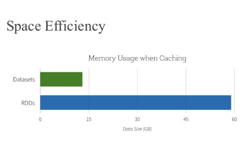
Npte: The above data and graph is taken from the course Big Data Analysis with Apache Spark at edX, UC Berkeley
This post is a continuation of my 2 earlier posts
1. Big Data-1: Move into the big league:Graduate from Python to Pyspark
2. Big Data-2: Move into the big league:Graduate from R to SparkR
In this post I perform equivalent operations on a small dataset using RDDs, Dataframes in Pyspark & SparkR and HiveQL. As in some of my earlier posts, I have used the tendulkar.csv file for this post. The dataset is small and allows me to do most everything from data cleaning, data transformation and grouping etc.
You can clone fork the notebooks from github at Big Data:Part 3
The notebooks have also been published and can be accessed below
1. RDD – Select all columns of tables
1b.RDD – Select columns 1 to 4
[[‘Runs’, ‘Mins’, ‘BF’, ‘4s’],
[’15’, ’28’, ’24’, ‘2’],
[‘DNB’, ‘-‘, ‘-‘, ‘-‘],
[’59’, ‘254’, ‘172’, ‘4’],
[‘8′, ’24’, ’16’, ‘1’]]
1c. RDD – Select specific columns 0, 10
[(‘Ground’, ‘Runs’),
(‘Karachi’, ’15’),
(‘Karachi’, ‘DNB’),
(‘Faisalabad’, ’59’),
(‘Faisalabad’, ‘8’)]
2. Dataframe:Pyspark – Select all columns
|Runs|Mins| BF| 4s| 6s| SR|Pos|Dismissal|Inns|Opposition| Ground|Start Date|
+—-+—-+—+—+—+—–+—+———+—-+———-+———-+———-+
| 15| 28| 24| 2| 0| 62.5| 6| bowled| 2|v Pakistan| Karachi| 15-Nov-89|
| DNB| -| -| -| -| -| -| -| 4|v Pakistan| Karachi| 15-Nov-89|
| 59| 254|172| 4| 0| 34.3| 6| lbw| 1|v Pakistan|Faisalabad| 23-Nov-89|
| 8| 24| 16| 1| 0| 50| 6| run out| 3|v Pakistan|Faisalabad| 23-Nov-89|
| 41| 124| 90| 5| 0|45.55| 7| bowled| 1|v Pakistan| Lahore| 1-Dec-89|
+—-+—-+—+—+—+—–+—+———+—-+———-+———-+———-+
only showing top 5 rows
2a. Dataframe:Pyspark- Select specific columns
|Runs| BF|Mins|
+—-+—+—-+
| 15| 24| 28|
| DNB| -| -|
| 59|172| 254|
| 8| 16| 24|
| 41| 90| 124|
+—-+—+—-+
3. Dataframe:SparkR – Select all columns
3a. Dataframe:SparkR- Select specific columns
1 15 24 28
2 DNB – –
3 59 172 254
4 8 16 24
5 41 90 124
6 35 51 74
4. Hive QL – Select all columns
|Runs|Mins|BF |4s |6s |SR |Pos|Dismissal|Inns|Opposition|Ground |Start Date|
+—-+—-+—+—+—+—–+—+———+—-+———-+———-+———-+
|15 |28 |24 |2 |0 |62.5 |6 |bowled |2 |v Pakistan|Karachi |15-Nov-89 |
|DNB |- |- |- |- |- |- |- |4 |v Pakistan|Karachi |15-Nov-89 |
|59 |254 |172|4 |0 |34.3 |6 |lbw |1 |v Pakistan|Faisalabad|23-Nov-89 |
|8 |24 |16 |1 |0 |50 |6 |run out |3 |v Pakistan|Faisalabad|23-Nov-89 |
|41 |124 |90 |5 |0 |45.55|7 |bowled |1 |v Pakistan|Lahore |1-Dec-89 |
+—-+—-+—+—+—+—–+—+———+—-+———-+———-+———-+
4a. Hive QL – Select specific columns
+—-+—+—-+
|15 |24 |28 |
|DNB |- |- |
|59 |172|254 |
|8 |16 |24 |
|41 |90 |124 |
+—-+—+—-+
5. RDD – Filter rows on specific condition
[[‘Runs’,
‘Mins’,
‘BF’,
‘4s’,
‘6s’,
‘SR’,
‘Pos’,
‘Dismissal’,
‘Inns’,
‘Opposition’,
‘Ground’,
‘Start Date’],
[’15’,
’28’,
’24’,
‘2’,
‘0’,
‘62.5’,
‘6’,
‘bowled’,
‘2’,
‘v Pakistan’,
‘Karachi’,
’15-Nov-89′],
[‘DNB’,
‘-‘,
‘-‘,
‘-‘,
‘-‘,
‘-‘,
‘-‘,
‘-‘,
‘4’,
‘v Pakistan’,
‘Karachi’,
’15-Nov-89′],
[’59’,
‘254’,
‘172’,
‘4’,
‘0’,
‘34.3’,
‘6’,
‘lbw’,
‘1’,
‘v Pakistan’,
‘Faisalabad’,
’23-Nov-89′],
[‘8′,
’24’,
’16’,
‘1’,
‘0’,
’50’,
‘6’,
‘run out’,
‘3’,
‘v Pakistan’,
‘Faisalabad’,
’23-Nov-89′]]
5a. Dataframe:Pyspark – Filter rows on specific condition
|Runs|Mins| BF| 4s| 6s| SR|Pos|Dismissal|Inns|Opposition| Ground|Start Date|
+—-+—-+—+—+—+—–+—+———+—-+———-+———-+———-+
| 15| 28| 24| 2| 0| 62.5| 6| bowled| 2|v Pakistan| Karachi| 15-Nov-89|
| 59| 254|172| 4| 0| 34.3| 6| lbw| 1|v Pakistan|Faisalabad| 23-Nov-89|
| 8| 24| 16| 1| 0| 50| 6| run out| 3|v Pakistan|Faisalabad| 23-Nov-89|
| 41| 124| 90| 5| 0|45.55| 7| bowled| 1|v Pakistan| Lahore| 1-Dec-89|
| 35| 74| 51| 5| 0|68.62| 6| lbw| 1|v Pakistan| Sialkot| 9-Dec-89|
+—-+—-+—+—+—+—–+—+———+—-+———-+———-+———-+
only showing top 5 rows
5b. Dataframe:SparkR – Filter rows on specific condition
5c Hive QL – Filter rows on specific condition
|Runs|BF |Mins|
+—-+—+—-+
|15 |24 |28 |
|59 |172|254 |
|8 |16 |24 |
|41 |90 |124 |
|35 |51 |74 |
|57 |134|193 |
|0 |1 |1 |
|24 |44 |50 |
|88 |266|324 |
|5 |13 |15 |
+—-+—+—-+
only showing top 10 rows
6. RDD – Find rows where Runs > 50
6a. Dataframe:Pyspark – Find rows where Runs >50
from pyspark.sql import SparkSession
|Runs|Mins| BF| 4s| 6s| SR|Pos|Dismissal|Inns| Opposition| Ground|Start Date|
+—-+—-+—+—+—+—–+—+———+—-+————–+————+———-+
| 59| 254|172| 4| 0| 34.3| 6| lbw| 1| v Pakistan| Faisalabad| 23-Nov-89|
| 57| 193|134| 6| 0|42.53| 6| caught| 3| v Pakistan| Sialkot| 9-Dec-89|
| 88| 324|266| 5| 0|33.08| 6| caught| 1| v New Zealand| Napier| 9-Feb-90|
| 68| 216|136| 8| 0| 50| 6| caught| 2| v England| Manchester| 9-Aug-90|
| 114| 228|161| 16| 0| 70.8| 4| caught| 2| v Australia| Perth| 1-Feb-92|
| 111| 373|270| 19| 0|41.11| 4| caught| 2|v South Africa|Johannesburg| 26-Nov-92|
| 73| 272|208| 8| 1|35.09| 5| caught| 2|v South Africa| Cape Town| 2-Jan-93|
| 50| 158|118| 6| 0|42.37| 4| caught| 1| v England| Kolkata| 29-Jan-93|
| 165| 361|296| 24| 1|55.74| 4| caught| 1| v England| Chennai| 11-Feb-93|
| 78| 285|213| 10| 0|36.61| 4| lbw| 2| v England| Mumbai| 19-Feb-93|
+—-+—-+—+—+—+—–+—+———+—-+————–+————+———-+
6b. Dataframe:SparkR – Find rows where Runs >50
7 RDD – groupByKey() and reduceByKey()
(‘Lahore’, 17.0),
(‘Adelaide’, 32.6),
(‘Colombo (SSC)’, 77.55555555555556),
(‘Nagpur’, 64.66666666666667),
(‘Auckland’, 5.0),
(‘Bloemfontein’, 85.0),
(‘Centurion’, 73.5),
(‘Faisalabad’, 27.0),
(‘Bridgetown’, 26.0)]
7a Dataframe:Pyspark – Compute mean, min and max
| Ground| avg(Runs)|min(Runs)|max(Runs)|
+————-+—————–+———+———+
| Bangalore| 54.3125| 0| 96|
| Adelaide| 32.6| 0| 61|
|Colombo (PSS)| 37.2| 14| 71|
| Christchurch| 12.0| 0| 24|
| Auckland| 5.0| 5| 5|
| Chennai| 60.625| 0| 81|
| Centurion| 73.5| 111| 36|
| Brisbane|7.666666666666667| 0| 7|
| Birmingham| 46.75| 1| 40|
| Ahmedabad| 40.125| 100| 8|
|Colombo (RPS)| 143.0| 143| 143|
| Chittagong| 57.8| 101| 36|
| Cape Town|69.85714285714286| 14| 9|
| Bridgetown| 26.0| 0| 92|
| Bulawayo| 55.0| 36| 74|
| Delhi|39.94736842105263| 0| 76|
| Chandigarh| 11.0| 11| 11|
| Bloemfontein| 85.0| 15| 155|
|Colombo (SSC)|77.55555555555556| 104| 8|
| Cuttack| 2.0| 2| 2|
+————-+—————–+———+———+
only showing top 20 rows
7b Dataframe:SparkR – Compute mean, min and max
Also see
1. My book ‘Practical Machine Learning in R and Python: Third edition’ on Amazon
2.My book ‘Deep Learning from first principles:Second Edition’ now on Amazon
3.The Clash of the Titans in Test and ODI cricket
4. Introducing QCSimulator: A 5-qubit quantum computing simulator in R
5.Latency, throughput implications for the Cloud
6. Simulating a Web Joint in Android
5. Pitching yorkpy … short of good length to IPL – Part 1
To see all posts click Index of Posts