Computing IPL player similarity using Embeddings, Deep Learning

In this post, I revisit the visualisation of IPL batsman and bowler similarities using Google’s Embedding Projector. I had previously done this using multivariate regression in my earlier post ‘Using embeddings, collaborative filtering with Deep Learning to analyse T20 players.’ However, I was not too satisfied with the result since I was not getting the required accuracy.

This post uses the win-loss status of IPL matches from 2014 onwards upto 2023 in Logistic Regression with Deep Learning. A 16-dimensional embedding layer is added for the batsman and the bowler for ball-by-ball data. Since I have used a reduced size data set (from 2014) I get a slightly reduced accuracy, but still I think this is a well-formulated problem.

A Deep Learning network performs gradient descent based using Adam optimisation to arrive at an accuracy of 0.8047. The weights of the learnt Deep Learning network in ‘layer 0’ is used for displaying the batsman and bowler similarities.

Similarity measures – Cosine similarity

A cosine similarity is a value that is bound by a constrained range of 0 and 1. The closer the value is to 0 means that the two vectors are orthogonal or perpendicular to each other. When the value is closer to one, it means the angle is smaller and the batsman and bowler are similar.

a) Data set

For the data set only IPL T20 matches from Jan 2014 upto the present (May 2023) was taken. A Deep Learning model using Logistic Regression with batsman and bowler embedding is used to minimise the error. An accuracy of 0.8047 is obtained. In my earlier post ‘GooglyPlusPlus: Win Probability using Deep Learning and player embeddings‘ I had used data from all T20 leagues (~1.2 million rows) and got an accuracy of 0.8647

b) Import the data

import pandas as pd
import numpy as np
from zipfile import ZipFile
import tensorflow as tf
from tensorflow import keras
from tensorflow.keras import layers
from tensorflow.keras import regularizers
from pathlib import Path
import matplotlib.pyplot as plt

import pandas as pd
import numpy as np
from zipfile import ZipFile
import tensorflow as tf
from tensorflow import keras
from tensorflow.keras import layers
from tensorflow.keras import regularizers

df1=pd.read_csv('ipl2014_23.csv')
print("Shape of dataframe=",df1.shape)

train_dataset = df1.sample(frac=0.8,random_state=0)
test_dataset = df1.drop(train_dataset.index)
train_dataset1 = train_dataset[['batsmanIdx','bowlerIdx','ballNum','ballsRemaining','runs','runRate','numWickets','runsMomentum','perfIndex']]
test_dataset1 = test_dataset[['batsmanIdx','bowlerIdx','ballNum','ballsRemaining','runs','runRate','numWickets','runsMomentum','perfIndex']]
train_dataset1
train_labels = train_dataset.pop('isWinner')
test_labels = test_dataset.pop('isWinner')
train_dataset1

a=train_dataset1.describe()
stats=a.transpose

Shape of dataframe= (138896, 10)
batsmanIdx	bowlerIdx	ballNum	ballsRemaining	runs	runRate	numWickets	runsMomentum	perfIndex
count	111117.000000	111117.000000	111117.000000	111117.000000	111117.000000	111117.000000	111117.000000	111117.000000	111117.000000
mean	218.672939	169.204145	120.372067	60.749822	86.881701	1.636353	2.423167	0.296061	10.578927
std	118.405729	96.934754	69.991408	35.298794	51.643164	2.672564	2.085956	0.620872	4.436981
min	1.000000	1.000000	1.000000	1.000000	-5.000000	-5.000000	0.000000	0.057143	0.000000
25%	111.000000	89.000000	60.000000	30.000000	45.000000	1.160000	1.000000	0.106383	7.733333
50%	220.000000	170.000000	119.000000	60.000000	85.000000	1.375000	2.000000	0.142857	10.329545
75%	325.000000	249.000000	180.000000	91.000000	126.000000	1.640000	4.000000	0.240000	13.108696
max	411.000000	332.000000	262.000000	135.000000	258.000000	251.000000	10.000000	11.000000	66.000000

c) Create a Deep Learning ML model using batsman & bowler embeddings

import pandas as pd
import numpy as np
from keras.layers import Input, Embedding, Flatten, Dense
from keras.models import Model
from keras.layers import Input, Embedding, Flatten, Dense, Reshape, Concatenate, Dropout
from keras.models import Model

tf.random.set_seed(432)
# create input layers for each of the predictors
batsmanIdx_input = Input(shape=(1,), name='batsmanIdx')
bowlerIdx_input = Input(shape=(1,), name='bowlerIdx')
ballNum_input = Input(shape=(1,), name='ballNum')
ballsRemaining_input = Input(shape=(1,), name='ballsRemaining')
runs_input = Input(shape=(1,), name='runs')
runRate_input = Input(shape=(1,), name='runRate')
numWickets_input = Input(shape=(1,), name='numWickets')
runsMomentum_input = Input(shape=(1,), name='runsMomentum')
perfIndex_input = Input(shape=(1,), name='perfIndex')

# Set the embedding size
no_of_unique_batman=len(df1["batsmanIdx"].unique())
print(no_of_unique_batman)
no_of_unique_bowler=len(df1["bowlerIdx"].unique())
print(no_of_unique_bowler)
embedding_size_bat = no_of_unique_batman ** (1/4)
embedding_size_bwl = no_of_unique_bowler ** (1/4)


# create embedding layer for the categorical predictor
batsmanIdx_embedding = Embedding(input_dim=no_of_unique_batman+1, output_dim=16,input_length=1)(batsmanIdx_input)
batsmanIdx_flatten = Flatten()(batsmanIdx_embedding)
bowlerIdx_embedding = Embedding(input_dim=no_of_unique_bowler+1, output_dim=16,input_length=1)(bowlerIdx_input)
bowlerIdx_flatten = Flatten()(bowlerIdx_embedding)

# concatenate all the predictors
x = keras.layers.concatenate([batsmanIdx_flatten,bowlerIdx_flatten, ballNum_input, ballsRemaining_input, runs_input, runRate_input, numWickets_input, runsMomentum_input, perfIndex_input])

# add hidden layers
#x = Dense(64, activation='relu')(x)
#x = Dropout(0.1)(x)
x = Dense(32, activation='relu')(x)
x = Dropout(0.1)(x)
x = Dense(16, activation='relu')(x)
x = Dropout(0.1)(x)
x = Dense(8, activation='relu')(x)
x = Dropout(0.1)(x)
# add output layer
output = Dense(1, activation='sigmoid', name='output')(x)
print(output.shape)
# create model
model = Model(inputs=[batsmanIdx_input,bowlerIdx_input, ballNum_input, ballsRemaining_input, runs_input, runRate_input, numWickets_input, runsMomentum_input, perfIndex_input], outputs=output)
model.summary()

# compile model
optimizer=keras.optimizers.Adam(learning_rate=.01, beta_1=0.9, beta_2=0.999, epsilon=1e-07, amsgrad=True)

model.compile(optimizer=optimizer, loss='binary_crossentropy', metrics=['accuracy'])

# train the model
history=model.fit([train_dataset1['batsmanIdx'],train_dataset1['bowlerIdx'],train_dataset1['ballNum'],train_dataset1['ballsRemaining'],train_dataset1['runs'],
           train_dataset1['runRate'],train_dataset1['numWickets'],train_dataset1['runsMomentum'],train_dataset1['perfIndex']], train_labels, epochs=40, batch_size=1024,
          validation_data = ([test_dataset1['batsmanIdx'],test_dataset1['bowlerIdx'],test_dataset1['ballNum'],test_dataset1['ballsRemaining'],test_dataset1['runs'],
           test_dataset1['runRate'],test_dataset1['numWickets'],test_dataset1['runsMomentum'],test_dataset1['perfIndex']],test_labels), verbose=1)

plt.plot(history.history["loss"])
plt.plot(history.history["val_loss"])
plt.title("model loss")
plt.ylabel("loss")
plt.xlabel("epoch")
plt.legend(["train", "test"], loc="upper left")
plt.show()

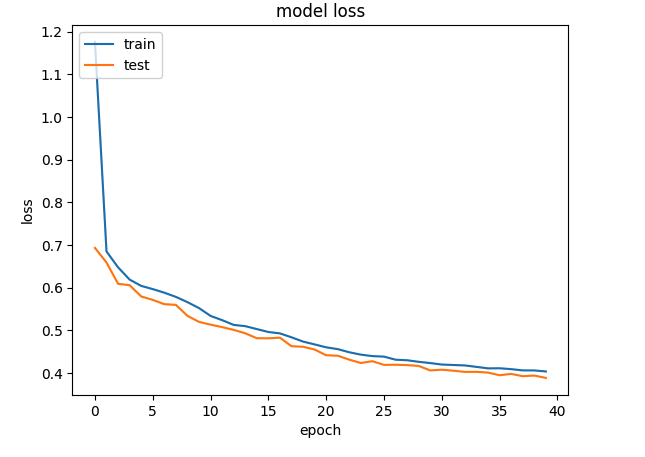
d) Project embeddings with Google’s Embedding projector

try:
  # %tensorflow_version only exists in Colab.
  %tensorflow_version 2.x
except Exception:
  pass

%load_ext tensorboard
import os
import tensorflow as tf
import tensorflow_datasets as tfds
from tensorboard.plugins import projector

%pwd
# Set up a logs directory, so Tensorboard knows where to look for files.
log_dir='/logs/batsmen/'
if not os.path.exists(log_dir):
    os.makedirs(log_dir)

df3=pd.read_csv('batsmen.csv')
batsmen = df3["batsman"].unique().tolist()
batsmen
# Create dictionary of batsman to index
batsmen2index = {x: i for i, x in enumerate(batsmen)}
batsmen2index
# Create dictionary of index to batsman
index2batsmen = {i: x for i, x in enumerate(batsmen)}
index2batsmen


# Save Labels separately on a line-by-line manner.
with open(os.path.join(log_dir, 'metadata.tsv'), "w") as f:
  for batsmanIdx in range(1, 411):
       # Get the name of batsman associated at the current index
        batsman = index2batsmen.get([batsmanIdx][0])

        f.write("{}\n".format(batsman))

# Save the weights we want to analyze as a variable. Note that the first
# value represents any unknown word, which is not in the metadata, here
# we will remove this value.
weights = tf.Variable(model.get_weights()[0][1:])
print(weights)
print(type(weights))
print(len(model.get_weights()[0]))
# Create a checkpoint from embedding, the filename and key are the
# name of the tensor.
checkpoint = tf.train.Checkpoint(embedding=weights)
checkpoint.save(os.path.join(log_dir, "embedding.ckpt"))

# Set up config.
config = projector.ProjectorConfig()
embedding = config.embeddings.add()
# The name of the tensor will be suffixed by `/.ATTRIBUTES/VARIABLE_VALUE`.
embedding.tensor_name = "embedding/.ATTRIBUTES/VARIABLE_VALUE"
embedding.metadata_path = 'metadata.tsv'
projector.visualize_embeddings(log_dir, config)
# Now run tensorboard against on log data we just saved.

%reload_ext tensorboard
%tensorboard --logdir /logs/batsmen/

e) Here are similarity measures for some batsmen

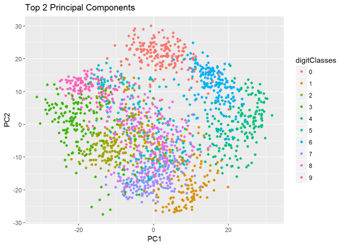
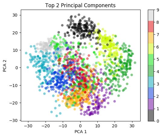
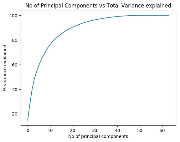
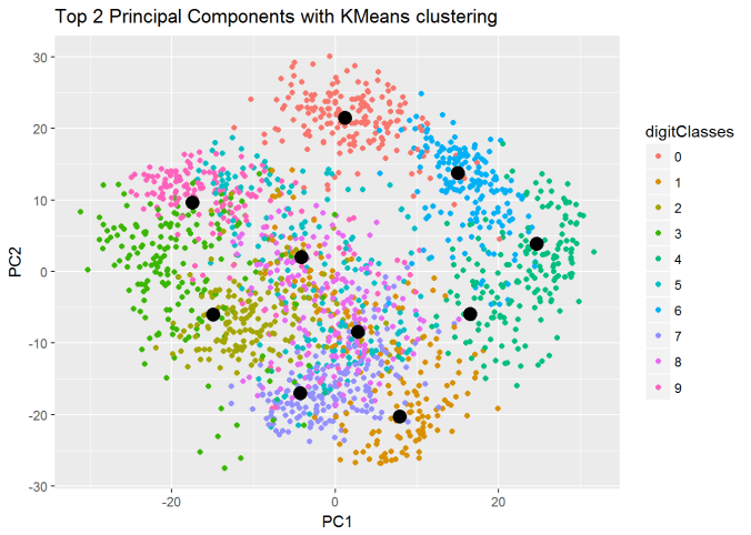
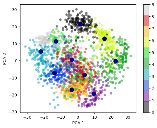
I) Principal Component Analysis (PCA) : In the charts and video animation below, the 16-dimensional embedding vector of batsmen and bowler is reduced to 3 principal components in a lower dimension for visualisation and analysis as shown below

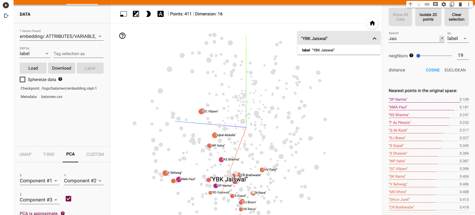
a) Yashasvi Jaiswal (similar players

i) PCA – Chart

Yashasvi Jaiswal style of attack is similar to Faf Du Plessis, Quentim De Kock, Bravo etc. In the below chart the ange between Jaiswal and SP Narine is 0.109, and Faf du Plessis is 0.253. These represent the angle in radians. The smaller the angle the more similar the performance style of the players and cos 0=1 or the players are similar.

ii) PCA animation video for Yashasvi Jaiswal

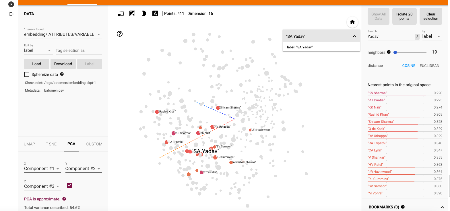
b) Suryakumar Yadav (SKY)

i) PCA -Chart

The closest neighbours for SKY is RV Uthappa, Rahul Tripathi, Q de Kock, Samson, Rashid Khan

ii) PCA – Animation video for Suryakumar Yadav
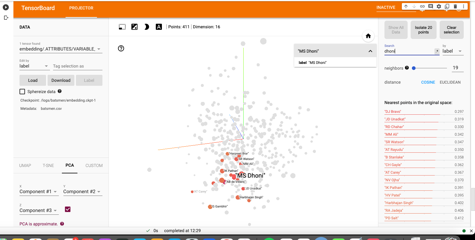
c) M S Dhoni

i) PCA – Chart

Dhoni rubs shoulders with Bravo, AB De Villiers, Shane Watson, Chris Gayle, Rayadu, Gautam Gambhir

ii) PCA – Animation video for M S Dhoni

f) PCA Analysis for bowlers
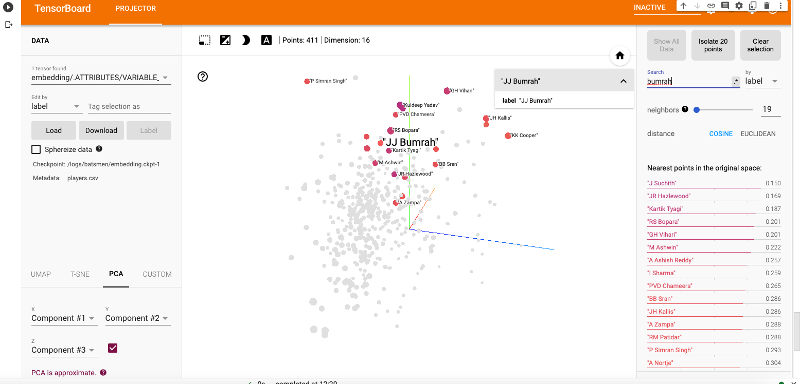
a) Jasprit Bumrah

i) PCA – Chart

Bumrah bowling performance is similar to Josh Hazzlewood, Chameera, Kuldeep Yadav, Nortje, Adam Zampa etc.

ii) PCA Animation video for Jasprit Bumrah

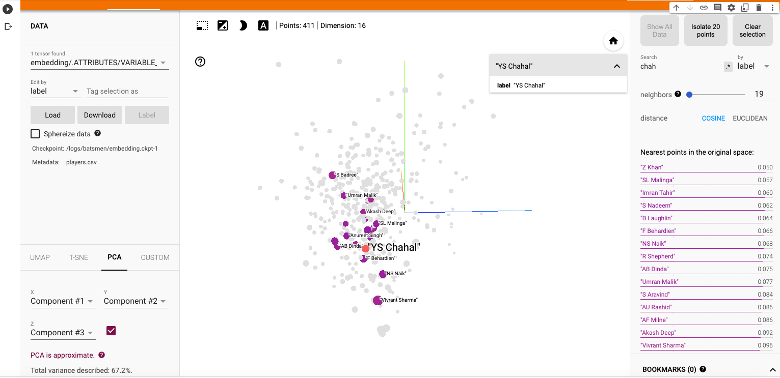
b) Yuzhvendra Chahal

i) PCA – Chart

Chahal’s performance has a strong similarity to Malinga, Zaheer Khan, Imran Tahir, R Sheperd, Adil Rashid

ii) PCA Animation video for YS Chahal

f) Other similarity measures ( t-SNE & UMAP)

There are 2 other similarity visualisations in Google’s Embedding Projector namely

i) t-SNE (t-distributed Stochastic Neighbor Embedding) – t-SNE tries to find a faithful representation of the data distribution in higher dimensional space to a lower dimensional space. t-SNE differs from PCA by preserving only or local similarities whereas PCA is maintains preserving large pairwise distances.

a) t-SNE Animation video

ii) UMAP – Uniform Manifold Approximation and Projection

UMAP learns the manifold structure of the high dimensional data and finds a low dimensional embedding that preserves the essential topological structure of that manifold.

ii) UMAP – Animation video

The Embedding projector thus helps in identifying players based on how they perform against bowlers, and probably picks up a lot of features like strike rate and performance in different stages of the game.

Hope you enjoyed the post!

Also see

  1. Exploring Quantum Gate operations with QCSimulator
  2. De-blurring revisited with Wiener filter using OpenCV
  3. Using Reinforcement Learning to solve Gridworld
  4. Deep Learning from first principles in Python, R and Octave – Part 4
  5. Big Data 6: The T20 Dance of Apache NiFi and yorkpy
  6. Latency, throughput implications for the Cloud
  7. Programming languages in layman’s language
  8. Practical Machine Learning with R and Python – Part 6
  9. Using Linear Programming (LP) for optimizing bowling change or batting lineup in T20 cricket
  10. A closer look at “Robot Horse on a Trot” in Android

To see all posts click Index of posts

Presentation on ‘Machine Learning in plain English – Part 3

This is the 3rd and final part of Machine Learning in plain English -Part 3. In this presentation, I discuss the intuition behind SVMs, B-Splines, GAMs, Decision Trees, Random Forest and Gradient Boosting. Also I touch upon Unsupervised Learning, specifically PCA and K-Means. As before the presentation does not include any math or programming. The presentation can be seen below


The implementations of all the discussed algorithm are are available in my book which is available on Amazon My book ‘Practical Machine Learning with R and Python’ on Amazon

You may also like
1. My TEDx talk on the “Internet of Things”
2. Deep Learning from first principles in Python, R and Octave – Part 2
3. De-blurring revisited with Wiener filter using OpenCV
4. Architecting a cloud based IP Multimedia System (IMS)
5.The 3rd paperback & kindle editions of my books on Cricket, now on Amazon

To see all posts click Index of posts

Practical Machine Learning with R and Python – Part 6

Introduction

This is the final and concluding part of my series on ‘Practical Machine Learning with R and Python’. In this series I included the implementations of the most common Machine Learning algorithms in R and Python. The algorithms implemented were

1. Practical Machine Learning with R and Python – Part 1 In this initial post, I touch upon regression of a continuous target variable. Specifically I touch upon Univariate, Multivariate, Polynomial regression and KNN regression in both R and Python
2. Practical Machine Learning with R and Python – Part 2 In this post, I discuss Logistic Regression, KNN classification and Cross Validation error for both LOOCV and K-Fold in both R and Python
3. Practical Machine Learning with R and Python – Part 3 This 3rd part included feature selection in Machine Learning. Specifically I touch best fit, forward fit, backward fit, ridge(L2 regularization) & lasso (L1 regularization). The post includes equivalent code in R and Python.
4. Practical Machine Learning with R and Python – Part 4 In this part I discussed SVMs, Decision Trees, Validation, Precision-Recall, AUC and ROC curves
5. Practical Machine Learning with R and Python – Part 5  In this penultimate part, I touch upon B-splines, natural splines, smoothing spline, Generalized Additive Models(GAMs), Decision Trees, Random Forests and Gradient Boosted Treess.

In this last part I cover Unsupervised Learning. Specifically I cover the implementations of Principal Component Analysis (PCA). K-Means and Heirarchical Clustering. You can download this R Markdown file from Github at MachineLearning-RandPython-Part6

Note: Please listen to my video presentations Machine Learning in youtube
1. Machine Learning in plain English-Part 1
2. Machine Learning in plain English-Part 2
3. Machine Learning in plain English-Part 3

Check out my compact and minimal book  “Practical Machine Learning with R and Python:Third edition- Machine Learning in stereo”  available in Amazon in paperback($12.99) and kindle($8.99) versions. My book includes implementations of key ML algorithms and associated measures and metrics. The book is ideal for anybody who is familiar with the concepts and would like a quick reference to the different ML algorithms that can be applied to problems and how to select the best model. Pick your copy today!!


1.1a Principal Component Analysis (PCA) – R code

Principal Component Analysis is used to reduce the dimensionality of the input. In the code below 8 x 8 pixel of handwritten digits is reduced into its principal components. Then a scatter plot of the first 2 principal components give a very good visial representation of the data

library(dplyr)
library(ggplot2)
#Note: This example is adapted from an the example in the book Python Datascience handbook by 
# Jake VanderPlas (https://jakevdp.github.io/PythonDataScienceHandbook/05.09-principal-component-analysis.html)

# Read the digits data (From sklearn datasets)
digits= read.csv("digits.csv")
# Create a digits classes target variable
digitClasses <- factor(digits$X0.000000000000000000e.00.29)

#Invoke the Principal Componsent analysis on columns 1-64
digitsPCA=prcomp(digits[,1:64])

# Create a dataframe of PCA
df <- data.frame(digitsPCA$x)
# Bind the digit classes
df1 <- cbind(df,digitClasses)
# Plot only the first 2 Principal components as a scatter plot. This plot uses only the
# first 2 principal components 
ggplot(df1,aes(x=PC1,y=PC2,col=digitClasses)) + geom_point() +
  ggtitle("Top 2 Principal Components")

1.1 b Variance explained vs no principal components – R code

In the code below the variance explained vs the number of principal components is plotted. It can be seen that with 20 Principal components almost 90% of the variance is explained by this reduced dimensional model.

# Read the digits data (from sklearn datasets)
digits= read.csv("digits.csv")
# Digits target
digitClasses <- factor(digits$X0.000000000000000000e.00.29)
digitsPCA=prcomp(digits[,1:64])


# Get the Standard Deviation
sd=digitsPCA$sdev
# Compute the variance
digitsVar=digitsPCA$sdev^2
#Compute the percent variance explained
percentVarExp=digitsVar/sum(digitsVar)

# Plot the percent variance exlained as a function of the  number of principal components
#plot(cumsum(percentVarExp), xlab="Principal Component", 
#     ylab="Cumulative Proportion of Variance Explained", 
#     main="Principal Components vs % Variance explained",ylim=c(0,1),type='l',lwd=2,
#       col="blue")

1.1c Principal Component Analysis (PCA) – Python code

import numpy as np
from sklearn.decomposition import PCA
from sklearn import decomposition
from sklearn import datasets
import matplotlib.pyplot as plt
  
from sklearn.datasets import load_digits
# Load the digits data
digits = load_digits()
# Select only the first 2 principal components
pca = PCA(2)  # project from 64 to 2 dimensions
#Compute the first 2 PCA
projected = pca.fit_transform(digits.data)

# Plot a scatter plot of the first 2 principal components
plt.scatter(projected[:, 0], projected[:, 1],
            c=digits.target, edgecolor='none', alpha=0.5,
            cmap=plt.cm.get_cmap('spectral', 10))
plt.xlabel('PCA 1')
plt.ylabel('PCA 2')
plt.colorbar();
plt.title("Top 2 Principal Components")
plt.savefig('fig1.png', bbox_inches='tight')

1.1 b Variance vs no principal components

– Python code

import numpy as np
from sklearn.decomposition import PCA
from sklearn import decomposition
from sklearn import datasets
import matplotlib.pyplot as plt
  
from sklearn.datasets import load_digits
digits = load_digits()
# Select all 64 principal components
pca = PCA(64)  # project from 64 to 2 dimensions
projected = pca.fit_transform(digits.data)

# Obtain the explained variance for each principal component
varianceExp= pca.explained_variance_ratio_
# Compute the total sum of variance
totVarExp=np.cumsum(np.round(pca.explained_variance_ratio_, decimals=4)*100)

# Plot the variance explained as a function of the number of principal components
plt.plot(totVarExp)
plt.xlabel('No of principal components')
plt.ylabel('% variance explained')
plt.title('No of Principal Components vs Total Variance explained')
plt.savefig('fig2.png', bbox_inches='tight')

1.2a K-Means – R code

In the code first the scatter plot of the first 2 Principal Components of the handwritten digits is plotted as a scatter plot. Over this plot 10 centroids of the 10 different clusters corresponding the 10 diferent digits is plotted over the original scatter plot.

library(ggplot2)
# Read the digits data
digits= read.csv("digits.csv")
# Create digit classes target variable
digitClasses <- factor(digits$X0.000000000000000000e.00.29)

# Compute the Principal COmponents
digitsPCA=prcomp(digits[,1:64])

# Create a data frame of Principal components and the digit classes 
df <- data.frame(digitsPCA$x)
df1 <- cbind(df,digitClasses)

# Pick only the first 2 principal components
a<- df[,1:2]
# Compute K Means of 10 clusters and allow for 1000 iterations
k<-kmeans(a,10,1000)

# Create a dataframe of the centroids of the clusters
df2<-data.frame(k$centers)

#Plot the first 2 principal components with the K Means centroids
ggplot(df1,aes(x=PC1,y=PC2,col=digitClasses)) + geom_point() +
    geom_point(data=df2,aes(x=PC1,y=PC2),col="black",size = 4) + 
    ggtitle("Top 2 Principal Components with KMeans clustering") 

1.2b K-Means – Python code

The centroids of the 10 different handwritten digits is plotted over the scatter plot of the first 2 principal components.

import numpy as np
from sklearn.decomposition import PCA
from sklearn import decomposition
from sklearn import datasets
import matplotlib.pyplot as plt
from sklearn.datasets import load_digits
from sklearn.cluster import KMeans
digits = load_digits()

# Select only the 1st 2 principal components
pca = PCA(2)  # project from 64 to 2 dimensions
projected = pca.fit_transform(digits.data)

# Create 10 different clusters
kmeans = KMeans(n_clusters=10)

# Compute  the clusters
kmeans.fit(projected)
y_kmeans = kmeans.predict(projected)
# Get the cluster centroids
centers = kmeans.cluster_centers_
centers

#Create a scatter plot of the first 2 principal components
plt.scatter(projected[:, 0], projected[:, 1],
            c=digits.target, edgecolor='none', alpha=0.5,
            cmap=plt.cm.get_cmap('spectral', 10))
plt.xlabel('PCA 1')
plt.ylabel('PCA 2')
plt.colorbar();
# Overlay the centroids on the scatter plot
plt.scatter(centers[:, 0], centers[:, 1], c='darkblue', s=100)
plt.savefig('fig3.png', bbox_inches='tight')

1.3a Heirarchical clusters – R code

Herirachical clusters is another type of unsupervised learning. It successively joins the closest pair of objects (points or clusters) in succession based on some ‘distance’ metric. In this type of clustering we do not have choose the number of centroids. We can cut the created dendrogram mat an appropriate height to get a desired and reasonable number of clusters These are the following ‘distance’ metrics used while combining successive objects

  • Ward
  • Complete
  • Single
  • Average
  • Centroid
# Read the IRIS dataset
iris <- datasets::iris
iris2 <- iris[,-5]
species <- iris[,5]

#Compute the distance matrix
d_iris <- dist(iris2) 

# Use the 'average' method to for the clsuters
hc_iris <- hclust(d_iris, method = "average")

# Plot the clusters
plot(hc_iris)

# Cut tree into 3 groups
sub_grp <- cutree(hc_iris, k = 3)

# Number of members in each cluster
table(sub_grp)
## sub_grp
##  1  2  3 
## 50 64 36
# Draw rectangles around the clusters
rect.hclust(hc_iris, k = 3, border = 2:5)

1.3a Heirarchical clusters – Python code

from sklearn.datasets import load_iris
import matplotlib.pyplot as plt
from scipy.cluster.hierarchy import dendrogram, linkage
# Load the IRIS data set
iris = load_iris()


# Generate the linkage matrix using the average method
Z = linkage(iris.data, 'average')

#Plot the dendrogram
#dendrogram(Z)
#plt.xlabel('Data')
#plt.ylabel('Distance')
#plt.suptitle('Samples clustering', fontweight='bold', fontsize=14);
#plt.savefig('fig4.png', bbox_inches='tight')

Conclusion

This is the last and concluding part of my series on Practical Machine Learning with R and Python. These parallel implementations of R and Python can be used as a quick reference while working on a large project. A person who is adept in one of the languages R or Python, can quickly absorb code in the other language.

Hope you find this series useful!

More interesting things to come. Watch this space!

References

  1. Statistical Learning, Prof Trevor Hastie & Prof Robert Tibesherani, Online Stanford
  2. Applied Machine Learning in Python Prof Kevyn-Collin Thomson, University Of Michigan, Coursera

Also see
1. The many faces of latency
2. Simulating a Web Join in Android
3. The Anamoly
4. yorkr pads up for the Twenty20s:Part 3:Overall team performance against all oppositions
5. Bend it like Bluemix, MongoDB using Auto-scale – Part 1!

To see all posts see ‘Index of posts