IBM Data Science Experience:  First steps with yorkr

Fresh, and slightly dizzy, from my foray into Quantum Computing with IBM’s Quantum Experience, I now turn my attention to IBM’s Data Science Experience (DSE).

I am on the verge of completing a really great 3 module ‘Data Science and Engineering with Spark XSeries’ from the University of California, Berkeley and I have been thinking of trying out some form of integrated delivery platform for performing analytics, for quite some time.  Coincidentally,  IBM comes out with its Data Science Experience. a month back. There are a couple of other collaborative platforms available for playing around with Apache Spark or Data Analytics namely Jupyter notebooks, Databricks, Data.world.

I decided to go ahead with IBM’s Data Science Experience as  the GUI is a lot cooler, includes shared data sets and integrates with Object Storage, Cloudant DB etc,  which seemed a lot closer to the cloud, literally!  IBM’s DSE is an interactive, collaborative, cloud-based environment for performing data analysis with Apache Spark. DSE is hosted on IBM’s PaaS environment, Bluemix. It should be possible to access in DSE the plethora of cloud services available on Bluemix. IBM’s DSE uses Jupyter notebooks for creating and analyzing data which can be easily shared and has access to a few hundred publicly available datasets

Disclaimer: This article represents the author’s viewpoint only and doesn’t necessarily represent IBM’s positions, strategies or opinions

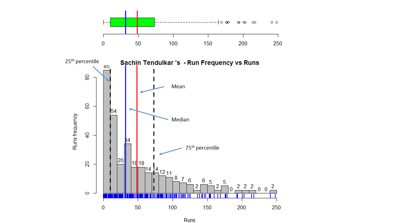
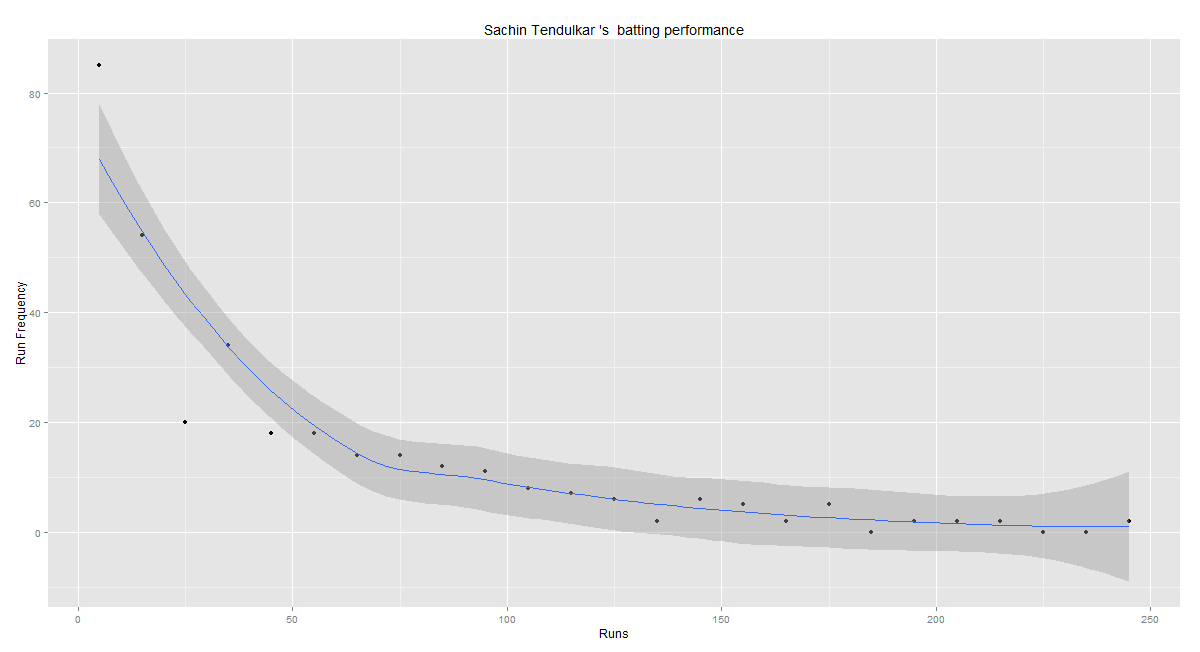
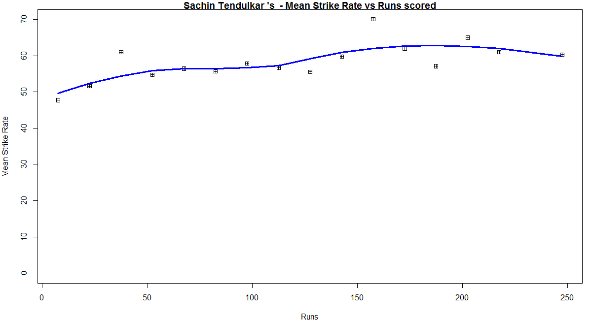
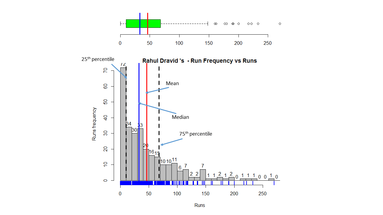
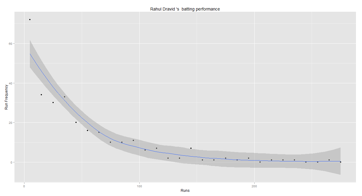
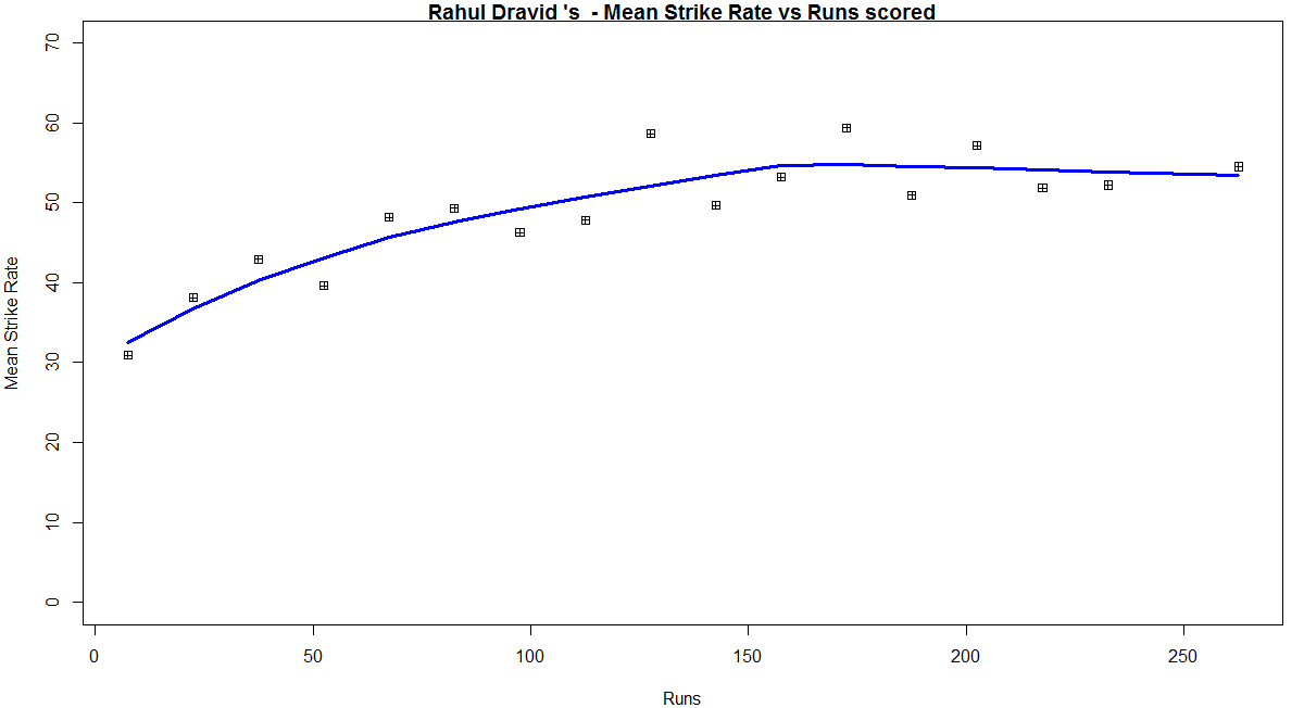
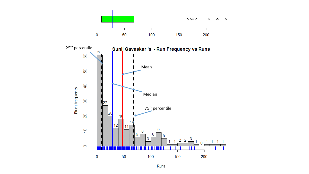
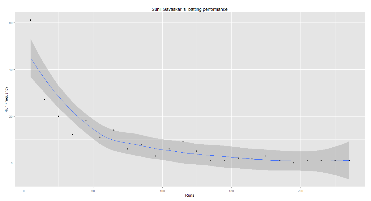
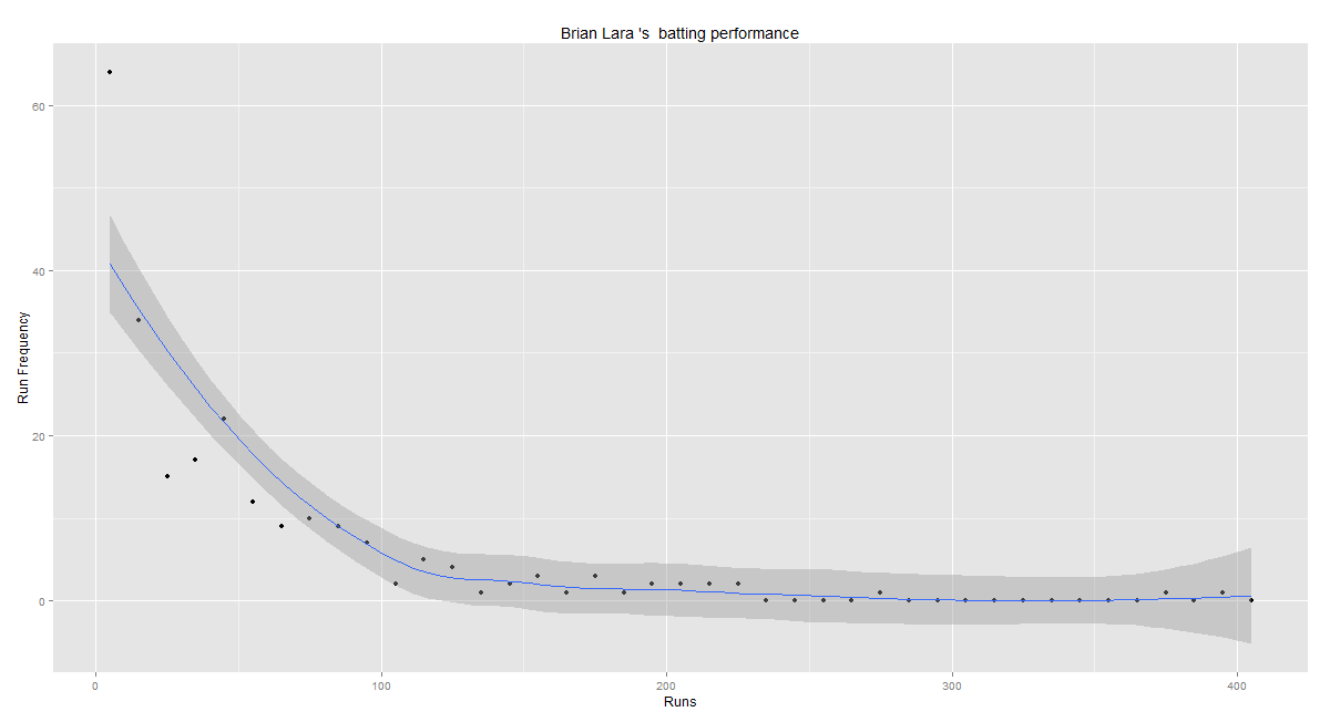
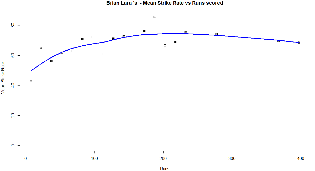
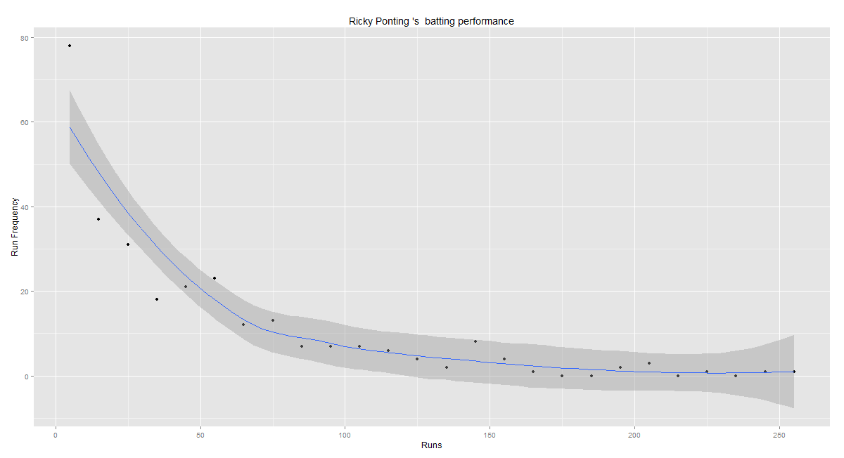
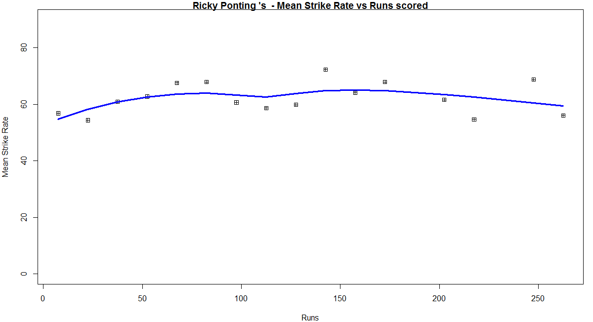
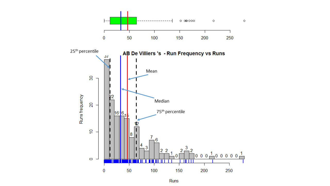
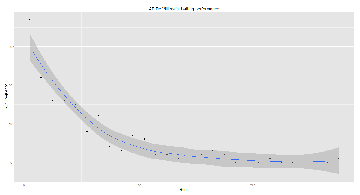
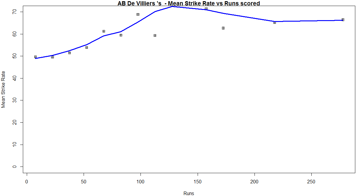
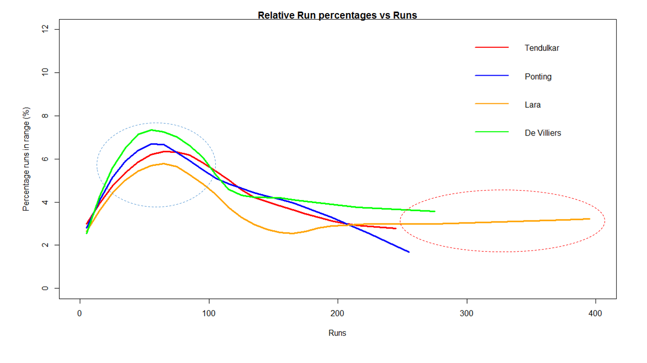
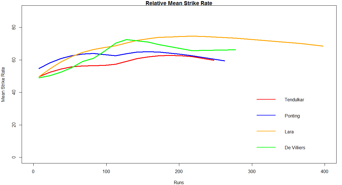
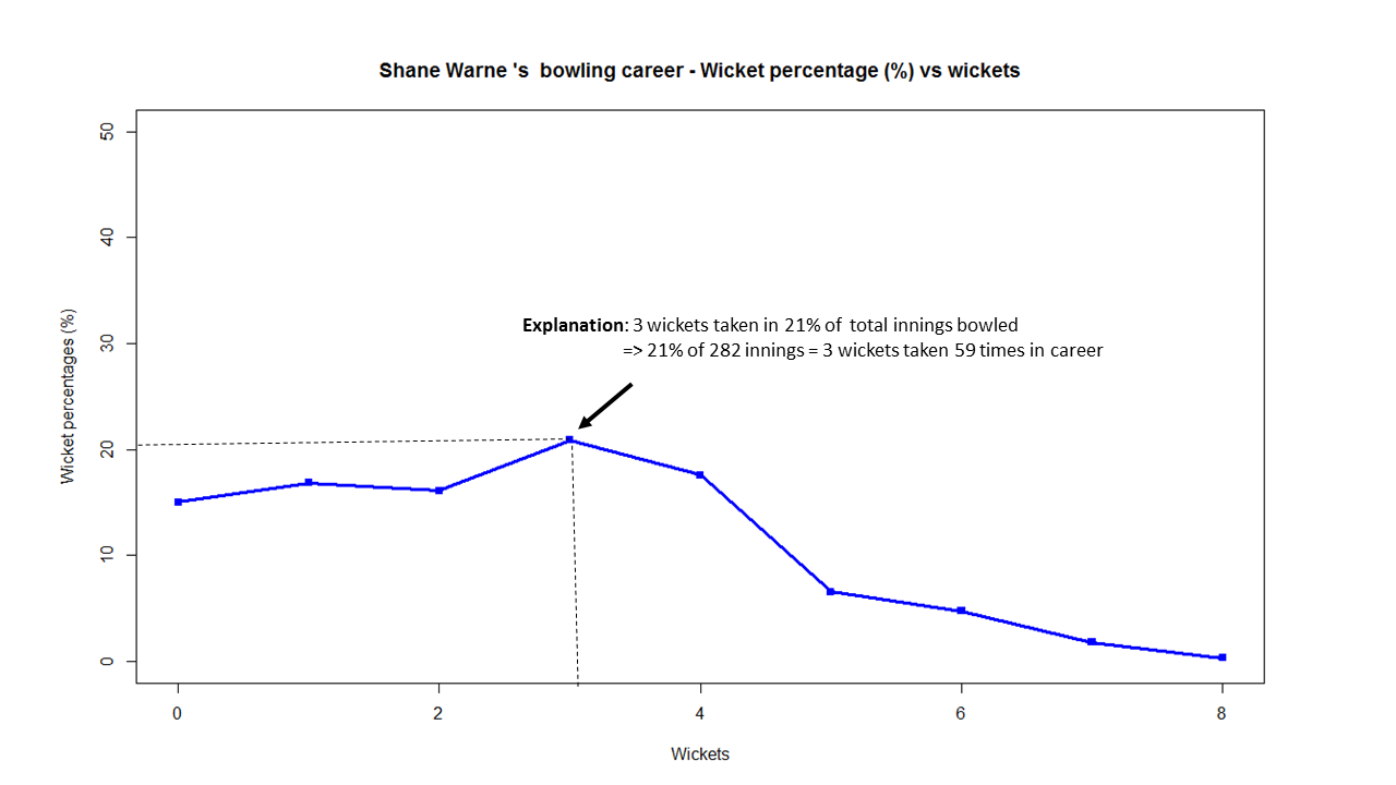
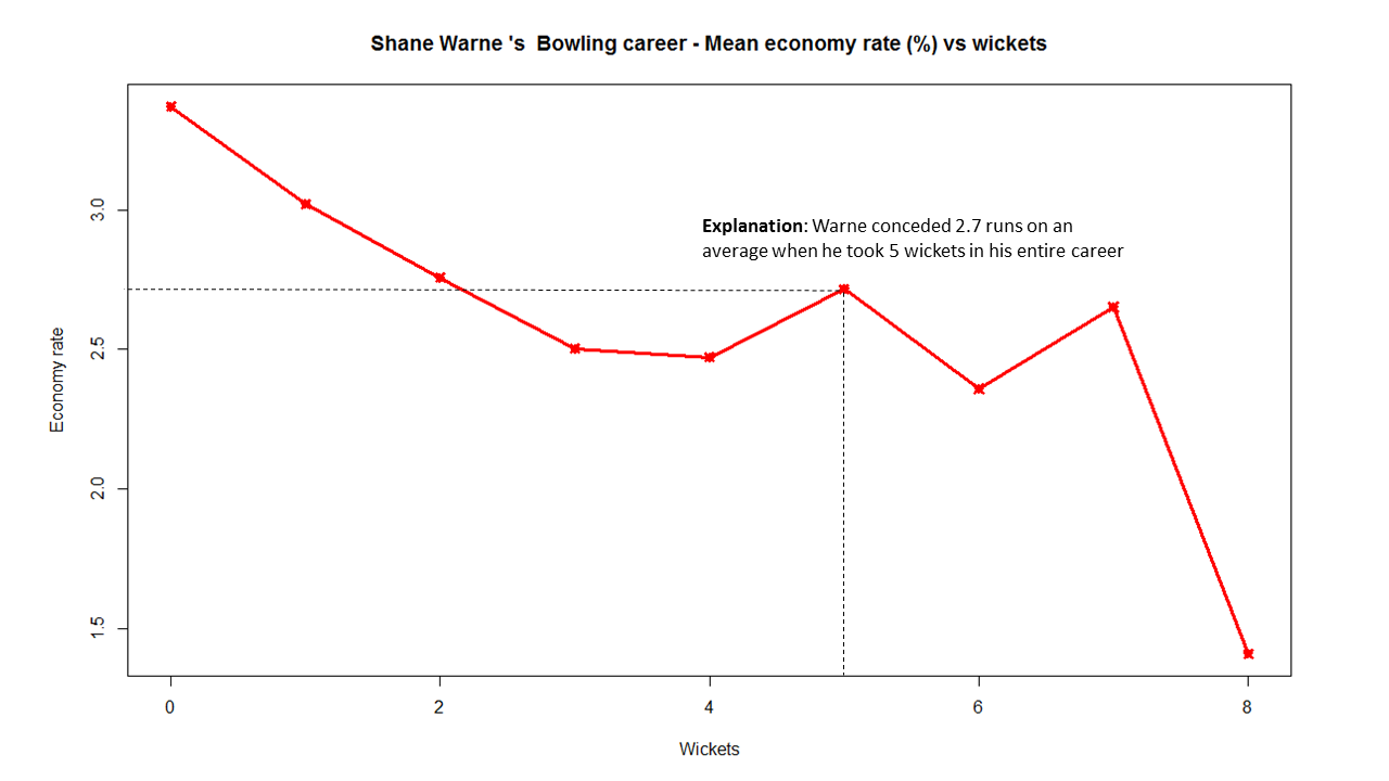
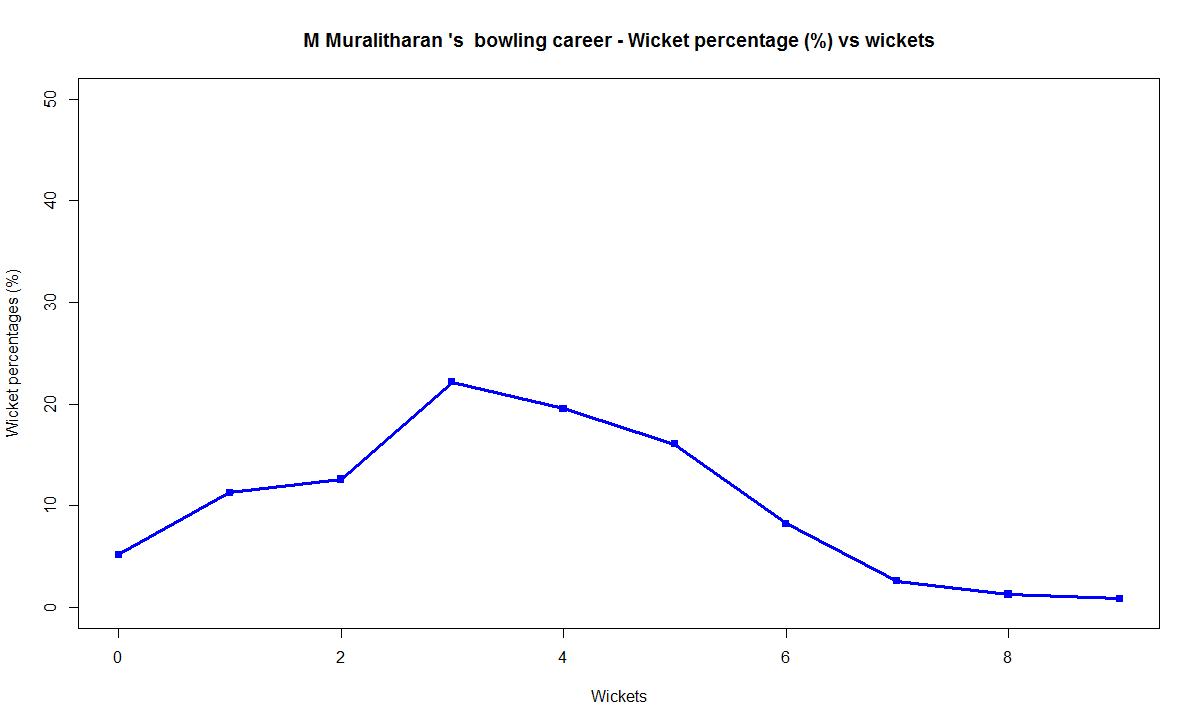
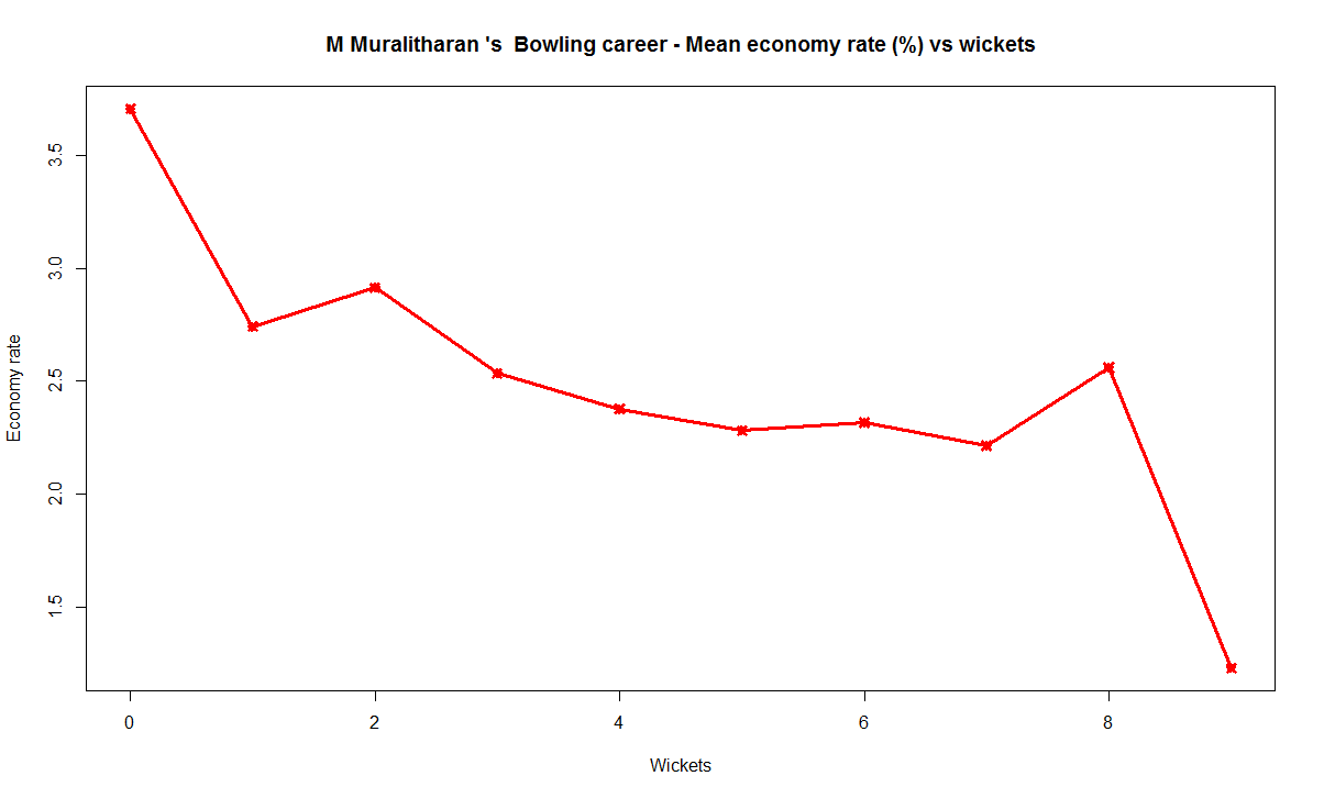
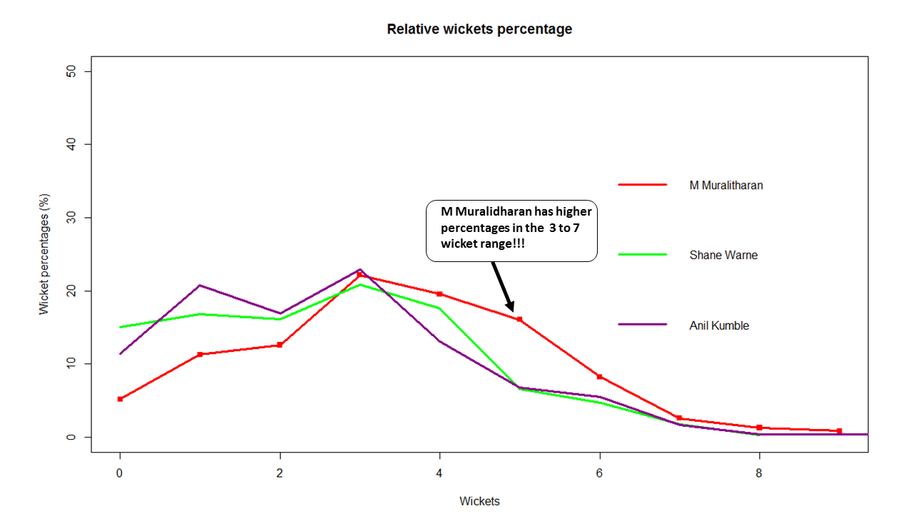
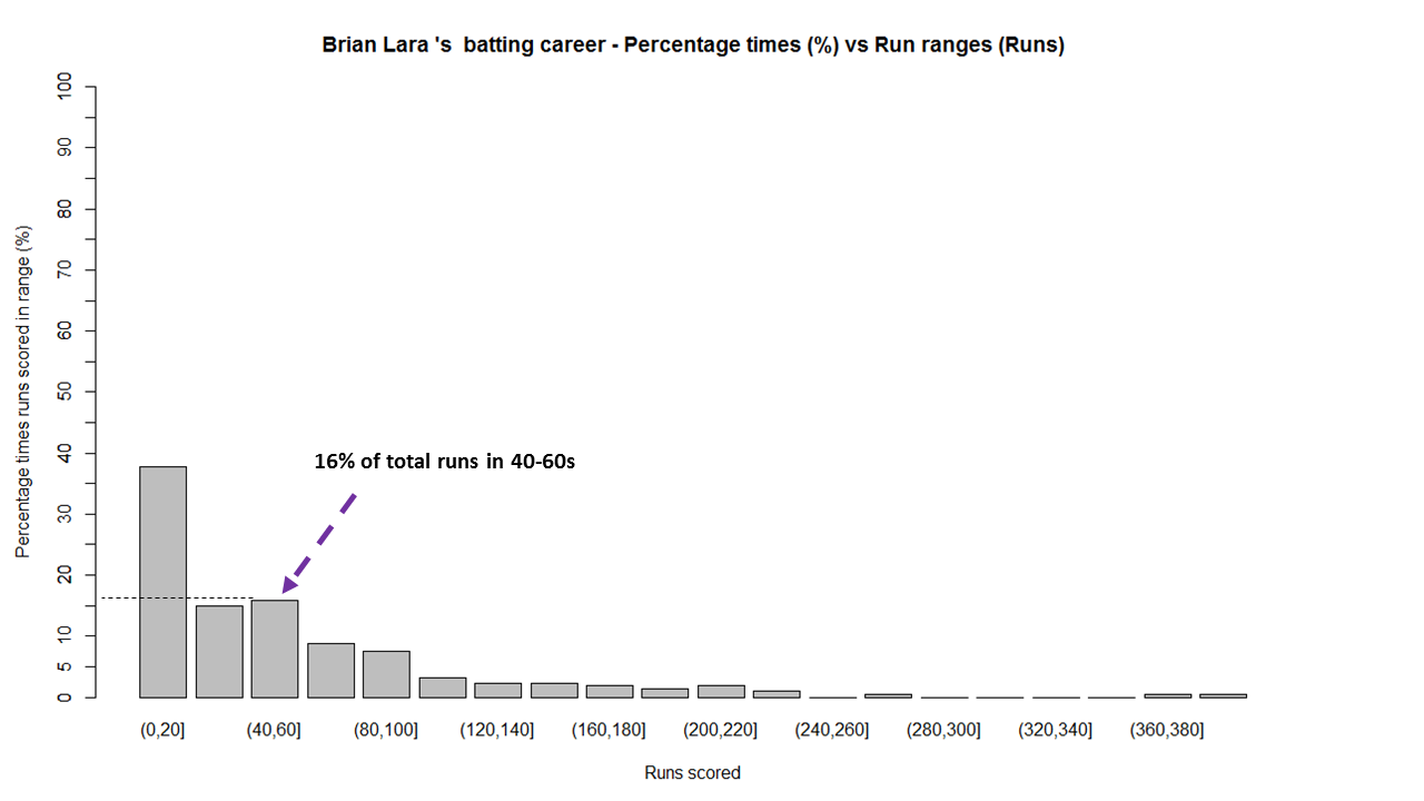
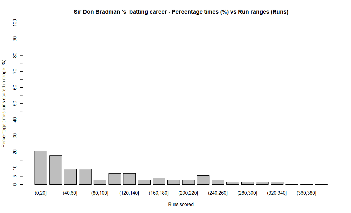
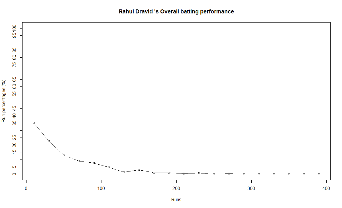
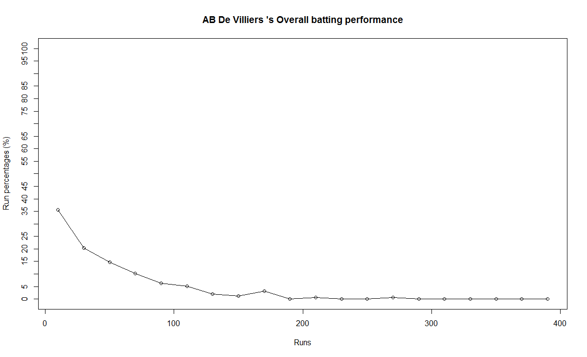
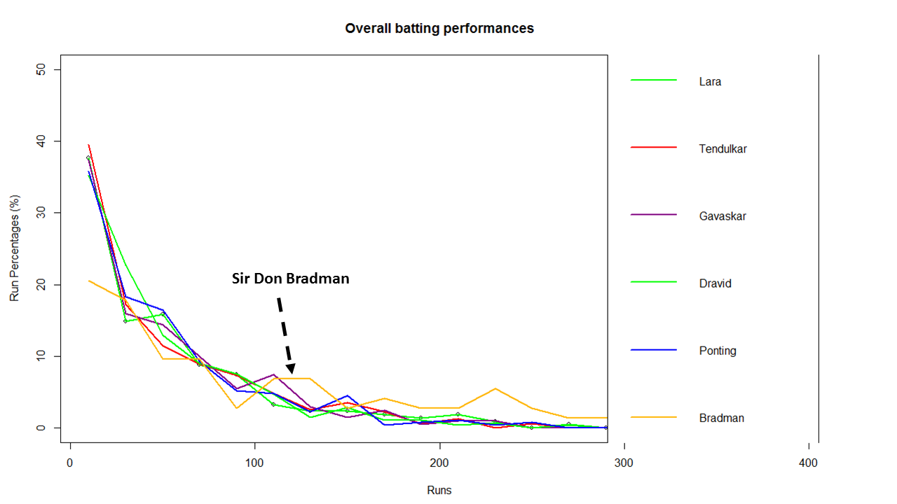
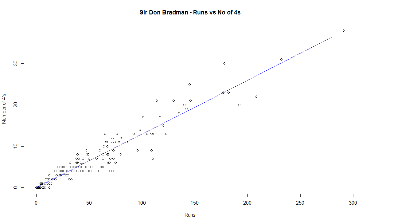
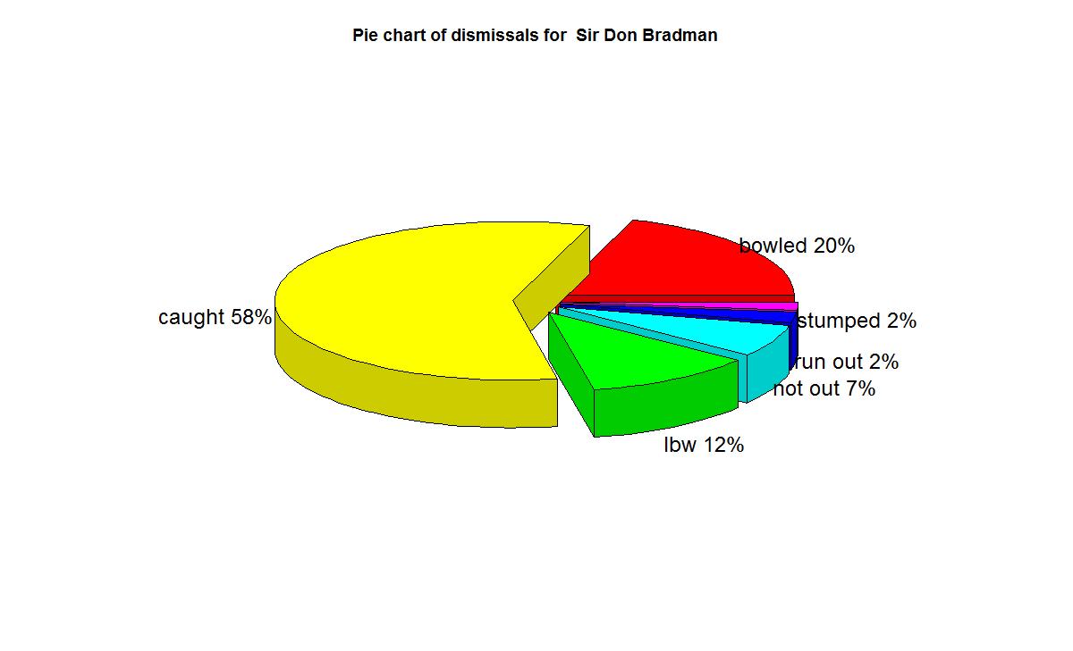
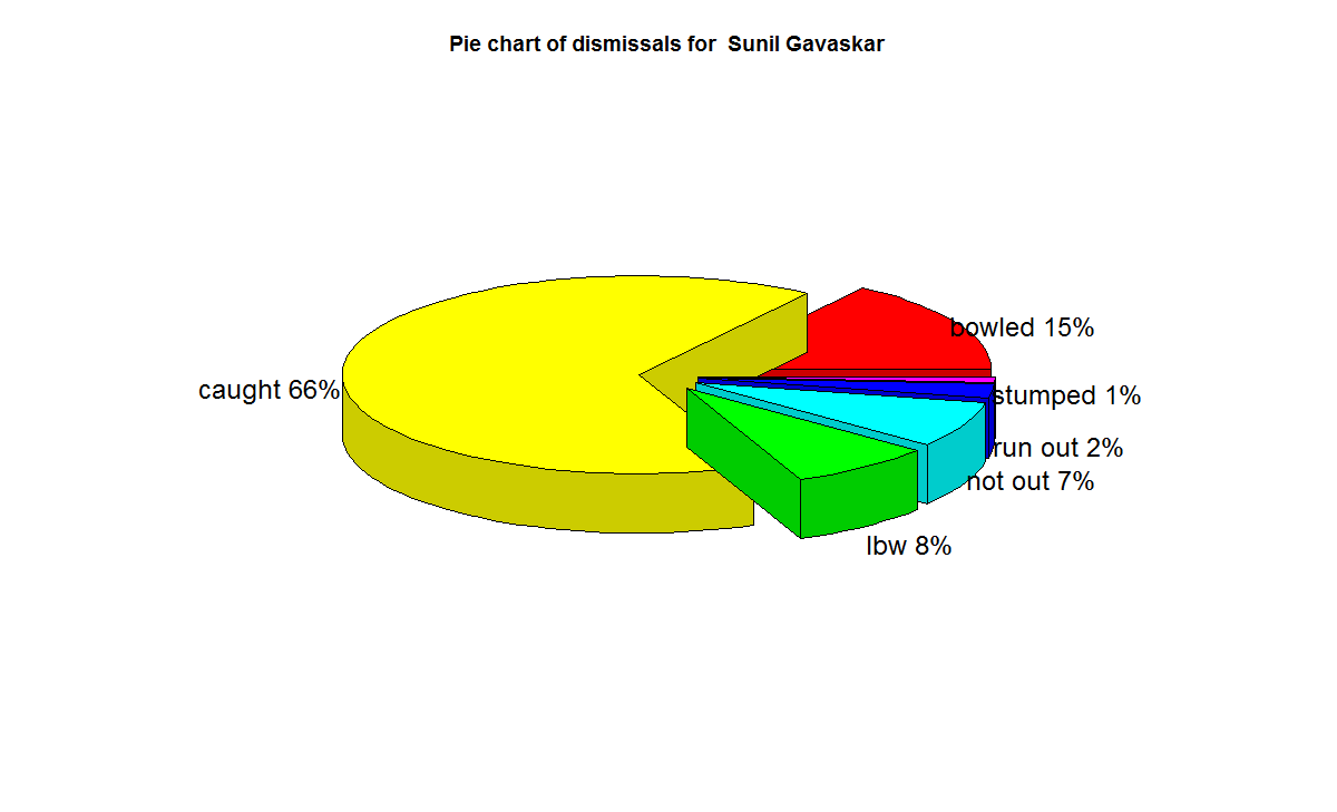
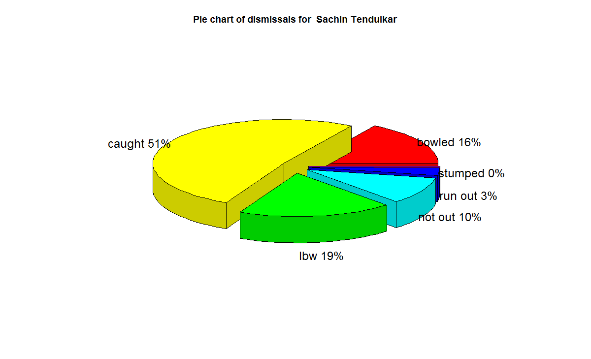
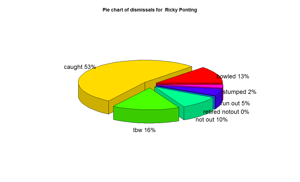
In this post, I use IBM’s DSE and my R package yorkr, for analyzing the performance of 1 ODI match (Aus-Ind, 2 Feb 2012)  and the batting performance of Virat Kohli in IPL matches. These are my ‘first’ steps in DSE so, I use plain old “R language” for analysis together with my R package ‘yorkr’. I intend to  do more interesting stuff on Machine learning with SparkR, Sparklyr and PySpark in the weeks and months to come.

You can checkout the Jupyter notebooks created with IBM’s DSE Y at Github  – “Using R package yorkr – A quick overview’ and  on NBviewer at “Using R package yorkr – A quick overview

Working with Jupyter notebooks are fairly straight forward which can handle code in R, Python and Scala. Each cell can either contain code (Python or Scala), Markdown text, NBConvert or Heading. The code is written into the cells and can be executed sequentially. Here is a screen shot of the notebook.

Untitled

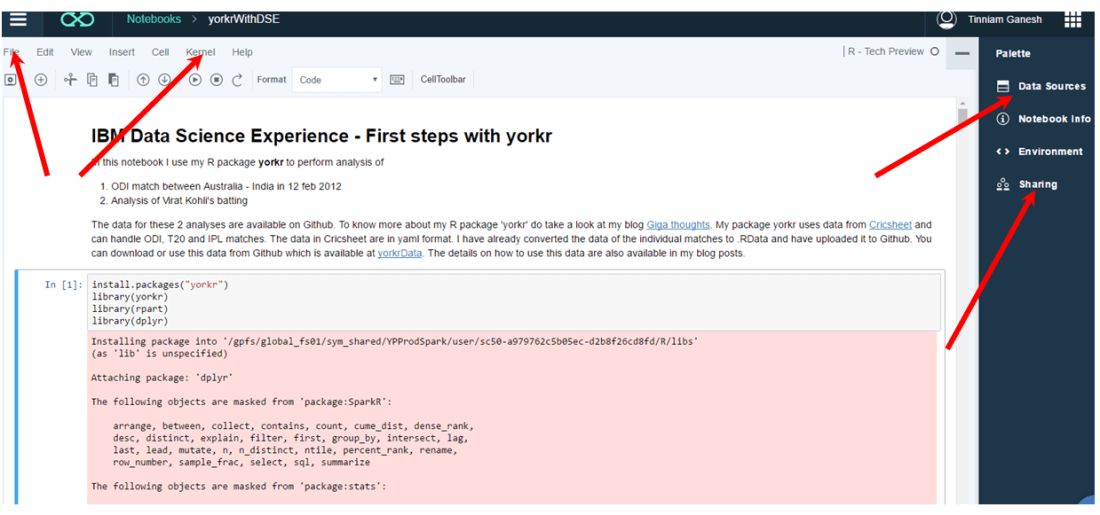
The ‘File’ menu can be used for ‘saving and checkpointing’ or ‘reverting’ to a checkpoint. The ‘kernel’ menu can be used to start, interrupt, restart and run all cells etc. Data Sources icon can be used to load data sources to your code. The data is uploaded to Object Storage with appropriate credentials. You will have to  import this data from Object Storage using the credentials. In my notebook with yorkr I directly load the data from Github.  You can use the sharing to share the notebook. The shared notebook has an extension ‘ipynb’. You can use the ‘Sharing’ icon  to share the notebook. The shared notebook has an extension ‘ipynb’. You an import this notebook directly into your environment and can get started with the code available in the notebook.

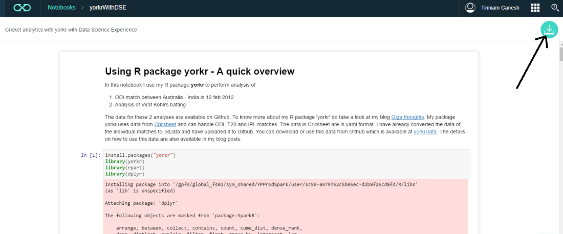
You can import existing R, Python or Scala notebooks as shown below. My notebook ‘Using R package yorkr – A quick overview’ can be downloaded using the link ‘yorkrWithDSE’ and clicking the green download icon on top right corner.

Untitled2

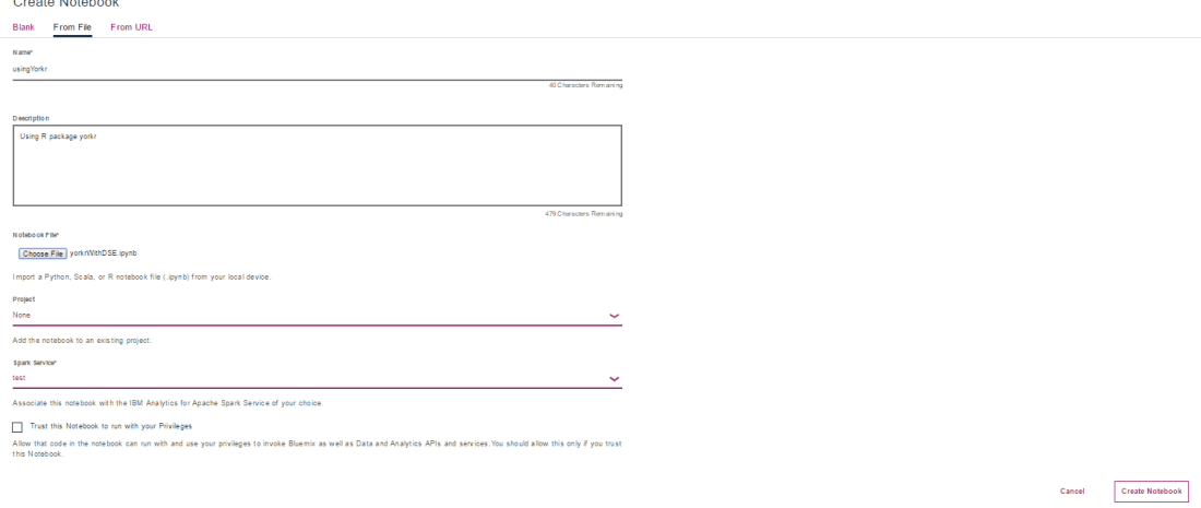
I have also uploaded the file to Github and you can download from here too ‘yorkrWithDSE’. This notebook can be imported into your DSE as shown below

Untitled1

Jupyter notebooks have been integrated with Github and are rendered directly from Github.  You can view my Jupyter notebook here  – “Using R package yorkr – A quick overview’. You can also view it on NBviewer at “Using R package yorkr – A quick overview

So there it is. You can download my notebook, import it into IBM’s Data Science Experience and then use data from ‘yorkrData” as shown. As already mentioned yorkrData contains converted data for ODIs, T20 and IPL. For details on how to use my R package yorkr  please my posts on yorkr at “Index of posts

Hope you have fun playing wit IBM’s Data Science Experience and my package yorkr.

I will be exploring IBM’s DSE in weeks and months to come in the areas of Machine Learning with SparkR,SparklyR or pySpark.

Watch this space!!!

Disclaimer: This article represents the author’s viewpoint only and doesn’t necessarily represent IBM’s positions, strategies or opinions

Also see

1. Introducing QCSimulator: A 5-qubit quantum computing simulator in R
2. Natural Processing Language : What would Shakespeare say?
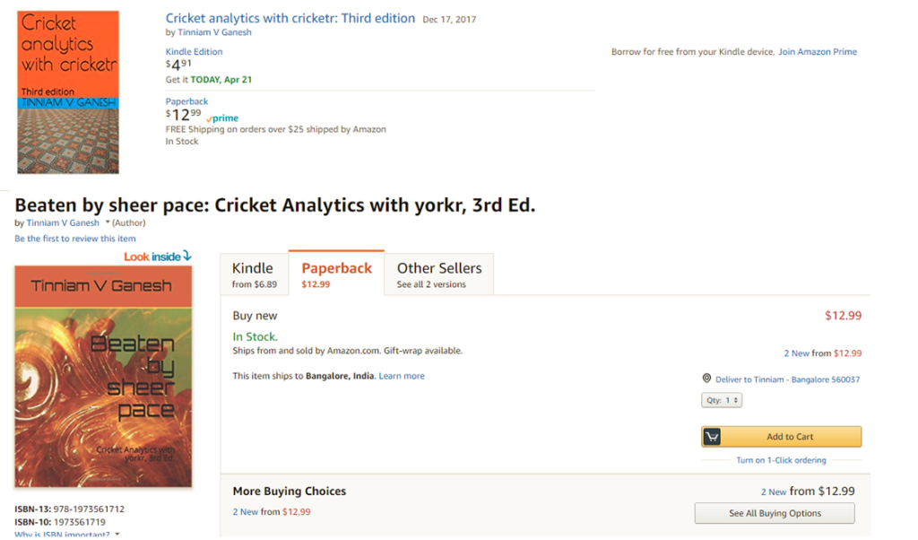
3. Introducing cricket package yorkr:Part 1- Beaten by sheer pace!
4. A closer look at “Robot horse on a Trot! in Android”
5.  Re-introducing cricketr! : An R package to analyze performances of cricketers
6.   What’s up Watson? Using IBM Watson’s QAAPI with Bluemix, NodeExpress – Part 1
7.  Deblurring with OpenCV: Wiener filter reloaded

To see all my posts check
Index of posts

A short video tutorial on my R package cricketr

Take a look at my short video presentation my R package cricketr

Also see
1. Sixer – R package cricketr’s new Shiny Avatar
2. Literacy in India : A deepR dive.
3.  Natural Language Processing: What would Shakespeare say?
4. Revisiting crimes against women in India
5. Dabbling with Weiner filter with OpenCV
6.  A method to crowd source pothole marking on (Indian) Roads.
7.  My presentation on ‘Internet of Things’ at TEDxBNMIT
8.  TSW-4: Gossip protocol- Epidemics and rumors to the rescue
9.  The common alphabet of programming languages

Important note: Do check out my other posts using cricketr at cricketr-posts

If you are passionate about cricket, and love analyzing cricket performances, then check out my racy book on cricket ‘Cricket analytics with cricketr and cricpy – Analytics harmony with R & Python’! This book discusses and shows how to use my R package ‘cricketr’ and my Python package ‘cricpy’ to analyze batsmen and bowlers in all formats of the game (Test, ODI and T20). The paperback is available on Amazon at $21.99 and  the kindle version at $9.99/Rs 449/-. A must read for any cricket lover! Check it out!!

Untitled


Important note 1: The latest release of ‘cricketr’ now includes the ability to analyze performances of teams now!!  See Cricketr adds team analytics to its repertoire!!!

Important note 2 : Cricketr can now do a more fine-grained analysis of players, see Cricketr learns new tricks : Performs fine-grained analysis of players

Important note 3: Do check out the python avatar of cricketr, ‘cricpy’ in my post ‘Introducing cricpy:A python package to analyze performances of cricketers

Sixer – R package cricketr’s new Shiny avatar

Published in R-bloggers: Sixer – R package cricketr’s new Shiny app

In this post I create a Shiny App, Sixer, based on my R package cricketr. I had developed the R package cricketr, a few months back for analyzing the performances of batsman and bowlers in all formats of the game (Test, ODI and Twenty 20). This package uses the statistics info available in ESPN Cricinfo Statsguru. I had written a series of posts using the cricketr package where I chose a few batsmen, bowlers and compared their performances of these players. Here I have created a complete Shiny app with a lot more players and with almost all the features of the cricketr package. The motivation for creating the Shiny app was to

  • To show case the  ‘cricketr’ package and to highlight its functionalities
  • Perform analysis of more batsman and bowlers
  • Allow users to interact with the package and to allow them to try out the different features and functions of the package and to also check performances of some of their favorite crickets

If you are passionate about cricket, and love analyzing cricket performances, then check out my racy book on cricket ‘Cricket analytics with cricketr and cricpy – Analytics harmony with R & Python’! This book discusses and shows how to use my R package ‘cricketr’ and my Python package ‘cricpy’ to analyze batsmen and bowlers in all formats of the game (Test, ODI and T20). The paperback is available on Amazon at $21.99 and  the kindle version at $9.99/Rs 449/-. A must read for any cricket lover! Check it out!!

Untitled


$4.99/Rs 320 and $6.99/Rs448 respectively

Important note 1: The latest release of ‘cricketr’ now includes the ability to analyze performances of teams now!!  See Cricketr adds team analytics to its repertoire!!!

Important note 2 : Cricketr can now do a more fine-grained analysis of players, see Cricketr learns new tricks : Performs fine-grained analysis of players

Important note 3: Do check out the python avatar of cricketr, ‘cricpy’ in my post ‘Introducing cricpy:A python package to analyze performances of cricketers

a) You can try out the interactive  Shiny app Sixer at – Sixer
b) The code for this Shiny app project can be cloned/forked from GitHub – Sixer
Note: Please be mindful of  ESPN Cricinfo Terms of Use.
(Take a look at my short video tutorial on my R package cricketr on Youtube – R package cricketr – A short tutorial)

Important note: Do check out my other posts using cricketr at cricketr-posts

In this Shiny app I have 5 tabs which perform the following function
1.  Analyze Batsman
This tab analyzes batsmen based on different functions and plots the performances of the selected batsman. There are functions that compute and display batsman’s run-frequency ranges, Mean Strike rate, No of 4’s, dismissals, 3-D plot of Runs scored vs Balls Faced and Minutes at crease, Contribution to wins & losses, Home-Away record etc. The analyses can be done for Test cricketers, ODI and Twenty 20 batsman. I have included most of the Test batting giants including Tendulkar, Dravid, Sir Don Bradman, Viv Richards, Lara, Ponting etc. Similarly the ODI list includes Sehwag, Devilliers, Afridi, Maxwell etc. The Twenty20 list includes the Top 10 Twenty20 batsman based on their ICC rankings

2. Analyze bowler
This tab analyzes the bowling performances of bowlers, Wickets percentages, Mean Economy Rate, Wickets at different venues, Moving average of wickets etc. As earlier I have all the Top bowlers including Warne, Muralidharan, Kumble- the famed Indian spin quartet of Bedi, Chandrasekhar, Prasanna, Venkatraghavan, the deadly West Indies trio of Marshal, Roberts and Holding and the lethal combination of Imran Khan, Wasim Akram and Waqar Younis besides the dangerous Dennis Lillee and Jeff Thomson. Do give the functions a try and see for yourself the performances of these individual bowlers

3. Relative performances of batsman
This tab allows the selection of multiple batsmen (Test, ODI and Twenty 20) for comparisons. There are 2 main functions Relative Runs Frequency performance and Relative Mean Strike Rate

4. Relative performances of bowlers
Here we can compare bowling performances of multiple bowlers, which include functions Relative Bowling Performance and Relative Economy Rate. This can be done for Test, ODI and Twenty20 formats

5. Check for In-Form status of players
This tab checks the form status of batsman or bowler selected for all of the different formats of the game. The below computation uses Null Hypothesis testing and p-value to determine if the batsman is in-form or out-of-form. For this 90% of the career runs is chosen as the population and the mean computed. The last 10% is chosen to be the sample set and the sample Mean and the sample Standard Deviation are calculated. Note: The accuracy of the p-value test depends on the size of the population and the size of the sample set. It  may not be very significant for players with a few innings played.

Some of my earlier posts based my R package cricketr are listed below
1. Introducing cricketr!: An R package for analyzing performances of cricketers
2. Taking cricketr for a spin – Part 1
3. cricketr plays the ODIs
4. cricketr adapts to the Twenty20 International
5. cricketr digs the Ashes

Do try out the interactive Sixer Shiny app – Sixer
You can clone the code from Github – Sixer

There is not much in way of explanation. The Shiny app’s use is self-explanatory. You can choose a match type ( Test,ODI or Twenty20), choose a batsman/bowler  from the drop down list and select the plot you would like to seeHere a few sample plots
A. Analyze batsman tab
i) Batsman – Brian Lara , Match Type – Test, Function – Mean Strike Rate
sxr-1ii) Batsman – Shahid Afridi, Match Type –  ODI, Function – Runs vs Balls faced
The plot below shows that if Afridi faces around 50 balls he is likely to score around 60 runs in ODIs.
sxr-2iii)   Batsman – Chris Gayle, Match Type – Twenty20  Function – Moving Average
sxr-3B. Analyze bowler tab

i. Bowler – B S Chandrasekhar, Match Type – Test, Function – Wickets vs Runs
sxr-4ii)  Bowler – Malcolm Marshall, Match Type – Test, Function – Mean Economy Ratesxr-5iii)  Bowler – Sunil Narine, Match Type – Twenty 20, Function – Bowler Wicket Rate
sxr-6
C. Relative performance of batsman (you can select more than 1)
The below plot gives the Mean Strike Rate of batsman. Viv Richards, Brian Lara, Sanath Jayasuriya and David Warner are best strikers of the ball.
sxr-7

Here are some of the great strikers of the ball in ODIs
sxr-8D. Relative performance of bowlers (you can select more than 1)
Finally a look at the famed Indian spin quartet.  From the plot below it can be seen that  B S Bedi  & Venkatraghavan were more economical than Chandrasekhar and Prasanna.
sxr-9

But the latter have a better 4-5 wicket haul than the former two as seen in the plot below

sxr-11Finally a look at the average number of balls to take a wicket by the Top 4 Twenty 20 bowlers.
sxr-10

E. Check for In-form status of players
Note: The accuracy of the p-value depends on the size of the population and the size of the sample set. It  may not be very significant for smaller data sizes

i. Match Type – Test,  Player Type – Batsman  Name – Wickets v
In this plot the in-form status of Viv Richards is checked. This shows that Viv Richards was out-of-form
sxr-12In the plot below the form status of S. Venkataraghavan is shown. According to this at the time of  his retirement S Venkat was still in-form
sxr-13

Do give the Shiny app Sixer a try.

Also see
1. Literacy in India : A deepR dive.
2.  Natural Language Processing: What would Shakespeare say?
3. Revisiting crimes against women in India
4. Informed choices through Machine Learning : Analyzing Kohli, Tendulkar and Dravid
5. Experiments with deblurring using OpenCV
6.  What’s up Watson? Using IBM Watson’s QAAPI with Bluemix, NodeExpress – Part 1
7.  Working with Node.js and PostgreSQL
8. A method for optimal bandwidth usage by auctioning available bandwidth using the OpenFlow Protocol
9.  Latency, throughput implications for the cloud
10.  A closer look at “Robot horse on a Trot! in Android”

Literacy in India – A deepR dive

Published in R-bloggers: Literacy in India – A deepR dive
You can do magic!
You can have anything,
That you desire
Magic…
You can do magic – song by America (1982)

That is exactly how I feel when I write code in R. A few lines of R, lo behold, hundreds of rows and columns are magically transformed into  easily understandable graphs, regression curves or choropleth maps. (By the way, the song is a really cool! Listen to it if you have not heard it before). You really can do magic with R

In this post I do a deep dive into literacy in India The dataset is taken from Open Government Data (OGD) platform India was used for this purpose. This data is based on the 2001 census. Though the data is a little dated, it is extremely rich with literacy details across different age groups, and over all Indian States. The data includes the total number of persons/males/females who are in the primary, middle.matric, college,technical diploma, non-technical diploma and so on. In fact the data also includes the educational background of people in the districts in each state. I slice and dice the data across multiple parameters. I have created an interactive Shiny App which will provide very detailed visualization based on the parameters chosen

Do try out my interactive Shiny app : IndiaLiteracy

The entire code for this app is on GitHub. Feel free to download/clone/fork/modify or enhance the code – IndiaLiteracy

For analyzing   such a rich data set as the Census data of 2001, I create 4 tabs
1) State Literacy
2) Educational Levels vs Age
3) India Literacy and
4) District Literacy

Here are the details of these 4 tabs in my Shiny app

A) State Literacy
This tab provides the age wise distribution of people (Persons/Males/Females) who attend educational institutions. This is shown as a barplot. The plot also includes the national average. In the plot below which is for entire India we see that the national average

1

The distribution of females attending primary school in the state of Haryana is shown. Also included is the national average. As can be seen there are options for (Total/Urban/Rural) against (Persons/Males/Females) and whether these people attend educational institutions are illiterate of literate.

2

I also have another option under “Who’ which is “All” This will plot the age wise distribution of males/females/persons in urban/rural or entire state.

3

B. Educational Institutions vs Age plot

This plot displays the the educational institutions attended by people in a particular age group. So for example in the state of Orissa for the 18 year age group we can see that there persons who are in (Primary, Matric, Higher Secondary, Non-Technical Diploma and Technical Diploma). The bar length for each color is the percentage of the total persons at that level of education

4

C. Literacy across India
This tab plots a chorpleth map for a region(Urban+Rural, Urban, Rural), Who(Persons, Males, Females) and the literacy level (attending educational institutions, primary, higher secondary, Matric etc) across the whole of India.

6

D. Literacy within a state
This tab plots a chorpleth map of literacy in the districts of a state. A sample plot for Karnataka is shown below

7

E. Key observations

There is a wealth of insights you can glean by looking at the various charts. Here a few insights from my initial observations
1) The literacy in Kerala across ages is higher than the national average while in Bihar it is less than the national average

a) Kerala

8b) Bihar

9
2) In Rajasthan The Males Attending education instituions is higher than the national average while for females it less than the national average. However the situation is reverse in Chandigarh where there are the percentage of females attending education instiuons is higher than the national average and the males

a) Rajasthan

10b) Chandigarh

11
3) When we look at the number of persons attending educational institution across India the north-eastern states lead with Manipur, Nagaland and Sikkim in the top 3.

12

We have heard that Kerala is the most literate state. But  it looks like Manipur, Nagaland, Sikkim actually edge Kerala out. If we look at the State literacy chart for Kerala and Manipur this becomes more clear

a) Kerala

13

b) Manipur

14

It can be seen that in Manipur the number of persons attending educational instition in the age range 13-24 years it is much higher than the national average and much higher than Kerala

4) If we take a look at the District wise literacy for the state of Bihar we see that the literacy is lower in the north eastern districts.,

15

5) Here is another interesting observation I made. The top 3 states which are most ‘literate with no education’ are i) Rajasthan ii) Madhya Pradesh iii) Chhattisgarh

16

While I have included several charts with accompanying explanation, this is largely unnecessary as  most of the charts are self-explanatory.

Do try out the Shiny app and see for yourself the literacy in each state/district/age group educational  level etc –IndiaLiteracy

Feel free to clone/fork my code and make your own enhancements –IndiaLiteracy

You may also like
1.  Natural Language Processing: What would Shakespeare say?
2. Introducing cricketr! : An R package to analyze performances of cricketers
3. Revisiting crimes against women in India
4. Informed choices through Machine Learning : Analyzing Kohli, Tendulkar and Dravid
5. Re-working the Lucy-Richardson Algorithm in OpenCV
6.  What’s up Watson? Using IBM Watson’s QAAPI with Bluemix, NodeExpress – Part 1
7.  Bend it like Bluemix, MongoDB with autoscaling – Part 2
8. TWS-4: Gossip protocol: Epidemics and rumors to the rescue
9. Thinking Web Scale (TWS-3): Map-Reduce – Bring compute to data
10.  Simulating an Edge Shape in Android

Mirror, mirror … the best batsman of them all?

“Full many a gem of purest serene
The dark oceans of cave bear.”
Thomas Gray – Elegy in country churchyard

In this post I do a fine grained analysis of the batting performances of cricketing icons from India and also from the international scene to determine how they stack up against each other.  I perform 2 separate analyses 1) Between Indian legends (Sunil Gavaskar, Sachin Tendulkar & Rahul Dravid) and another 2) Between contemporary cricketing stars (Brian Lara, Sachin Tendulkar, Ricky Ponting and A B De Villiers)

In the world and more so in India, Tendulkar is probably placed on a higher pedestal than all other cricketers. I was curious to know how much of this adulation is justified. In “Zen and the art of motorcycle maintenance” Robert Pirsig mentions that while we cannot define Quality (in a book, music or painting) we usually know it when we see it. So do the people see an ineffable quality in Tendulkar or are they intuiting his greatness based on overall averages?

In this context, we need to keep in mind the warning that Daniel Kahnemann highlights in his book, ‘Thinking fast and slow’. Kahnemann suggests that we should regard “statistical intuition with proper suspicion and replace impression formation by computation wherever possible”. This is because our minds usually detects patterns and associations  even when none actually exist.

So this analysis tries to look deeper into these aspects by performing a detailed statistical analysis.

The data for all the batsman has been taken from ESPN Cricinfo. The data is then cleaned to remove ‘DNB’ (did not bat), ‘TDNB’ (Team did not bat) etc before generating the graphs.

The code, data and the plots can be cloned,forked from Github at the following link bestBatsman. You should be able to use the code as-is for any other batsman you choose to.

Feel free to agree, disagree, dispute or argue with my analysis.

If you are passionate about cricket, and love analyzing cricket performances, then check out my 2 racy books on cricket! In my books, I perform detailed yet compact analysis of performances of both batsmen, bowlers besides evaluating team & match performances in Tests , ODIs, T20s & IPL. You can buy my books on cricket from Amazon at $12.99 for the paperback and $4.99/$6.99 respectively for the kindle versions. The books can be accessed at Cricket analytics with cricketr  and Beaten by sheer pace-Cricket analytics with yorkr  A must read for any cricket lover! Check it out!!

1


Important note: Do check out the python avatar of cricketr, ‘cricpy’ in my post ‘Introducing cricpy:A python package to analyze performances of cricketers

The batting performances of the each of the cricketers is described in 3 plots a) Combined boxplot & histogram b) Runs frequency vs Runs plot c) Mean Strike Rate vs Runs plot

A) Batting performance of Sachin Tendulkar

a) Combined Boxplot and histogram of runs scored
srt-boxhist1

The above graph is combined boxplot and a histogram. The boxplot at the top shows the 1st quantile (25th percentile) which is the left side of the green rectangle, the 3rd quantile( 75% percentile) right side of the green rectangle and the mean and the median. These values are also shown in the histogram below. The histogram gives the frequency of Runs scored in the given range for e.g (0-10, 11-20, 21-30 etc) for Tendulkar

b) Batting performance – Runs frequency vs Runs
srt-perf

The graph above plots the  best fitting curve for Runs scored in the frequency ranges.

c) Mean Strike Rate vs Runs
srt-sr

This plot computes the Mean Strike Rate for each interval for e.g if between the ranges 11-21 the Strike Rates were 40.5, 48.5, 32.7, 56.8 then the average of these values is computed for the range 11-21 = (40.5 + 48.5 + 32.7 + 56.8)/4. This is done for all ranges and the Mean Strike Rate in each range is plotted and the loess curve is fitted for this data.

B) Batting performance of Rahul Dravid
a) Combined Boxplot and histogram of runs scored
dravid-boxhist1

The mean, median, the 25th and 75 th percentiles for the runs scored by Rahul Dravid are shown above

b) Batting performance – Runs frequency vs Runs
dravid-perf

c) Mean Strike Rate vs Runs
dravid-sr

C) Batting performance of Sunil Gavaskar
a) Combined Boxplot and histogram of runs scored
gavaskar-boxhist1

The mean, median, the 25th and 75 th percentiles for the runs scored by Sunil Gavaskar are shown above
b) Batting performance – Runs frequency vs Runs
gavaskar-perf

c) Mean Strike Rate vs Runs
gavaskar-sr
D) Relative performances of Tendulkar, Dravid and Gavaskar
relative-perf1

The above plot computes the percentage of the total career runs scored in a given range for each of the batsman.
For e.g if Dravid scored the runs 23, 22, 28, 21, 25 in the range 21-30 then the
Range 21 – 20 => percentageRuns = ( 23 + 22 + 28 + 21 + 25)/ Total runs in career * 100
The above plot shows that Rahul Dravid’s has a higher contribution in the range 20-70 while Tendulkar has a larger percentahe in the range 150-230

E) Relative Strike Rates of Tendulkar, Dravid and Gavaskar
relative-SR

With respect to the Mean Strike Rate Tendulkar is clearly superior to both Gavaskar & Dravid

F) Analysis of Tendulkar, Dravid and Gavaskar
rel-perf1

The above table captures the the career details of each of the batsman
The following points can be noted
1) The ‘number of innings’ is the data you get after removing rows with DNB, TDNB etc
2) Tendulkar has the higher average 48.39 > Gavaskar (47.3) > Dravid (46.46)
3) The skew of  Dravid (1.67) is greater which implies that there the runs scored are more skewed to right (greater runs) in comparison to mean

G) Batting performance of Brian Lara
a) Combined Boxplot and histogram of runs scored
lara-boxhist1
The mean, median, 1st and 3rd quartile are shown above

b) Batting performance – Runs frequency vs Runs
lara-perf

c) Mean Strike Rate vs Runs
lara-sr

H) Batting performance of Ricky Ponting
a) Combined Boxplot and histogram of runs scored
ponting-boxhist1

b) Batting performance – Runs frequency vs Runs
ponting-perf

c) Mean Strike Rate vs Runs
ponting-SR

I) Batting performance of AB De Villiers
a) Combined Boxplot and histogram of runs scored
devilliers-boxhist1

b) Batting performance – Runs frequency vs Runs
devillier-perf

c) Mean Strike Rate vs Runs
devilliers-SR

J) Relative performances of Tendulkar, Lara, Ponting and De Villiers
relative-perf-intl1

Clearly De Villiers is ahead in the percentage Runs scores in the range 30-80. Tendulkar is better in the range between 80-120. Lara’s career has a long tail.

K) Relative Strike Rates of Tendulkar, Lara, Ponting and De Villiers
relative-SR-intl

The Mean Strike Rate of Lara is ahead of the lot, followed by De Villiers, Ponting and then Tendulkar
L) Analysis of Tendulkar, Lara, Ponting and De Villiers
rel-perf-intl1
The following can be observed from the above table
1) Brian Lara has the highest average (51.52) > Sachin Tendulkar (48.39 > Ricky Ponting (46.61) > AB De Villiers (46.55)
2) Brian Lara also the highest skew which means that the data is more skewed to the right of the mean than the others

You can clone the code rom Github at the following link bestBatsman. You should be able to use the code as-is for any other batsman you choose to.

Also see
1. Informed choices through Machine Learning : Analyzing Kohli, Tendulkar and Dravid
2. Informed choices through Machine Learning-2: Pitting together Kumble, Kapil, Chandra
3. Analyzing cricket’s batting legends – Through the mirage with R
4. Masters of spin – Unraveling the web with R

You may also like
1. A peek into literacy in India:Statistical learning with R
2. A crime map of India in R: Crimes against women
3.  What’s up Watson? Using IBM Watson’s QAAPI with Bluemix, NodeExpress – Part 1
4.  Bend it like Bluemix, MongoDB with autoscaling – Part 2

Masters of Spin: Unraveling the web with R

Here is a look at some of the masters of spin bowling in cricket. Specifically this post analyzes 3 giants of spin bowling in recent times, namely Shane Warne of Australia, Muthiah Muralitharan of Sri Lanka and our very own Anil Kumble of India.  As to “who is the best leggie” has been a hot topic in cricket in recent years.  As in my earlier post “Analyzing cricket’s batting legends: Through the mirage with R”, I was not interested in gross statistics like most wickets taken.

In this post I try to analyze how each bowler has performed over his entire test career. All bowlers have bowled around ~240 innings. All  other things being equal, it does take a sense to look a little deeper into what their performance numbers reveal about them. As in my earlier posts the data has been taken from ESPN CricInfo’s Statguru

If you are passionate about cricket, and love analyzing cricket performances, then check out my 2 racy books on cricket! In my books, I perform detailed yet compact analysis of performances of both batsmen, bowlers besides evaluating team & match performances in Tests , ODIs, T20s & IPL. You can buy my books on cricket from Amazon at $12.99 for the paperback and $4.99/$6.99 respectively for the kindle versions. The books can be accessed at Cricket analytics with cricketr  and Beaten by sheer pace-Cricket analytics with yorkr  A must read for any cricket lover! Check it out!!

1

acks), and $4.99/Rs 320 and $6.99/Rs448 respectively

Important note: Do check out the python avatar of cricketr, ‘cricpy’ in my post ‘Introducing cricpy:A python package to analyze performances of cricketers

I have chosen these 3 spinners for the following reasons

Shane Warne : Clearly a deadly spinner who can turn the ball at absurd angles
Muthiah Muralitharan : While controversy dogged Muralitharan he was virtually unplayable on many cricketing venues
Anil Kumble: A master spinner whose chess like strategy usually outwitted the best of batsmen.

The King of Spin according to my analysis below is clearly Muthiah Muralitharan. This is clearly shown in the final charts where the performances of bowlers are plotted on a single graph. Muralitharan is clearly a much more lethal bowler and has a higher strike rate. In addition Muralitharan has the lowest mean economy rate amongst the 3 for wickets in the range 3 to 7.  Feel free to add your own thoughts, comments and dissent.

The code for this implementation is available at GitHub at mastersOfSpin. Feel free to clone,fork or hack the code to your own needs. You should be able to use the code as-is on other bowlers with little or no modification

So here goes

Wickets frequency percentage vs Wickets plot
For this plot I determine how frequently the bowler takes ‘n’ wickets in his career and calculate the percentage over his entire career.  In other words this is done as follows in R

# Create a table of Wickets vs the frequency of the wickts
colnames(wktsDF) # Calculate wickets percentage
wktsDF$freqPercent

and plot this as a graph.

This is shown for Warne below
1) Shane Warne –  Wickets Frequency percentage vs Wickets plot

warne-wkts-1

Wickets – Mean Economy rate chart
This chart plots the mean economy rate for ‘n’ wickets for the bowler. As an example to do this for 3 wickets for Shane Warne, a list is created of economy rates when Warne has taken  3 wickets in his entire career. The average of this list is then computed and stored against Warne’s 3 wickets. This is done for all wickets taken in Warne’s career. The R snippet for this implementation is shown below

econRate for (i in 0: max(as.numeric(as.character(bowler$Wkts)))) {
# Create a vector of Economy rate  for number of wickets 'i'
a b # Compute the mean economy rate by using lapply on the list
econRate[i+1] print(econRate[i])
}

Shane Warne –  Wickets vs Mean Economy rate
This plot for Shane Warne is shown below

warne-er-1

The plots for M Muralithan and Anil Kumble are included below

2) M Muralitharan – Wickets Frequency percentage vs Wickets plot
murali-wkts

M Muralitharan – Wickets vs Mean Economy rate

murali-er

3) Anil Kumble – Wickets Frequency percentage vs Wickets plot
kumble-wkts

Anil Kumble – Wickets vs Mean Economy rate
kumble-er

Finally the relative performance of the bowlers is generated by creating a single chart where the wicket frequencies and the mean economy rate vs wickets is plotted.

This is shown below

Relative wicket percentages
relative-wkts-pct-1

Relative mean economy rate
relative-er-1

As can be seen in the above 2 charts M Muralidharan not only has a higher strike rate as far as wickets in 3 to 7 range, he also has a much lower mean economy rate

You can clone/fork the R code from GitHub at mastersOfSpin

Conclusion: The performance of Muthiah Muralitharan is clearly superior to both Shane Warne and Kumble. In my opinion the king of spin is M Muralitharan, followed by Shane Warne and finally Anil Kumble

Feel free to dispute my claims. Comments, suggestions are more than welcome

Also see

1. Informed choices through Machine Learning : Analyzing Kohli, Tendulkar and Dravid
2. Informed choices through Machine Learning-2: Pitting together Kumble, Kapil, Chandra
3. Analyzing cricket’s batting legends – Through the mirage with R

You may also like
1. A peek into literacy in India:Statistical learning with R
2. A crime map of India in R: Crimes against women
3.  What’s up Watson? Using IBM Watson’s QAAPI with Bluemix, NodeExpress – Part 1
4.  Bend it like Bluemix, MongoDB with autoscaling – Part 2

Analyzing cricket’s batting legends – Through the mirage with R

In this post I do a deep dive into the records of the all-time batting legends of cricket to identify interesting information about their achievements. In my opinion, the usual currency for batsman’s performance like most number of centuries or highest batting average are too gross in their significance. I wanted something finer where we can pin-point specific strengths of different  players

This post will answer the following questions.
– How many times has a batsman scored runs in a specific range say 20-40 or 80-100 and so on?
– How do different batsmen compare against each other?
– Which of the batsmen stayed well beyond their sell-by date?
– Which of the batsmen retired too soon?
– What is the propensity for a batsman to get caught, bowled run out etc?

For this analysis I have chosen the batsmen below for the following reasons
Sir Don Bradman : With a  batting average of 99.94 Bradman was an obvious choice
Sunil Gavaskar is one of India’s batting icons who amassed 774 runs in his debut against the formidable West Indies in West Indies
Brian Lara : A West Indian batting hero who has double, triple and quadruple centuries under his belt
Sachin Tendulkar: A prolific run getter, India’s idol, who holds the record for most test centuries by any batsman (51 centuries)
Ricky Ponting:A dangerous batsman against any bowling attack and who can demolish any bowler on his day
Rahul Dravid: He was India’s most dependable batsman who could weather any storm in a match single-handedly
AB De Villiers : The destructive South African batsman who can pulverize any attack when he gets going

The analysis has been performed on these batsmen on various parameters. Clearly different batsmen have shone in different batting aspects. The analysis focuses on each of these to see how the different players stack up against each other.

The data for the above batsmen has been taken from ESPN Cricinfo. Only the batting statistics of the above batsmen in Test cricket has been taken. The implementation for this analysis has been done using the R language.  The R implementation, datasets and the plots can be accessed at GitHub at analyze-batting-legends. Feel free to fork or clone the code. You should be able to use the code with minor modifications on other players. Also go ahead make your own modifications and hack away!

If you are passionate about cricket, and love analyzing cricket performances, then check out my 2 racy books on cricket! In my books, I perform detailed yet compact analysis of performances of both batsmen, bowlers besides evaluating team & match performances in Tests , ODIs, T20s & IPL. You can buy my books on cricket from Amazon at $12.99 for the paperback and $4.99/$6.99 respectively for the kindle versions. The books can be accessed at Cricket analytics with cricketr  and Beaten by sheer pace-Cricket analytics with yorkr  A must read for any cricket lover! Check it out!!

1

Important note: Do check out the python avatar of cricketr, ‘cricpy’ in my post ‘Introducing cricpy:A python package to analyze performances of cricketers

Key insights from my analysis below
a) Sir Don Bradman’s unmatchable record of 99.94 test average with several centuries, double and triple centuries makes him the gold standard of test batting as seen in the ‘All-time best batsman below’
b) Sunil Gavaskar is the king of batting in India, followed by Rahul Dravid and finally Sachin Tendulkar. See the charts below for details
c) Sunil Gavaskar and Rahul Dravid had at least 2 more years of good test cricket in them. Their retirement was premature. This is based on the individual batsmen’s career graph (moving average below)
d) Brian Lara, Sachin Tendulkar, Ricky Ponting, Vivian Richards retired at a time when their batting was clearly declining. The writing on the wall was clear and they had to go (see moving average below)
e) The biggest hitter of 4’s was Vivian Richards. In the 2nd place is Brian Lara. Tendulkar & Dravid follow behind. Dravid is a surprise as he has the image of a defender.
e) While Sir Don Bradman made huge scores, the number of 4’s in his innings was significantly less. This could be because the ground in those days did not carry the ball far enough
f) With respect to dismissals  Richards was able to keep his wicket intact (11%) of the times , followed by Ponting  Tendulkar, De Villiers, Dravid (10%) who carried the bat, and Gavaskar & Bradman (7%)

A) Runs frequency table and charts
These plots normalize the batting performance of different batsman, since the number of innings played ranges from 89 (Bradman) to 348 (Tendulkar), by calculating the percentage frequency the batsman scores runs in a particular range.   For e.g. Sunil Gavaskar made scores between 60-80 10% of his total innings

This is shown in a tabular form below

runs-frequency
The individual charts for each of the players are shwon belowThe top performers after  removing ranges 0-20 & 20-40 are
Between 40-60 runs – 1) Ricky Ponting (16.4%) 2) Brian lara (15.8%) 3) AB De Villiers (14.6%)
Between 60-80 runs – 1) Vivian Richards (18%) 2) AB De Villiers (10.2%) 3) Sunil Gavaskar (10%)
Between 80-100 runs – 1) Rahul Dravid (7.6%) 2) Brian Lara (7.4%) 3) AB De Villiers (6.4%)
Between 100 -120 runs – 1) Sunil Gavaskar (7.5%) 2) Sir Don Bradman (6.8%) 3) Vivian Richards (5.8%)
Between 120-140 runs – 1) Sir Don Bradman (6.8%) 2) Sachin Tendulkar (2.5%) 3) Vivian Richards (2.3%)

The percentage frequency for Brian Lara is included below
1) Brian Lara
lara-run-freq

The above chart shows out of the total number of innings played by Brian Lara he scored runs in the range (40-60) 16% percent of the time. The chart also shows that Lara scored between 0-20, 40%  while also scoring in the ranges 360-380 & 380-400 around 1%.
The same chart is displayed as continuous graph below
lara-run-perf

The run frequency charts for other batsman are
2) Sir Don Bradman
a) Run frequency
bradman-freq
Note: Notice the significant contributions by Sir Don Bradman in the ranges 120-140,140-160,220-240,all the way up to 340
b) Performance
bradman-perf
3) Sunil Gavaskar
a) Runs frequency chart
gavaskar-freq
b) Performance chart
gavaskar-perf
4) Sachin Tendulkar
a) Runs frequency chart
tendulkar-freq
b) Performance chart
tendulkar-perf
5) Ricky Ponting
a) Runs frequency
ponting-freq
b) Performance
ponting-perf
6) Rahul Dravid
a) Runs frequency chart
dravid-freq
b) Performance chart
dravid-perf
7) Vivian Richards
a) Runs frequency chart
richards-freq
b) Performance chart
richards-perf
8) AB De Villiers
a) Runs frequency chart
villiers-freq
b)  Performance chart
villier-perf

 B) Relative performance of the players
In this section I try to measure the relative performance of the players by superimposing the performance graphs obtained above.  You may say that “comparisons are odious!”. But equally odious are myths that are based on gross facts like highest runs, average or most number of centuries.
a) All-time best batsman
(Sir Don Bradman, Sunil Gavaskar, Vivian Richards, Sachin Tendulkar, Ricky Ponting, Brian Lara, Rahul Dravid, AB De Villiers)
overall-batting-perf
From the above chart it is clear that Sir Don Bradman is the ‘gold’ standard in batting. He is well above others for run ranges above 100 – 350
b) Best Indian batsman (Sunil Gavaskar, Sachin Tendulkar, Rahul Dravid)
srt-sg-dravid-perf
The above chart shows that Gavaskar is ahead of the other two for key ranges between 100 – 130 with almost 8% contribution of total runs. This followed by Dravid who is ahead of Tendulkar in the range 80-120. According to me the all time best Indian batsman is 1) Sunil Gavaskar 2) Rahul Dravid 3) Sachin Tendulkar

c) Best batsman -( Brian Lara, Ricky Ponting, Sachin Tendulkar, AB De Villiers)
This chart was prepared since this comparison was often made in recent times

rel

This chart shows the following ranking 1) AB De Villiers 2) Sachin Tendulkar 3) Brian Lara/Ricky Ponting
C) Chart of 4’s

fours-batsman
This chart is plotted with a 2nd order curve of the number of  4’s versus the total runs in the innings
1) Brian Lara
bradman-4s
2) Sir Don Bradman
bradman-4s
3) Sunil Gavaskar
gavaskar-4s
4) Sachin Tendulkar
tendulkar-4s
5) Ricky Ponting
ponting-4s
6) Rahul Dravid
dravid-4s
7) Vivian Richards
richards-4s
8) AB De Villiers
villiers-4s
D) Proclivity for type of dismissal
The below charts show how often the batsman was out bowled, caught, run out etc
1) Brian Lara
lara-dismissals
2) Sir Don Bradman
bradman-dismissals
3) Sunil  Gavaskar
gavaskar-dismissals
4) Sachin Tendulkar
tendulkar-dismissals
5) Ricky Ponting
ponting-dismissals
6) Rahul Dravid
dravid-dismissals
7) Vivian Richard
richards-dismissals
8) AB De Villiers
villiers-dismissals
E) Moving Average
The plots below provide the performance of the batsman as a time series (chronological) and is displayed as the continuous gray lines. A moving average is computed using ‘loess regression’ and is shown as the dark line. This dark line represents the players performance improvement or decline. The moving average plots are shown below
1) Brian Lara
lara-ma
2) Sir Don Bradman
bradman-ma
Sir Don Bradman’s moving average shows a remarkably consistent performance over the years. He probably could have a continued for a couple more years
3)Sunil Gavaskar

2

Gavaskar moving average does show a good improvement from a dip around 1983. Gavaskar retired bowing to public pressure on a mistaken belief that he was under performing. Gavaskar could have a continued for a couple of more years
4) Sachin Tendulkar

1

Tendulkar’s performance is clearly on the decline from 2011.  He could have announced his retirement at least 2 years prior
5) Ricky Ponting
ponting-ma
Ponting peak performance was around 2005 and does go steeply downward from then on. Ponting could have also retired around 2012
6) Rahul Dravid

1

Dravid seems to have recovered very effectively from his poor for around 2009. His overall performance shows steady improvement. Dravid’s announcement appeared impulsive. Dravid had another 2 good years of test cricket in him
7) Vivian Richards
richards-ma
Richard’s performance seems to have dropped around 1984 and seems to remain that way.
8) AB De Villiers
villiers-ma
AB De Villiers moving average shows a steady upward swing from 2009 onwards. De Villiers has at least 3-4 years of great test cricket ahead of him.

Finally as mentioned above the dataset, the R implementation and all the charts are available at GitHub at analyze-batting-legends. Feel free to fork and clone the code. The code should work for other batsman as-is. Also go ahead and make any modifications for obtaining further insights.

Conclusion: The batting legends have been analyzed from various angles namely i)  What is the frequency of runs scored in a particular range ii) How each batsman compares with others for relative runs in a specified range iii) How does the batsman get out?  iv) What were the peak and lean period of the batsman and whether they recovered or slumped from these periods.  While the batsman themselves have played in different time periods I think in an overall sense the performance under the conditions of the time will be similar.
Anyway feel free to let me know your thoughts. If you see other patterns in the data also do drop in your comment.

You may also like
1. Informed choices through Machine Learning : Analyzing Kohli, Tendulkar and Dravid
2. Informed choices through Machine Learning-2: Pitting together Kumble, Kapil,

Also see
– A crime map of India in R – Crimes against women
– What’s up Watson? Using IBM Watson’s QAAPI with Bluemix, NodeExpress – Part 1
– Bend it like Bluemix, MongoDB with autoscaling – Part 1

R incantations for the uninitiated

Here are some basic R incantations that will get you started with R

A) Scalars & Vectors:
Chant 1 – Now repeat after me, with your right hand forward at shoulder height “In R there are no scalars. There are only vectors of length 1”.
Just kidding:-)

To create an integer variable x with a value 5 we write
x <- 5 or
x = 5

While the former notation may seem odd, it is actually more logical considering that the RHS is assigned to LHS. Anyway both seem to work
Vectors can be created as follows
a <- c( 2:10)
b <- c("This", "is", 'R","language")

B) Sequences:
There are several ways of creating sequences of numbers which you intend to use for your computation
<- seq(5:25) # Sequence from 5 to 25

Other ways to create sequences
Increment by 2
> seq(5, 25, by=2)
[1]  5  7  9 11 13 15 17 19 21 23 25

>seq(5,25,length=18) # Create sequence from 5 to 25 with a total length of 18
[1]  5.000000  6.176471  7.352941  8.529412  9.705882 10.882353 12.058824 13.235294
[9] 14.411765 15.588235 16.764706 17.941176 19.117647 20.294118 21.470588 22.647059
[17] 23.823529 25.000000

C) Conditions and loops
An if-else if-else construct goes like this
if(condition) {
do something
} else if (condition) {
do something
} else {
do something
}

Note: Make sure the statements appear as above with the else if and else appearing on the same line as the closing braces, otherwise R complains about ‘unexpected else’ in else statement

D) Loops
I would like to mention 2 ways of doing ‘for’ loops  in R.
a) for (i in 1:10) {
statement
}

> a <- seq(5,25,length=10)
> a
[1]  5.000000  7.222222  9.444444 11.666667 13.888889 16.111111 18.333333
[8] 20.555556 22.777778 25.000000

b) Sequence along the vector sequence. Note: This is useful as we don’t have to know  the length of the vector/sequence
for (i in seq_along(a)){
+   print(a[i])
+ }

[1] 5
[1] 7.222222
[1] 9.444444
[1] 11.66667

There are others ways of looping with ‘while’ and ‘repeat’ which I have not included in this post.

R makes manipulation of matrices and data frames really easy. All the elements in a matrix are numeric while data frames can have different types for each of the element

E) Matrix
> rnorm(12,5,2)
[1] 2.699961 3.160208 5.087478 3.969129 3.317840 4.551565 2.585758 2.397780
[9] 5.297535 6.574757 7.468268 2.440835

a) Create a vector of 12 random numbers with a mean of 5 and SD of 2
> a <-rnorm(12,5,2)
b) Convert the vector to a matrix with 4 rows and 3 columns
> mat <- matrix(a,4,3)
> mat[,1]     [,2]     [,3]
[1,] 5.197010 3.839281 9.022818
[2,] 4.053590 5.321399 5.587495
[3,] 4.225763 4.873768 6.648151
[4,] 4.709784 4.129093 2.575523

c) Subset rows 1 & 2 from the matrix
> mat[1:2,]
[,1]     [,2]     [,3]
[1,] 5.19701 3.839281 9.022818
[2,] 4.05359 5.321399 5.587495

d) Subset matrix a rows 1& 2 and with columns 2 & 3
> mat[1:2,2:3]
[,1]     [,2]
[1,] 3.839281 9.022818
[2,] 5.321399 5.587495

e) Subset matrix a for all row elements for the column 3
> mat[,3]
[1] 9.022818 5.587495 6.648151 2.575523

e) Add row names and column names for the matrix as follows
> names <- c(“tim”,”pat”,”joe”,”jim”)
> v <- data.frame(names,mat)
> v
names       X1       X2       X3
1   tim 5.197010 3.839281 9.022818
2   pat 4.053590 5.321399 5.587495
3   joe 4.225763 4.873768 6.648151
4   jim 4.709784 4.129093 2.575523

> colnames(v) <- c("names","a","b","c")
> v
names        a        b        c
1   tim 5.197010 3.839281 9.022818
2   pat 4.053590 5.321399 5.587495
3   joe 4.225763 4.873768 6.648151
4   jim 4.709784 4.129093 2.575523

F) Data Frames
In R data frames are the most important method to manipulate large amounts of data. One can read data in .csv format into data frame using
df <- read.csv(“mydata.csv”)
To get a feel of data frames it is useful to play around with the numerous data sets that are available with the installation of R
To check the available dataframes do
>data()
AirPassengers                    Monthly Airline Passenger Numbers 1949-1960
BJsales                          Sales Data with Leading Indicator
BJsales.lead (BJsales)           Sales Data with Leading Indicator
BOD                              Biochemical Oxygen Demand
CO2                              Carbon Dioxide Uptake in Grass Plants
ChickWeight                      Weight versus age of chicks on different diets
...

I will be using the mtcars data frame. Here are some of the most important commands on data frames
a) load data from mtcars
data(mtcars)
b) > head(mtcars,3) # Display the top 3 rows of the data frame
mpg cyl disp  hp drat    wt  qsec vs am gear carb
Mazda RX4     21.0   6  160 110 3.90 2.620 16.46  0  1    4    4
Mazda RX4 Wag 21.0   6  160 110 3.90 2.875 17.02  0  1    4    4
Datsun 710    22.8   4  108  93 3.85 2.320 18.61  1  1    4    1

c) > tail(mtcars,4) # Display the boittom 4 rows of the data frame
mpg cyl disp  hp drat   wt qsec vs am gear carb
Ford Pantera L 15.8   8  351 264 4.22 3.17 14.5  0  1    5    4
Ferrari Dino   19.7   6  145 175 3.62 2.77 15.5  0  1    5    6
Maserati Bora  15.0   8  301 335 3.54 3.57 14.6  0  1    5    8
Volvo 142E     21.4   4  121 109 4.11 2.78 18.6  1  1    4    2

d) > names(mtcars)  # Display the names of the columns of the data frame
[1] "mpg"  "cyl"  "disp" "hp"   "drat" "wt"   "qsec" "vs"   "am"   "gear" "carb"

e) > summary(mtcars) # Display the summary of the data frame
mpg             cyl             disp             hp             drat             wt
Min.   :10.40   Min.   :4.000   Min.   : 71.1   Min.   : 52.0   Min.   :2.760   Min.   :1.513
1st Qu.:15.43   1st Qu.:4.000   1st Qu.:120.8   1st Qu.: 96.5   1st Qu.:3.080   1st Qu.:2.581
Median :19.20   Median :6.000   Median :196.3   Median :123.0   Median :3.695   Median :3.325
Mean   :20.09   Mean   :6.188   Mean   :230.7   Mean   :146.7   Mean   :3.597   Mean   :3.217
3rd Qu.:22.80   3rd Qu.:8.000   3rd Qu.:326.0   3rd Qu.:180.0   3rd Qu.:3.920   3rd Qu.:3.610
Max.   :33.90   Max.   :8.000   Max.   :472.0   Max.   :335.0   Max.   :4.930   Max.   :5.424
qsec             vs               am              gear            carb
Min.   :14.50   Min.   :0.0000   Min.   :0.0000   Min.   :3.000   Min.   :1.000
1st Qu.:16.89   1st Qu.:0.0000   1st Qu.:0.0000   1st Qu.:3.000   1st Qu.:2.000
Median :17.71   Median :0.0000   Median :0.0000   Median :4.000   Median :2.000
Mean   :17.85   Mean   :0.4375   Mean   :0.4062   Mean   :3.688   Mean   :2.812
3rd Qu.:18.90   3rd Qu.:1.0000   3rd Qu.:1.0000   3rd Qu.:4.000   3rd Qu.:4.000
Max.   :22.90   Max.   :1.0000   Max.   :1.0000   Max.   :5.000   Max.   :8.000

f) > str(mtcars) # Generate a concise description of the data frame - values in each column, factors
'data.frame':   32 obs. of  11 variables:
$ mpg : num  21 21 22.8 21.4 18.7 18.1 14.3 24.4 22.8 19.2 ...
$ cyl : num  6 6 4 6 8 6 8 4 4 6 ...
$ disp: num  160 160 108 258 360 ...
$ hp  : num  110 110 93 110 175 105 245 62 95 123 ...
$ drat: num  3.9 3.9 3.85 3.08 3.15 2.76 3.21 3.69 3.92 3.92 ...
$ wt  : num  2.62 2.88 2.32 3.21 3.44 ...
$ qsec: num  16.5 17 18.6 19.4 17 ...
$ vs  : num  0 0 1 1 0 1 0 1 1 1 ...
$ am  : num  1 1 1 0 0 0 0 0 0 0 ...
$ gear: num  4 4 4 3 3 3 3 4 4 4 ...
$ carb: num  4 4 1 1 2 1 4 2 2 4 ...

g) > mtcars[mtcars$mpg == 10.4,] #Select all rows in mtcars where the mpg column has a value 10.4
mpg cyl disp  hp drat    wt  qsec vs am gear carb
Cadillac Fleetwood  10.4   8  472 205 2.93 5.250 17.98  0  0    3    4
Lincoln Continental 10.4   8  460 215 3.00 5.424 17.82  0  0    3    4

h) > mtcars[(mtcars$mpg >20) & (mtcars$mpg <24),] # Select all rows in mtcars where the mpg > 20 and mpg < 24
mpg cyl  disp  hp drat    wt  qsec vs am gear carb
Mazda RX4      21.0   6 160.0 110 3.90 2.620 16.46  0  1    4    4
Mazda RX4 Wag  21.0   6 160.0 110 3.90 2.875 17.02  0  1    4    4
Datsun 710     22.8   4 108.0  93 3.85 2.320 18.61  1  1    4    1
Hornet 4 Drive 21.4   6 258.0 110 3.08 3.215 19.44  1  0    3    1
Merc 230       22.8   4 140.8  95 3.92 3.150 22.90  1  0    4    2
Toyota Corona  21.5   4 120.1  97 3.70 2.465 20.01  1  0    3    1
Volvo 142E     21.4   4 121.0 109 4.11 2.780 18.60  1  1    4    2

i) > myset <- mtcars[(mtcars$cyl == 6) | (mtcars$cyl == 4),] # Get all calls which are either 4 or 6 cylinder
> myset
mpg cyl  disp  hp drat    wt  qsec vs am gear carb
Mazda RX4      21.0   6 160.0 110 3.90 2.620 16.46  0  1    4    4
Mazda RX4 Wag  21.0   6 160.0 110 3.90 2.875 17.02  0  1    4    4
Datsun 710     22.8   4 108.0  93 3.85 2.320 18.61  1  1    4    1
Hornet 4 Drive 21.4   6 258.0 110 3.08 3.215 19.44  1  0    3    1
Valiant        18.1   6 225.0 105 2.76 3.460 20.22  1  0    3    1
Merc 240D      24.4   4 146.7  62 3.69 3.190 20.00  1  0    4    2…

j) > mean(myset$mpg) # Determine the mean of the set created above
[1] 23.97222

k) > table(mtcars$cyl) #Create a table of cars which have 4,6, or 8 cylinders

4  6  8
11  7 14

G) lapply,sapply,tapply
I use the iris data set for these commands
a) > data(iris) #Load iris data set

b) > names(iris)  #Show the column names of the data set
[1] "Sepal.Length" "Sepal.Width"  "Petal.Length" "Petal.Width"  "Species"
c) > lapply(iris,class) #Show the class of all the columns in iris
$Sepal.Length
[1] "numeric"
$Sepal.Width
[1] "numeric"
$Petal.Length
[1] "numeric"
$Petal.Width
[1] "numeric"
$Species
[1] "factor"

d) > sapply(iris,class) # Display a summary of the class of the iris data set
Sepal.Length  Sepal.Width Petal.Length  Petal.Width      Species
"numeric"    "numeric"    "numeric"    "numeric"     "factor"

e) tapply: Instead of getting the mean for each of the species as below we can use tapply
> a <-iris[iris$Species == "setosa",]
> mean(a$Sepal.Length)
[1] 5.006
> b <-iris[iris$Species == "versicolor",]
> mean(b$Sepal.Length)
[1] 5.936
> c <-iris[iris$Species == "virginica",]
> mean(c$Sepal.Length)
[1] 6.588

> tapply(iris$Sepal.Length,iris$Species,mean)
setosa versicolor  virginica
5.006      5.936      6.588

Hopefully this highly condensed version of R will set you on a R-oll.

You may like
– A peek into literacy in India:Statistical learning with R
– A crime map of India in R: Crimes against women
– Analyzing cricket’s batting legends – Through the mirage with R

A crime map of India in R – Crimes against women

In this post I take a look at the gory crime scene across India to determine which states are the heavy weights in crimes. Who is the undisputed champion of rapes in a year? Which state excels in cruelty by husbands and the relatives to wives? Which state leads in dowry deaths? To get the answers to these questions I perform analysis of the state-wise crime data against women with the data  from Open Government Data (OGD) Platform India. The dataset  for this analysis was taken for the Crime against Women from OGD.

(Do see my post Revisiting crimes against women in India which includes an interactive Shiny app)

The data in OGD is available for crimes against women in different states under different ‘crime heads’ like rape, dowry deaths, kidnapping & abduction etc. The data is available for years from 2001 to 2012. This data is plotted as a scatter plot and a linear regression line is then fit on the available data. Based on this linear model,  the projected incidence of crimes likes rapes, dowry deaths, abduction & kidnapping is performed for each of the states. This is then used to build a table of  different crime heads for all the states predicting the number of crimes till the year 2018. Fortunately, R  crunches through the data sets quite easily. The overall projections of crimes against as women is shown below based on the linear regression for each of these states

Projections over the next couple of years
The tables below are based on the projected incidence of crimes under various categories assuming that these states maintain their torrid crime rate. A cursory look at the tables below clearly indicate the Uttar Pradesh is the undisputed heavy weight champion in 4 of 5 categories shown. Maharashtra and Andhra Pradesh take 2nd and 3rd ranks in the total crimes against women and are significant contenders in other categories too.

A) Projected rapes in India
The top 3 heavy weights in projected rapes over the next 5 years are 1) Madhya Pradesh  2) Uttar Pradesh 3) Maharashtra

rapes

Full table: Rape.csv
B) Projected Dowry deaths in India 
dowrydeaths

Full table: Dowry Deaths.csv
C) Kidnapping & Abduction
kidnapping

Full table: Kidnapping&Abduction.csv
D) Cruelty by husband & relatives
cruelty

Full table: Cruelty by husbands_relatives.csv
E) Total crimes against women

total

Full table: Total crimes.csv
Here is a visualization of ‘Total crimes against women’  created as a choropleth map

1The implementation for this analysis was done using the  R language.  The R code, dataset, output and the crime charts can be accessed at GitHub at crime-against-women

Directory structure
– R code
dataset used
output
statewise-crime-charts

The analysis has been completely parametrized. A quick look at the implementation is shown  below. A function state crime was created as given below

statecrime.R
This function (statecrime.R)  does the following
a) Creates a scatter plot for the state for the crime head
b) Computes a best linear regression fir and draws this line
c) Uses the model parameters (coefficients) to compute the projected crime in the years to come
d) Writes the projected values to a text file
c) Creates a directory with the name of the state if it does not exist and stores the jpeg of the plot there.

statecrime <- function(indiacrime, row, state,crime) {
year <- c(2001:2012)
# Make seperate folders for each state
if(!file.exists(state)) {
dir.create(state)
}
setwd(state)
crimeplot <- paste(crime,".jpg")
jpeg(crimeplot)

# Plot the details of the crime
plot(year,thecrime ,pch= 15, col="red", xlab = "Year", ylab= crime, main = atitle,
,xlim=c(2001,2018),ylim=c(ymin,ymax), axes=FALSE)

A linear regression line is fit using ‘lm’

# Fit a linear regression model
lmfit <-lm(thecrime~year)
# Draw the lmfit line
abline(lmfit)

The model parameters are then used to draw the line and also project for the next 5 years from 2013 to 2018

nyears <-c(2013:2018)
nthecrime <- rep(0,length(nyears))
# Projected crime incidents from 2013 to 2018 using a linear regression model
for (i in seq_along(nyears)) {
nthecrime[i] <- lmfit$coefficients[2] * nyears[i] + lmfit$coefficients[1]
}

The projected data for each state is appended into an appropriate file which is then used to display the tables at the top of this post

# Write the projected crime rate in a file
nthecrime <- round(nthecrime,2)
nthecrime <- c(state, nthecrime, "\n")
print(nthecrime)
#write(nthecrime,file=fileconn, ncolumns=9, append=TRUE,sep="\t")
filename <- paste(crime,".txt")
# Write the output in the ./output directory
setwd("./output")
cat(nthecrime, file=filename, sep=",",append=TRUE)

The above function is then repeatedly called for each state for the different crime heads. (Note: It is possible to check the read both the states and crime heads with R and perform the computation repeatedly. However, I have done this the manual way!)

crimereport.R
# 1. Andhra Pradesh
i <- 1
statecrime(indiacrime, i, "Andhra Pradesh","Rape")
i <- i+38
statecrime(indiacrime, i, "Andhra Pradesh","Kidnapping& Abduction")
i <- i+38
statecrime(indiacrime, i, "Andhra Pradesh","Dowry Deaths")
i <- i+38
statecrime(indiacrime, i, "Andhra Pradesh","Assault on Women")
i <- i+38
statecrime(indiacrime, i, "Andhra Pradesh","Insult to modesty")
i <- i+38
statecrime(indiacrime, i, "Andhra Pradesh","Cruelty by husband_relatives")
i <- i+38
statecrime(indiacrime, i, "Andhra Pradesh","Imporation of girls from foreign country")
i <- i+38
statecrime(indiacrime, i, "Andhra Pradesh","Immoral traffic act")
i <- i+38
statecrime(indiacrime, i, "Andhra Pradesh","Dowry prohibition act")
i <- i+38
statecrime(indiacrime, i, "Andhra Pradesh","Indecent representation of Women Act")
i <- i+38
statecrime(indiacrime, i, "Andhra Pradesh","Commission of Sati Act")
i <- i+38
statecrime(indiacrime, i, "Andhra Pradesh","Total crimes against women")
...
...

and so on for all the states

Charts for different crimes against women

1) Uttar Pradesh

The plots for  Uttar Pradesh  are shown below

Rapes in UP

Rape

Dowry deaths in UP

Dowry Deaths

Cruelty by husband/relative

Cruelty by husband_relatives

Total crimes against women in Uttar Pradesh

Total crimes against women

You can find more charts in GitHub by clicking Uttar Pradesh

2) Maharashtra : Some of the charts for Maharashtra

Rape

Rape

Kidnapping & Abduction

Kidnapping& Abduction

Total crimes against women in Maharashtra

Total crimes against women

More crime charts  for Maharashtra

Crime charts can be accessed for the following states from GitHub ( in alphabetical order)

3) Andhra Pradesh
4) Arunachal Pradesh
5) Assam
6) Bihar
7) Chattisgarh
8) Delhi (Added as an exception based on its notoriety)
9) Goa
10) Gujarat
11) Haryana
12) Himachal Pradesh
13) Jammu & Kashmir
14) Jharkhand
15) Karnataka
16) Kerala
17) Madhya Pradesh
18) Manipur
19) Meghalaya
20) Mizoram
21) Nagaland
22) Odisha
23) Punjab
24) Rajasthan
25) Sikkim
26) Tamil Nadu
27) Tripura
28) Uttarkhand
29) West Bengal

The code, dataset and the charts can be cloned/forked from GitHub at crime-against-women

Let me know if you find any interesting patterns in the data.
Thoughts, comments welcome!


See also
My book ‘Practical Machine Learning with R and Python’ on Amazon
A peek into literacy in India: Statiscal learning with R

You may also like
– Analyzing cricket’s batting legends – Through the mirage with R
– What’s up Watson? Using IBM Watson’s QAAPI with Bluemix, NodeExpress – Part 1
– Bend it like Bluemix, MongoDB with autoscaling – Part 1

A peek into literacy in India: Statistical Learning with R

In this post I take a peek into the literacy landscape across India as a whole using R language.  The dataset from Open Government Data (OGD) platform India was used for this purpose. This data is based on the 2011 census. The XL sheets for the states were downloaded for data for each state. The Union Territories were not included in the analysis.

A thin slice of the data from each data set was taken from the data for each individual state (Note: This could also have been done from the consolidated india.xls XL sheet which I came to know of, much later).

I calculate the following for age group

Males (%) attending education institutions = (Males attending educational institutions * 100)/ Total males
Females (%) attending education institutions = (Females attending educational institutions * 100)/ Total Females

This is then plotted as a bar chart with the age distribution. I then overlay the national average for each state over the barchart to check whether the literacy in the state is above or below the national average. The implementation in R is included below

The code and data can be forked/cloned from GitHub at india-literacy

The results based on the analysis is given below.

  1. Kerala is clearly the top ranker with the literacy rates for both males and females well above the average
  2. The states with above average literacy are – Kerala, Himachal Pradesh, Uttarakhand, Tamil Nadu, Haryana, Himachal Pradesh, Karnataka, Maharashtra, Punjab, Uttarakhand
  3. The states with just about average literacy – Karnataka, Andhra Pradesh, Chattisgarh, Gujarat, Madhya Pradesh, Odisha, West Bengal
  4. The states with below average literacy – Uttar Pradesh, Bihar, Jharkhand, Arunachal Pradesh, Assam, Jammu and Kashmir, Jharkhand, Rajasthan


A brief implementation of the basic code in R is shown bwelow

# Read the Arunachal Pradhesh literacy related data
arunachal = read.csv("arunachal.csv")
# Create as a matrix
arunachalmat = as.matrix(arunachal)
arunachalTotal = arunachalmat[2:19,7:28]
# Take transpose as this is necessary for plotting bar charts
arunachalmat = t(arunachalTotal)
# Set the scipen option to format the y axis (otherwise prints as e^05 etc.)
getOption("scipen")
opt <- options("scipen" = 20)
getOption("scipen")
#Create a vector of total Males & Females
arunachalTotalM = arunachalmat[3,]
arunachalTotalF = arunachalmat[4,]
#Create a vector of males & females attending education institution
arunachalM = arunachalmat[6,]
arunachalF = arunachalmat[7,]
#Calculate percent of males attending education of total
arunachalpercentM = round(as.numeric(arunachalM) *100/as.numeric(arunachalTotalM),1)
barplot(arunachalpercentM,names.arg=arunachalmat[1,],main ="Percentage males attending educational institutions in Arunachal Pradesh",
xlab = "Age", ylab= "Percentage",ylim = c(0,100), col ="lightblue", legend= c("Males"))
points(age,indiapercentM,pch=15)
lines(age,indiapercentM,col="red",pch=20,lty=2,lwd=3)
legend( x="bottomright",
legend=c("National average"),
col=c("red"), bty="n" , lwd=1, lty=c(2),
pch=c(15) )
#Calculate percent of females attending education of total
arunachalpercentF = round(as.numeric(arunachalF) *100/as.numeric(arunachalTotalF),1)
barplot(arunachalpercentF,names.arg=arunachalmat[1,],main ="Percentage females attending educational institutions in Arunachal Pradesh ",
xlab = "Age", ylab= "Percentage", ylim = c(0,100), col ="lightblue", legend= c("Females"))
points(age,indiapercentF,pch=15)
lines(age,indiapercentF,col="red",pch=20,lty=2,lwd=3)
legend( x="bottomright",
legend=c("National average"),
col=c("red"), bty="n" , lwd=1, lty=c(2),
pch=c(15) )

A) Overall plot for India

a) India – Males

india-males

b) India – females

india-females

The plots for each individual state is given below

1) Literacy in Tamil Nadu

Tamil Nadu is slightly over the national average. The women seem to do marginally better than the males

a) Tamil Nadu – males

tn-males

b) Tamil Nadu – females

tn-females

2) Literacy in Uttar Pradesh

UP is slightly below the national average. Women are comparatively below men here

a) Uttar Pradesh – males

UP-males

b) Uttar Pradesh – females

UP-females

3) Literacy in Bihar

Bihar is well below the national average for both men and women

a) Bihar – males

bihar-males

b) Bihar – females

bihar-females

4. Literacy in Kerala

Kerala is the winner all the way in literacy with almost 100% literacy across all age groups

a) Kerala – males


kerala-females

b) Kerala -females

kerala-females


5. Literacy in Andhra Pradesh

AP just meets the national average for literacy.

a) Andhra Pradesh – males

andhra-males

b) Andhra Pradesh – females

andhra-females

6. Literacy in Arunachal Pradesh

Arunachal Pradesh is below average for most of the age groups

a) Arunachal Pradesh – males

arunachal-males

b) Arunachal Pradesh – females

arunachal-females

7. Literacy in  Assam

Assam is below national average

a) Assam – males

assam-males

b) Assam – females

assam-females


8. Literacy in Chattisgarh

Chattisgarh is on par with the national average for both men and women

a) Chattisgarh – males

chattisgarh-males

b) Chattisgarh – females

chattisgarh-females


9. Literacy in Gujarat

Gujarat is just about average

a) Gujarat – males

gujarat-males

b) Gujarat – females

gujarat-females

10. Literacy in Haryana

Haryana is slightly above average

a) Haryana – males

haryana-males

b) Haryana – females

haryana-females11.  Literacy in Himachal Pradesh

Himachal Pradesh is cool and above average.

a) Himachal Pradesh – males

himachal-males


b) Himachal Pradesh – females

himachal-females

12. Literacy in Jammu and Kashmir

J & K is marginally below average

a) Jammu and Kashmir – males

jk-males

b) Jammu and Kashmir – females

jk-females


13. Literacy in Jharkhand

Jharkhand is some ways below average

a) Jharkhand – males

jharkand-males

b) Jharkhand – females

jharkand-feamles

14. Literacy in Karnataka

Karnataka is on average for men. Womem seem to do better than men here

a) Karnataka – males

karnataka-males

b) Karnataka – females

karnataka-females

15. Literacy in Madhya Pradesh

Madhya Pradesh meets the national average

a) Madhya Pradesh – males

mp-males

b) Madhya Pradesh – females

mp-females

16. Literacy in Maharashtra

Maharashtra is front-runner in literacy

a) Maharashtra – females

maharashtra

b) Maharastra – females

maharashtra-feamles


17. Literacy in Odisha

Odisha meets national average

a) Odisha – males

odisha-males

b) Odisha – females

odisha-females


18. Literacy in  Punjab

Punjab is marginally above average with women doing even better

a) Punjab – males

punjab-males

b) Punjab – females

punjab-females19. Literacy in Rajasthan

Rajasthan is average for males and below average for females

a) Rajasthan – males

rajashthan-males

b) Rajasthan – females

rajasthan-females20. Literacy in Uttarakhand

Uttarakhand rocks and is above average

a) Uttarakhand – males

uttarkhan-males

b) Uttarakhand – females

uttarkhand-females

21. Literacy in West Bengal

West Bengal just about meets the national average.

a) West Bengal – males

wb-males


b) West Bengal – females

wb-females

The code can be cloned/forked from GitHub  india-literacy. I have done my analysis on the overall data. The data is further sub-divided across districts in each state and further into urban and rural. Many different ways of analysing are possible. One method is shown here

Conclusion

  1. Kerala is clearly head and shoulders above all states when it comes to literacy
  2. Many states are above average. They are Kerala, Himachal Pradesh, Uttarakhand, Tamil Nadu, Haryana, Himachal Pradesh, Karnataka, Maharashtra, Punjab, Uttarakhand
  3. States with average literacy are – Karnataka, Andhra Pradesh, Chattisgarh, Gujarat, Madhya Pradesh, Odisha, West Bengal
  4. States which fall below the national average are – Uttar Pradesh, Bihar, Jharkhand, Arunachal Pradesh, Assam, Jammu and Kashmir, Jharkhand, Rajasthan

See also
– A crime map of India in R: Crimes against women
– What’s up Watson? Using IBM Watson’s QAAPI with Bluemix, NodeExpress – Part 1
– Bend it like Bluemix, MongoDB with autoscaling – Part 1